


Today's Post in <50 words: Good design, for products or processes, should be intuitive, if not obvious. In this post, I struggle with refueling my car, opening a trash can, and finding an auditorium seat writing surface. Hilarity ensues.
A long time ago, I was thankfully introduced to (and read) Donald A. Norman's classic book The Design of Everyday Things. It's always made think about product design, software design, and the design of workplace processes (including the use of Lean methods like 5S, visual management, and kanban systems).
As I wrote about back in 2009 (when flummoxed by some overly-complicated hotel room lights), there seems to be a general principle that good design is obvious, visual, and intuitive. Bad design leads to extra instructions, labels, and tips being printed on products… as what's basically a workaround to a bad design.
One classic example that Norman uses is stove cooktop knobs and controls that don't map well to the actual burners.
Here is bad (confusing) design example (via Wikipedia), with four knobs in a straight line that don't map to the placement of the burners. Unless you use a particular cooktop a lot for a long time, you'll quite often be turning on the wrong burner:

By G5dvdyeh (http://en.wikipedia.org/wiki/File:Stove-square.jpg) [GFDL or FAL], via Wikimedia Commons
Here's a better (less confusing) design that somewhat (or better) maps the controls to the burners:
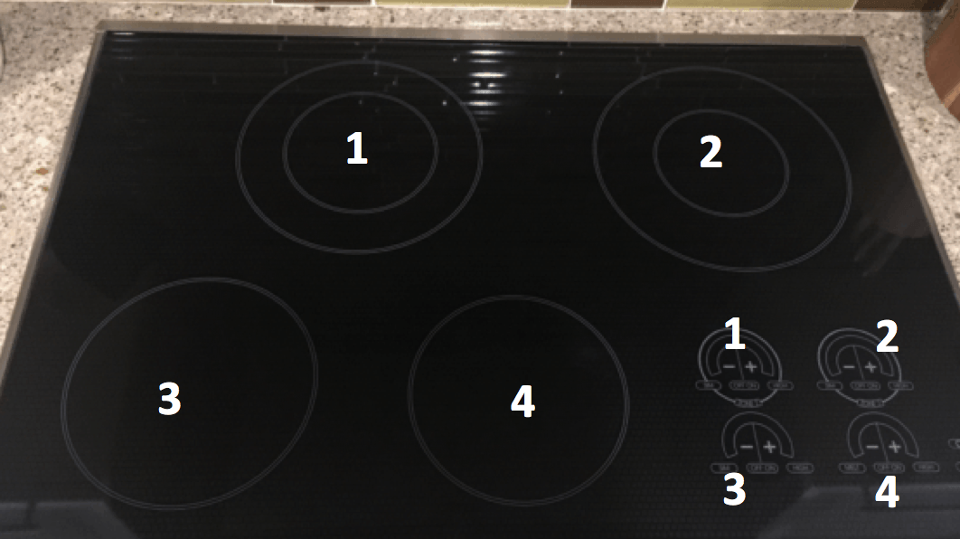
The touch controls (in the lower right) basically map to the burner locations.
I've recently run across a number of examples that I'd consider to be “bad design.”
Car Gas Cap Holder
For the first 18 months that I've owned my car, I've wondered why GM didn't include a “gas cap holder” on the inside of the fuel door. Was this corporate cost cutting and being cheap? I wasn't sure.
What I'm used to with cars, is having the cap get hung or held on the inside of the door.
When gassing up my car, I'd just let the cap dangle, because I didn't see a place to put the cap:
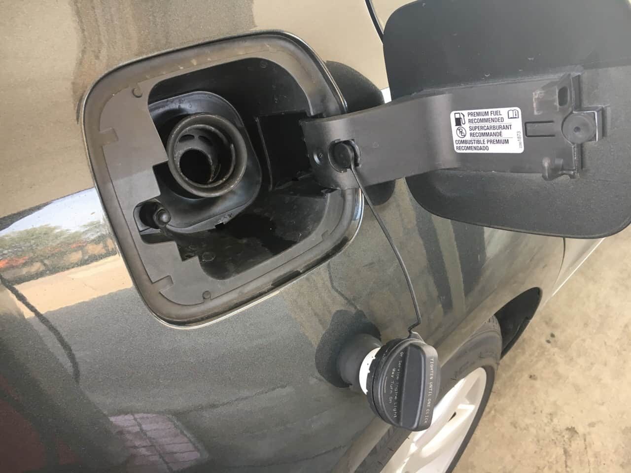
This seems to increase the risk of getting gas on the paint or chipping / dinging the paint. It's not a huge dissatisfier with a car I otherwise love, but it's annoying.
As it turns out, I discovered there is a small (and, to me, non obvious) hook that's intended to hang the cord, thus keeping the cap from hitting the side of the car:
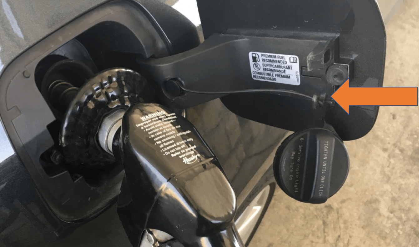
Here's a close up:
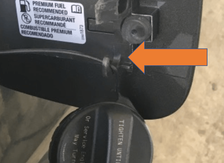
Some of you might tsk-tsk and say “read the manual” (or use the acronym of, ahem, RTFM). But, a modern car has a 400 page owner's manual. Good design means you don't have to read the manual (although I could have Googled this).
Good design makes the proper use visual and intuitive.
My suggestion would be to make that plastic hook yellow or orange so it stands out against the other black and gray parts.
Of course, a better design these days doesn't have a gas cap at all.
And the cord would be an example of “error proofing” that keeps you from leaving the gas cap behind or losing it, which happens no matter how “careful” we are as humans. We're human — we make mistakes. Good design makes it harder to make mistakes.
Hands-Free Trash Can
I recently saw this trash can in the food court of an American airport.
A hands-free trash can seems like a helpful invention (although it might be a bit more complicated than simply dropping trash into a hole (as you might do at In-N-Out, as I blogged about here).
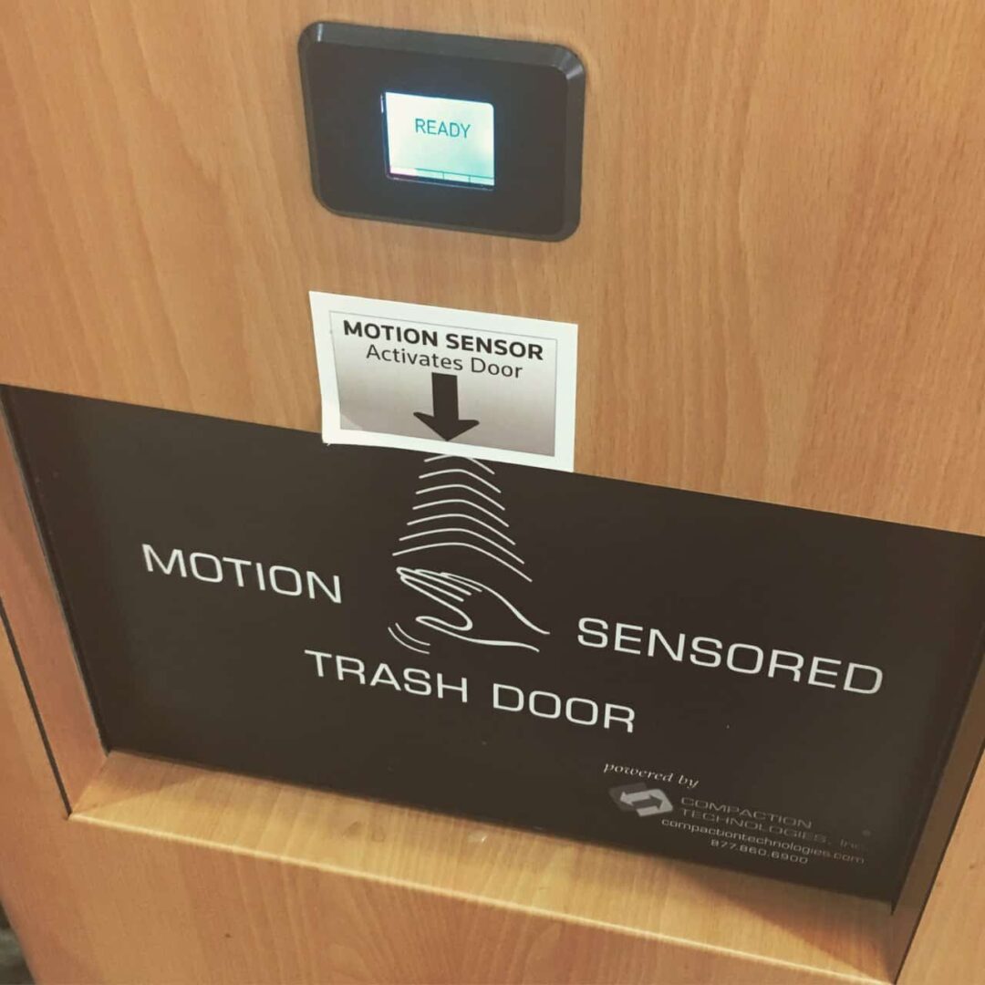
To me, it's a sign of “bad design” when you need to put multiple sets of instructions on a product.
The trash can, as manufactured, has a big label that says “Motion Sensored Trash Door” (although the graphic might not be obvious for an international travel who doesn't speak English).
Intuitive design should just open the trash door as you reach to push on it.
Something wasn't working with this design, because it appears the airport added a SECOND label that says basically the same thing as the first.
I've seen similar things in doctor's offices, where the door to the waiting room has THREE signs all saying “exit” or “exit to waiting room.”
Or you might have multiple signs saying “Put empty kanban bins HERE.”
If one sign isn't effective, why would more signs be more effective?
I do have a “hands free” trash can at home in the kitchen, but it's more intuitive. As you reach down to pull the lid open (to lift it up), the sensor triggers before you can touch it. It doesn't require labels (and I didn't have to add one) because, unlike an airport trash can, it's not being used by people who are unfamiliar with it.

Auditorium Seat Writing Surfaces
When I was at the Lean Healthcare Transformation Summit in Brussels last week, the keynote talks were in a very nice auditorium.
I was taking notes in a notebook and I couldn't find a swing-up writing surface. Normally, they're inside the armrest and you pull them up to use.
I couldn't find it… so I thought these chairs just didn't have little swing up desks.
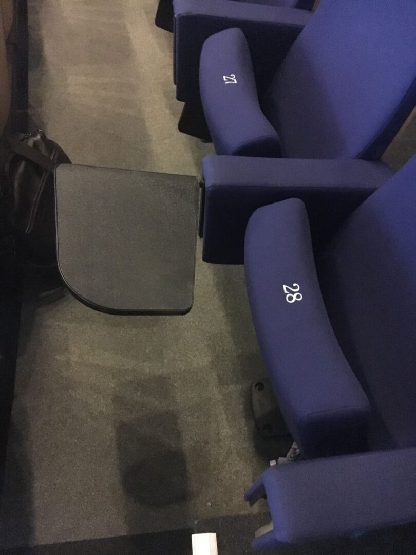
But, after the second keynote, I saw somebody with a writing surface.
Where was it?
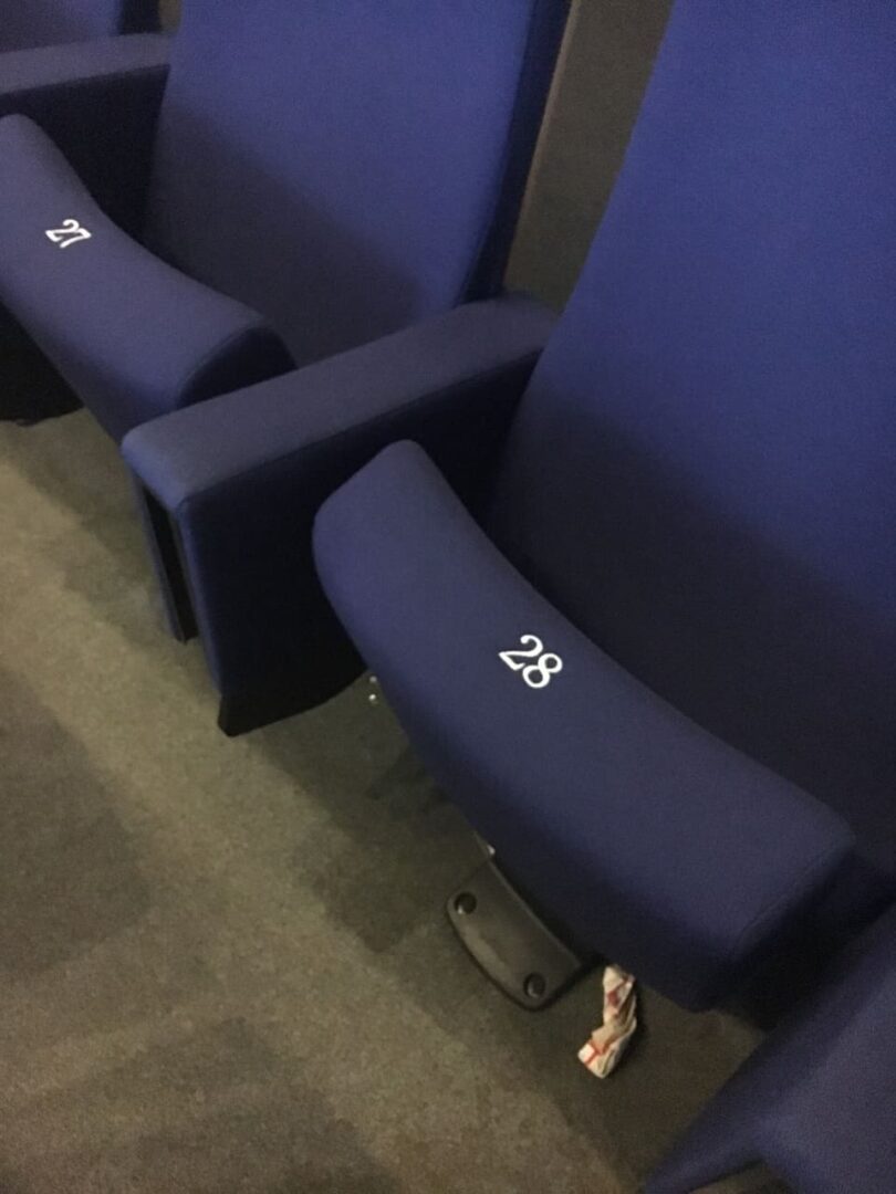
Look a little closer… from an angle you're not really going to see from a seated position:
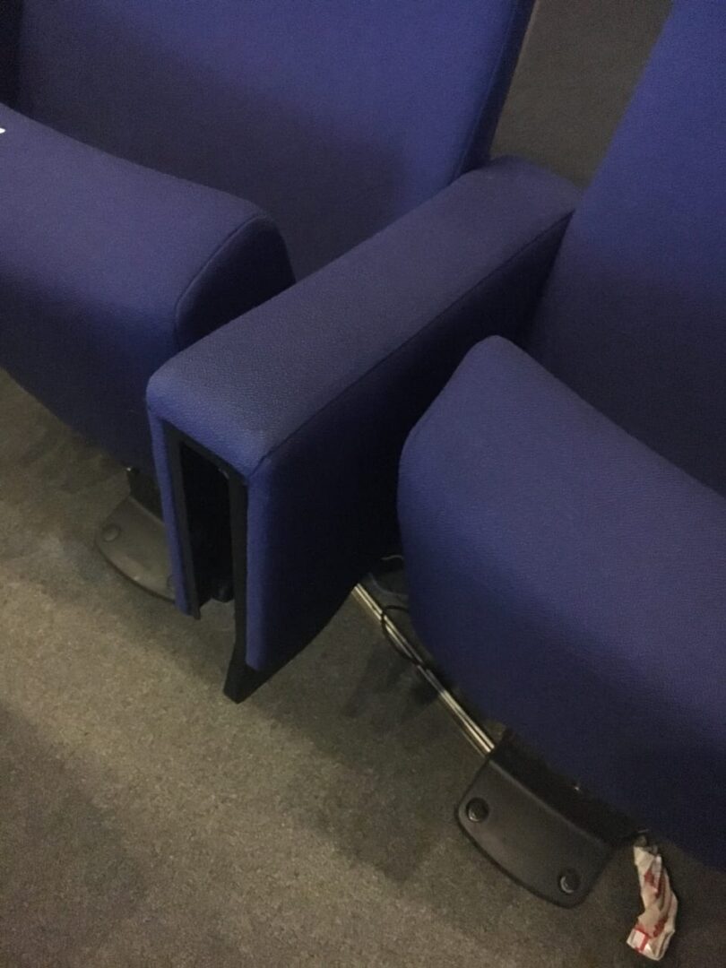
Oh, you mean hidden away inside the armrests?
I was NOT the only one to be confused by the hidden writing surfaces. I heard a number of people comment, so it wasn't just me.
It seems that the chair designers prioritized aesthetics over functionality and ease of use?
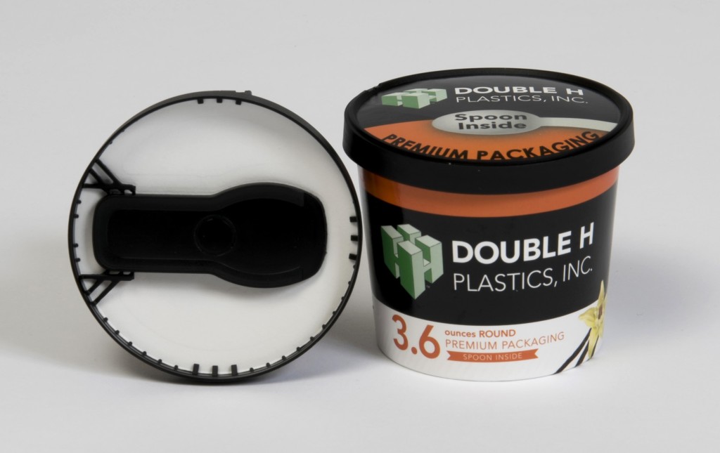
Ice Cream Cups and Spoons
Final example… when I was flying back home after the Summit, American Airlines offered a small single-serve ice cream cup to the passengers.
I pulled the lid off and expected to find a wooden or plastic spoon under the inside of the lid, like this.
I didn't see one.
The flight attendant said, as I heard her repeat multiple times (and probably for every single passenger):
“The spoon is under the top label on the lid.”
I wish I had taken a picture. The design was completely non-obvious and unintuitive.
I bet the flight attendant gets tired of telling every single passenger. The flight attendants seemed frustrated and worn out for many reasons…
Lessons for Your Process?
Can you think of examples where a workplace process of yours is not intuitive for “users” or those who do the work?
How can we apply these principles to make it easier and more intuitive to do the right thing?
Please scroll down (or click) to post a comment. Connect with me on LinkedIn.
Let’s build a culture of continuous improvement and psychological safety—together. If you're a leader aiming for lasting change (not just more projects), I help organizations:
- Engage people at all levels in sustainable improvement
- Shift from fear of mistakes to learning from them
- Apply Lean thinking in practical, people-centered ways
Interested in coaching or a keynote talk? Let’s talk.
Join me for a Lean Healthcare Accelerator Trip to Japan! Learn More


The hook for the fuel cap tether is part of a single piece molded plastic part, so making it orange would be difficult and might involve painting just that portion. I’ve been using such a hook for over 10 years. Even if the hook isn’t used, the tether is much better than pictured holder for the untethered gas cap that can be placed on top of the pump and easily forgotten.
The new Chevy Silverado pickup trucks have a “capless” fuel filler system. You open the fuel filler door and just put the nozzle into the filler – there is a system that is successful in keeping fuel vapors from escaping into the atmosphere. I suppose there will be complaints from people who are trying to find the filler cap that isn’t there. GM has a label proclaiming “easy fuel – no cap”.
Just as I thought – folks have found things to complain about with the capless fuel filler. One thing that can’t be error proofed very easily is the tendency for people to want to fill up their tanks to the very top, not leaving room for expansion, and presenting the possibility that expensive evaporative emission control components can be ruined by liquid fuel getting into spaces designed for vapors. http://www.carprousa.com/pros-and-cons-of-capless-gas-tanks-car-pro-news
I agree that the tether is useful and it’s good error proofing against leaving the cap behind. It’s still possible to make the error of leaving it dangling and bouncing around. The capless system prevents that. I’d prefer the capless system, I think. It’s been nice on some rental cars that I’ve rented.
Comments are closed.