


When executives have to mentally draw trend lines in their heads just to make sense of performance data, something's broken. That's the reality in organizations using “bowling charts” to track metrics.
I was recently talking with an executive about the way she looks at performance measures. She understands the value of Process Behavior Charts. But her organization (and her boss) insist on looking at metrics in the format that's often called “a bowler” or “a bowling chart.”
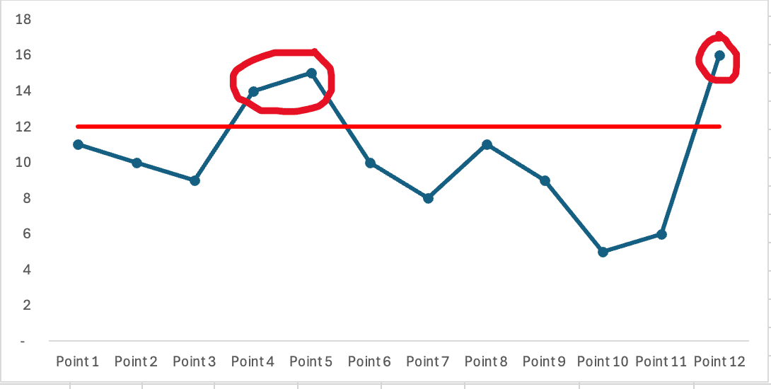
I blogged about this recently, but here's another example based on that to illustrate the typical view of the last 12 months' data:

It's hard to detect any sort of trend or movement in the numbers when you're basically looking at a spreadsheet. It's “visual” in that you see the numbers, but it's not the best variety of visual.
You can clearly see the three data points that are “red” — meaning they are worse than the target. But red versus green isn't the most statistically (or practically) meaningful thing as I, again, wrote about in that recent post).
I asked, “How can other senior leaders evaluate the bowling chart?”
The executive replied, with some gestures, “Well, the CEO looks at the numbers and he…”
The gestures indicated that the CEO was basically drawing a “run chart” (a.k.a. “line chart”) in his mind, or even with his finger.
I exclaimed, “It looks like he's mentally drawing a run chart!!!”
She thought that was likely the case.
I'm reminded of statistician Donald J. Wheeler, Ph. D., and his admonition not to ask leaders to “do mental gymnastics” with metrics and data. I think that's something he's said or would say.
Actually, in my book, I cited James Smith in his book Meaningful Graphs:
“One of the first rules of charts is that if you have to do any mental gymnastics to get the information you want from a chart, it's not a good chart.”
Here's my question then: Why not just show the executive or CEO the drawn chart instead of making them mentally convert the bowler to a chart, like the one below???
As Dr. Wheeler teaches, making charts that require interpretation defeats the purpose of using charts at all. Let's draw the trend so leaders don't have to.
And, as I wrote about the other day, the Process Behavior Chart methodology shows us that every single one of those 12 data points are “noise.” In more technical terms, it's all “common cause variation.”
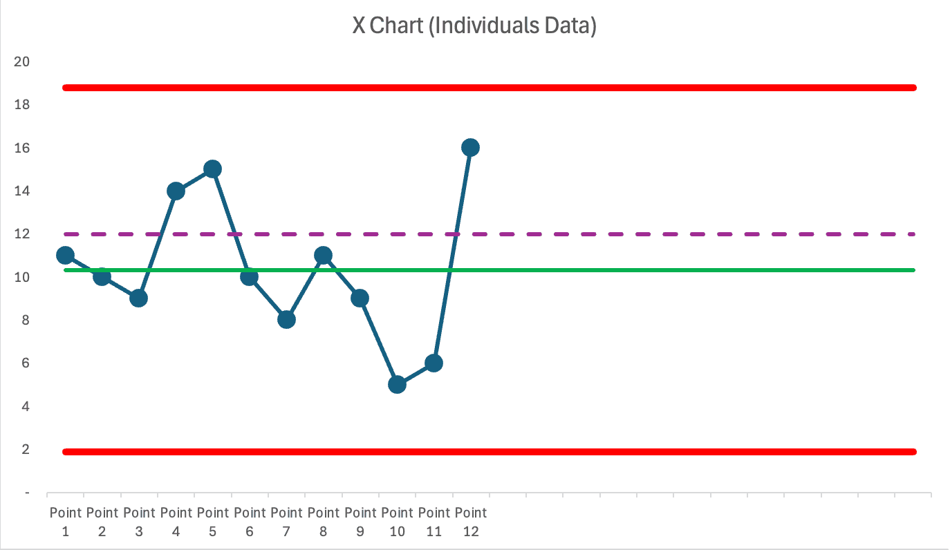
The three “reds” are within the calculated “Limits” of the chart just like the “greens” are. There's quite literally no root cause to be found for the “reds.” So asking for that investigation is the wrong approach — it's a waste of time.
Instead of asking:
“Why is that data point red?”
Leaders should be asking questions like:
“Why is our system generating those stable and predictable results? And how can we improve the system and its resulting performance?”
Be systematic instead of reactive. Take a step back and devote time to understanding the system instead of trying to understand last month.
That's a better use of time and a better pathway to improvement and performance.
But it starts with throwing the bowler… into the gutter. Use Process Behavior Charts instead — the method AND the mindsets.
Instead of forcing your CEO–or any leader–to do mental gymnastics by mentally sketching a trend line, why not show the actual trend?
When we present data visually in a way that reduces cognitive load, we invite better conversations. We create space for deeper questions:
- Is this just noise, or is something truly changing?
- What do we need to learn?
- How will we learn and improve?
That's the shift from reacting to responding–from judgment to curiosity.
As Wheeler reminds us, the purpose of data isn't to decorate a report or satisfy a traffic light rule. The purpose is insight, which becomes possible when we give people the tools to see clearly.
So let's stop handing out bowling charts and expecting everyone to play statistician. Let's start leading better by visualizing our systems more clearly. Your metrics shouldn't require decoding–they should tell a story.
Make it easier to see the truth. Then, improve from there.
As the subtitle of my book, Measures of Success, says: React Less, Lead Better, Improve More. I think that's good advice.
Conclusion
If we want leaders to focus on improvement instead of interpretation, we must give them better tools. That starts with rejecting visual clutter and cognitive acrobatics in favor of clarity and insight.
Process Behavior Charts aren't just a more sophisticated visualization–they're a fundamentally better way of understanding performance. They shift the conversation from “What's red this month?” to “What is our system capable of, and how might we improve it?”
It's not about replacing traffic lights with line graphs. It's about replacing judgment with learning. Blame with curiosity. Fire drills with focused improvement.
Don't just ask your executives to draw the right chart in their heads. Show it to them.
Get a free preview of the book here.
Please scroll down (or click) to post a comment. Connect with me on LinkedIn.
Let’s build a culture of continuous improvement and psychological safety—together. If you're a leader aiming for lasting change (not just more projects), I help organizations:
- Engage people at all levels in sustainable improvement
- Shift from fear of mistakes to learning from them
- Apply Lean thinking in practical, people-centered ways
Interested in coaching or a keynote talk? Let’s talk.
Join me for a Lean Healthcare Accelerator Trip to Japan! Learn More


