


tl;dr summary: This post challenges the traditional use of red-green binary charts in tracking performance and promotes Lean Process Behavior Charts. It emphasizes the importance of understanding variation in data, advocating for a more nuanced and statistically driven approach to determine real changes from mere noise in performance metrics.
Thanks again to Prof. Eric Olsen for inviting me to give a short talk as part of the virtual Central California Lean event.
I had ten minutes to get across some core concepts of how “Process Behavior Charts” (as described in my book Measures of Success) would be more helpful than “red/green” color coding of metrics, as used in the context of a Lean management system.
Below is a practice session that I did, coming in at about 12 minutes. A transcript follows. What do you think? Leave a comment and be part of the discussion. Here is a page with a deeper dive and follow-up notes on Process Behavior Charts.
Mark Graban: Hi, this is Mark Graban. This is a practice session for a talk I'm giving at the Central California Lean Conference 2021 titled, “Is Red and Green Really Lean?”
People in Lean management circles, in Lean Six Sigma, or other movements talk about the need to be data driven when we are managing and improving. Some prefer to use the language “fact-based.”
Is one data point really helpful? The singular of data, of course, is datum. How many organizations out there have some form of single data point datum-driven management, often with color coding?
Here's an example mocked up from a hospital. It doesn't matter what the metric is. It's some daily metric. 75 percent is the target. The most recent data point was 66 percent. That is lower than the target, because we want to be, ideally, at 100 percent.
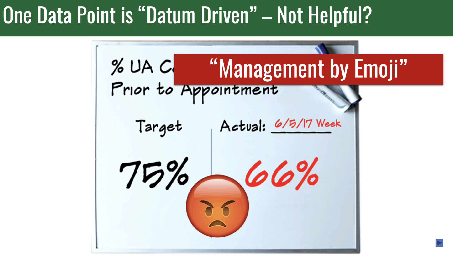
Color coding comes into play. The red marker comes out. For those who can't be bothered with doing the math of the numerical comparison, red, bad, not meeting target. That is a fact. Is that helpful for managing and improving our organization? I would argue no.
If the color coding's not good enough — I've seen this in hospitals, in factories, in different countries — you can buy emoji magnets that you put on your whiteboard, your team board, your huddle board, your metrics board. I'm not advocating for this.
The implication that we're supposed to feel sad about the red number, is that supposed to drive improvement? If so, why not try ramping up the emotion?
I call this management by emoji. I do not think that this is anything close to a best practice. One data point is not a trend. Wait, what about two data points? Organizations do this a lot. They show a data point. Instead of comparing it to a target, they also compare it to the month before, to the year before, the quarter before.
Let's imagine we are a leader who has four different sites. We've got some metrics. We see the December number, the most recent number in this case, and we see it compared to November.
We have color coding. We've got some red. We've got some green. There is sometimes a “trend signified.” This up arrow or down arrow is not a statistically meaningful trend. It is a simplistic comparison of December for site one is higher than November. Do we really need an arrow to point that out?
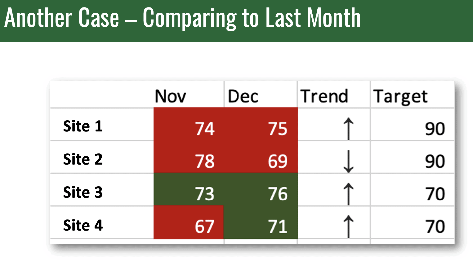
Both those data points are red. Bad. Two of those data points are green. Good. Wait a minute. Their target is 70 compared to 90. Are they pulling one over on us? Is their performance really better at sites three and four compared to sites one and two?
Whether we have one data point or two points, if that's how we are trying to manage our organization, there are, from my experience, three key questions that we need to ask and try to answer. Are we achieving our target or goal? Yes, no, red green, bad, good. Is knowing that for one or two data points really that helpful?
Two, are we improving? You can't detect a trend from one data point, and you can't detect a trend from two. Hard to answer that question. Impossible to answer that question. We need a better method.
Three, how do we improve? When do we react to a data point, and when do we step back and look at longer-term trends? We can't answer these questions well with one or two data points. How about more numbers?
A lot of organizations will use what some call bowling charts. There are 10 frames in a game of bowling, 12 months in the year. You could throw 12 strikes if you bowled a perfect game. I don't remember ever color coding my bowling scores red and green. Organizations do this.
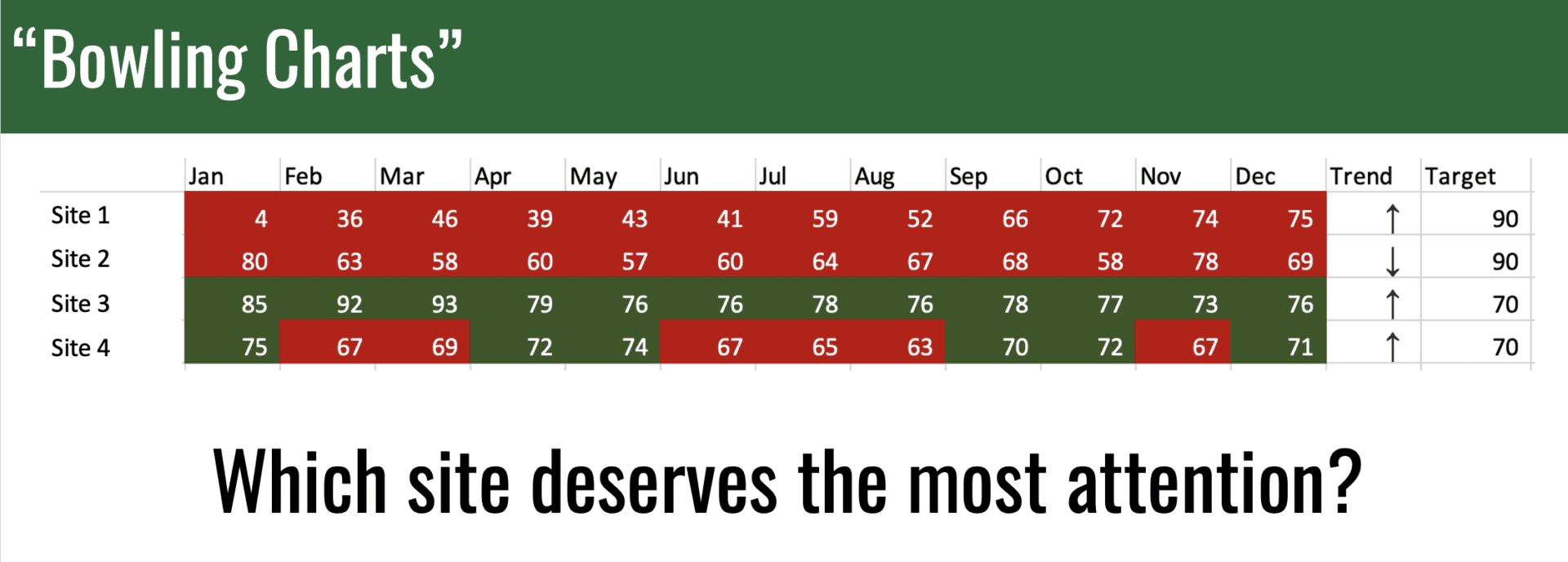
Now we've got, for these four sites, lots of red and green. Two of these metrics have been red all year long. Site three has been green all year long. Site four is sometimes red, sometimes green. That last data point's green. Do we call that improvement?
Snap decision. This is what managers are asked to do in meetings.
“Which of these four sites deserves the most attention right now?”
Attention could mean praise. It could mean follow-up and pressure to improve, even though pressure is not really the right way to improve a system.
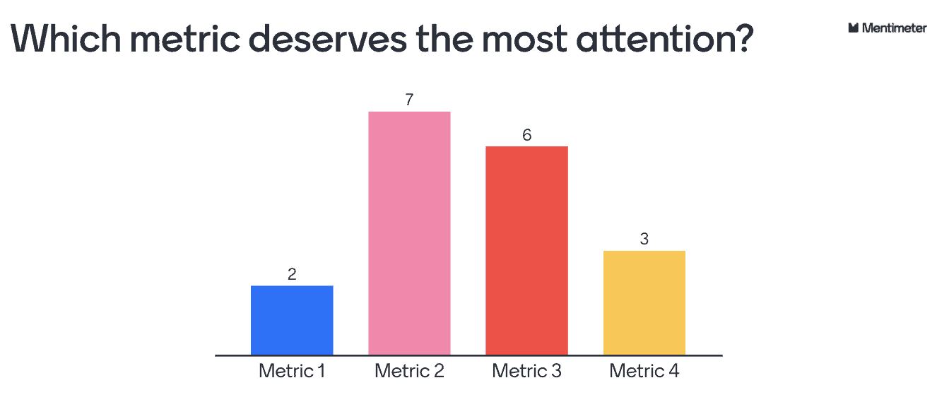
In a lot of versions of this talk when I do polling there will be people in the audience that will answer one, two, three, or four. We need to figure out what's the basis for deciding one of these deserves the most attention.
Are we achieving our target or goal? Yes, no, sometimes. Are we improving? Hard to tell from the list of numbers. How do we improve? When do we react? When do we take a step back? Hard to tell, again, from the list of numbers.
What can we do? I have friends in the National Health Service England. They use a charming hashtag online on social media, #plotthedots. Let's do that.
Let's, beyond visualizing the data as a run chart, do what the statistician Professor Don Wheeler teaches us in his book Understanding Variation about distinguishing signal from noise. As Wheeler teaches, while every data set contains noise some data sets may contain signals.
Therefore, before we can detect a signal that's something worth reacting to, within any given data set, you must first filter out the noise. How do we do this? Thankfully, we have a proven statistical method. It's easy to learn. It's easy to do. It's visual with a little bit of math. It's called a “Process Behavior Chart.”
Here's an example of a chart. We're going to build this and add more data. We may have a baseline timeframe that we see here. We plot the dots. We calculate an average. We calculate what are called the lower and upper limits. These are not goals or targets. This is the voice of the process. This shows us the range that going forward this metric is likely to continue fluctuating within.
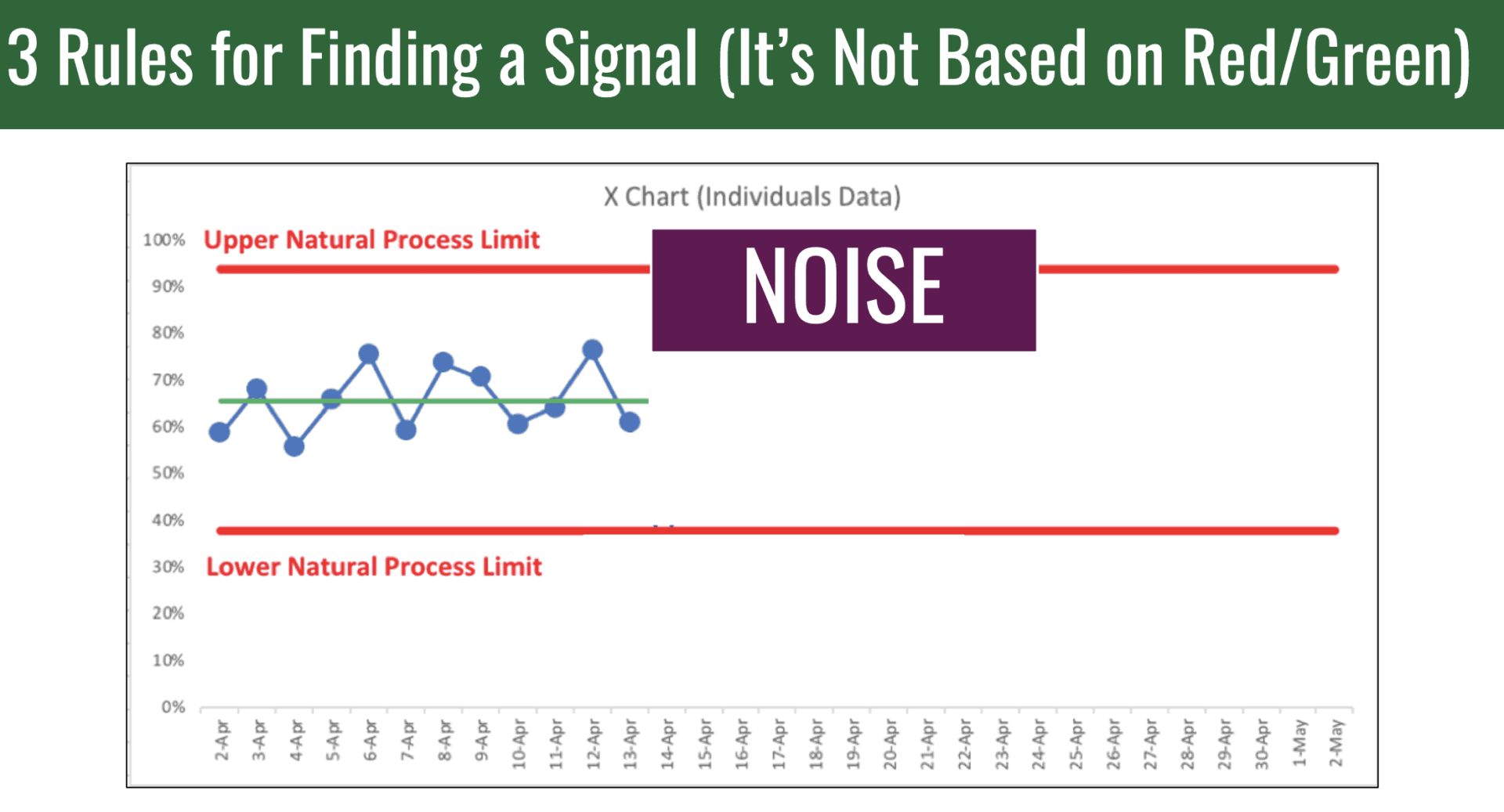
How do we find a signal? It's not based off of red and green color coding. All of these data points, so far, would be labeled and considered noise. None of those individual data points is worth reacting to on its own.
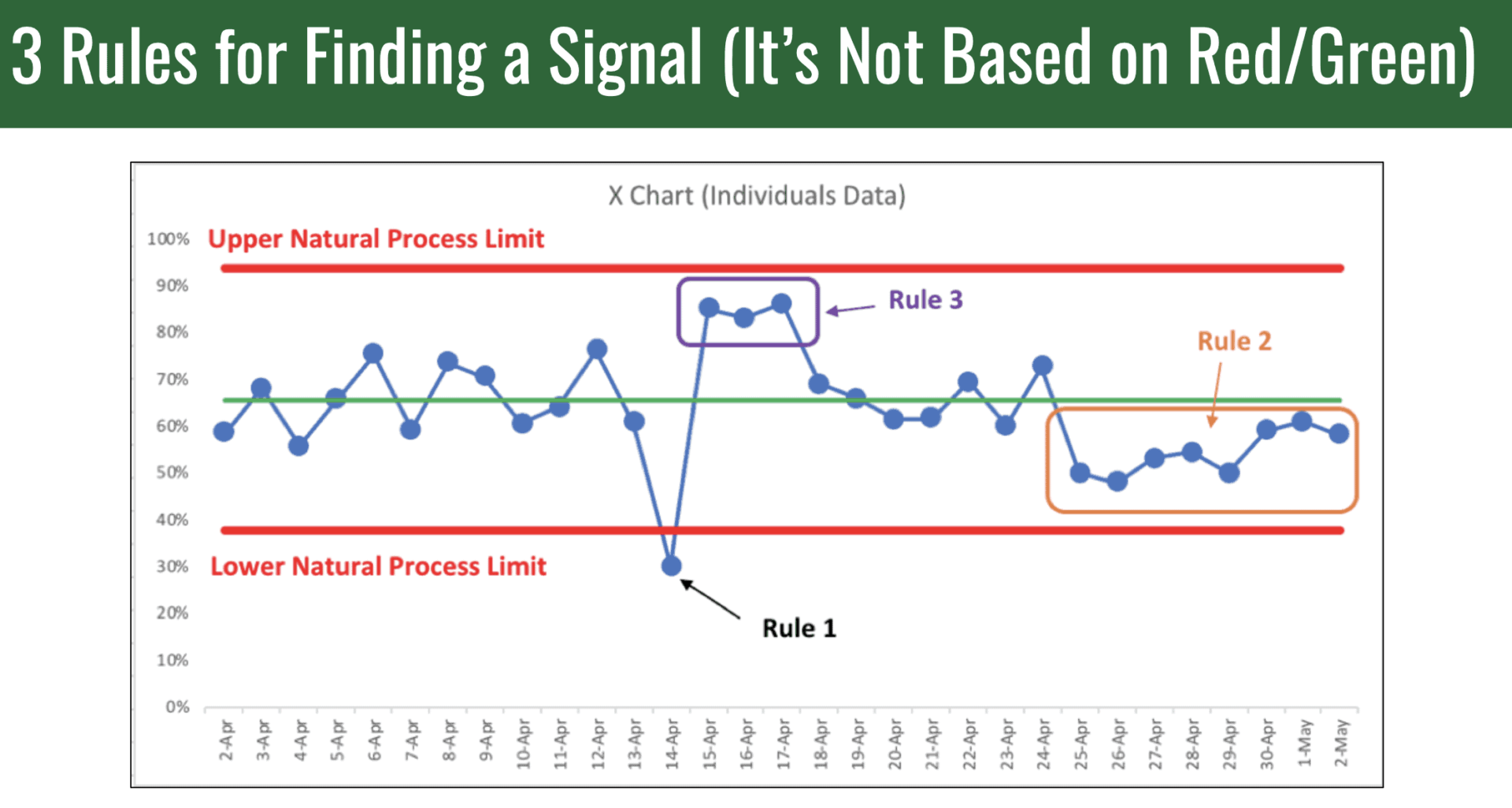
We have three rules for finding signals. One is any data point outside of the lower and upper limit that are calculated from the baseline timeframe. This data point is extremely unlikely to be randomly occurring. The signal tells us, “Ah, something has changed,” either as a result of something we did or something that just occurred. Either way, that's the time to go looking for a root cause.
Rule number two is looking for eight consecutive data points that are all above or below the average. Again, statistically unlikely to be randomly occurring, something changed.
Rule three is looking for a cluster of data points that are closer to one of the limits than they are to the average. The system, when we see those signals, is no longer fluctuating around an average. Something has changed, and we need to understand that cause and effect.
Let me show you an example of how Process Behavior Charts help us evaluate ongoing operations. Let's come back to our friend, or nemesis, the bowling chart.
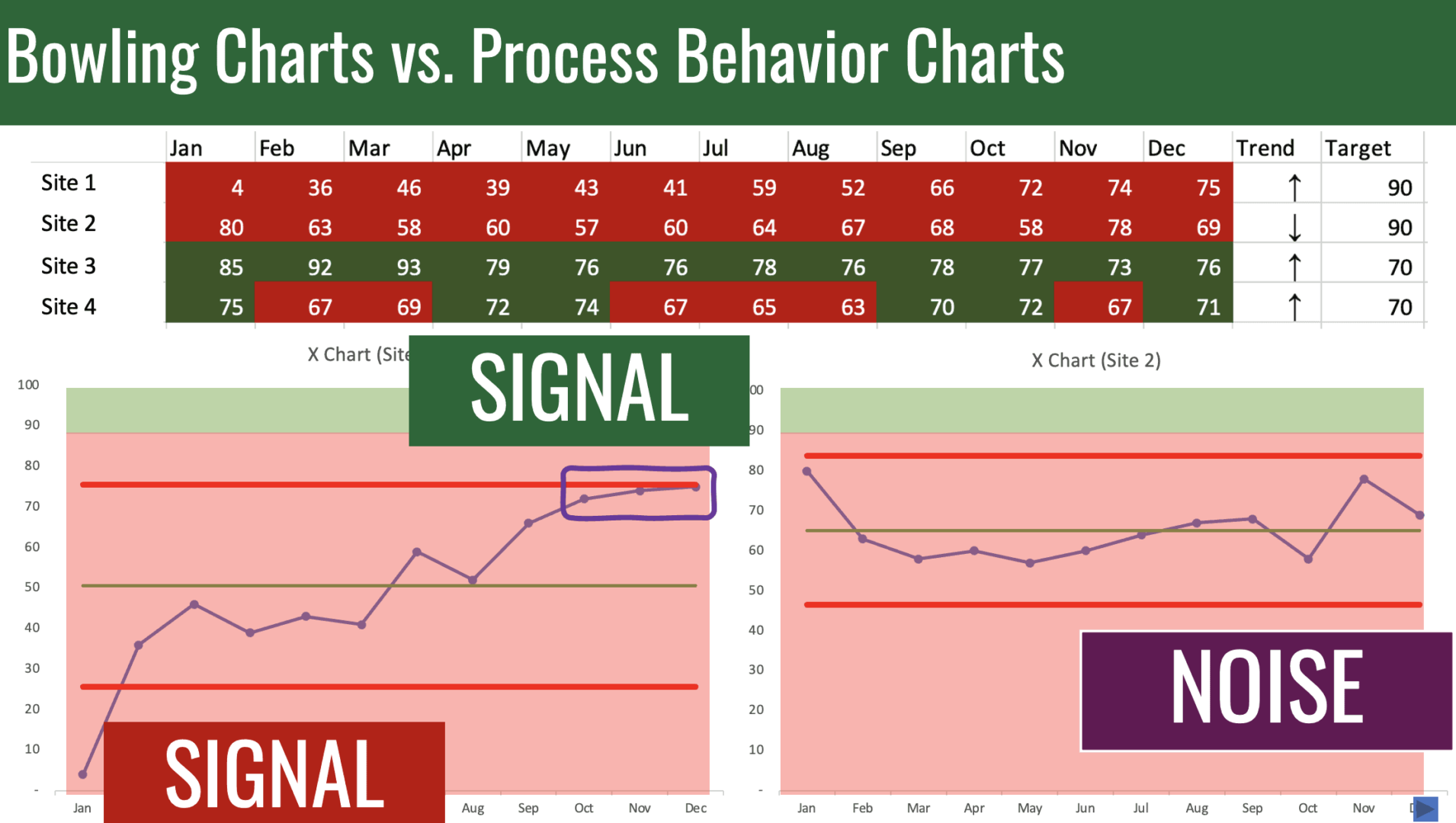
We can take these four metrics and plot the dots, #plotthedots, creating a Process Behavior Chart for site one and for site two. Look what was hidden, perhaps, in a list of red color-coded numbers.
For site two shows that that site is, apparently, fluctuating around an average. There are no signals. We see nothing but noise. Site one shows clear improvement from the beginning of the year to the end of the year.
Some organizations will choose to overlay their red and green color coding. What does the red and green really tell us in addition to what the Process Behavior Chart showed visually?
With site one, we have a signal in the positive direction. These three data points. There was a signal at the beginning of the year. Site one shows significant evidence of improvement. We may want to reward that effort or understand why that was. Site two, we see nothing but noise. It's fluctuating around an average.
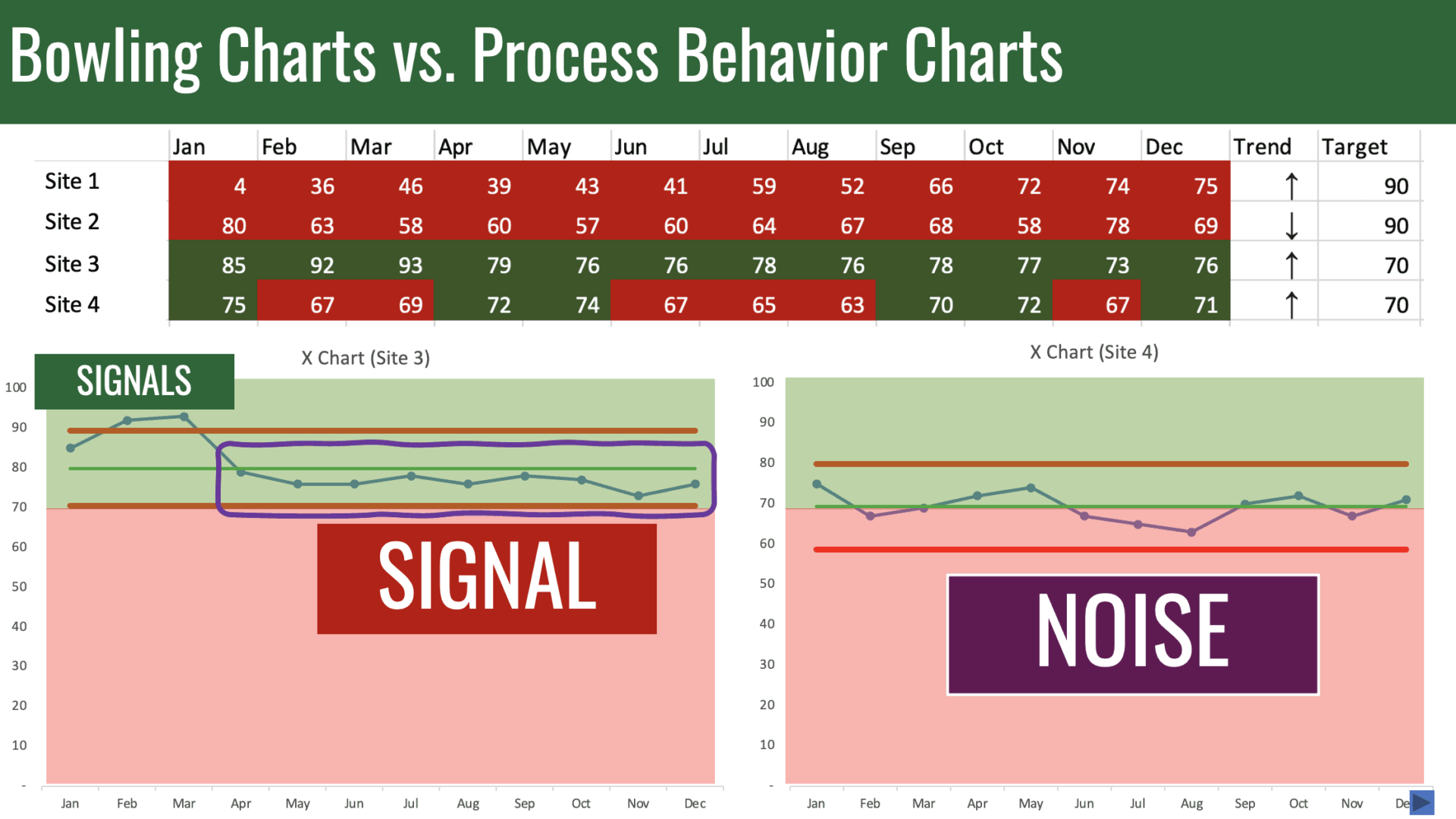
Let's look at sites three and four. Plot the dots for site three. Plot the dots for site four. Site three was in the green the entire year. A lot of organizations would say, “Well, if it's green there's nothing to see here,” but there is when we look at the Process Behavior Chart.
Beginning of the year, we have signals in a good direction. More importantly, we see the last nine months of the year were below average. That tells us that there's been a shift downward in performance.
The metric had been fluctuating around, let's say, 90. Now it's fluctuating around an average of about 76. Do we understand why? We should. We must.
Site four is simply fluctuating around an average. The average happens to be right about at the target. Here's an example where we're going to be constantly fluctuating between red and green. If we overreact to the red and demand root cause analysis for every red, we're reacting to noise, that's not good practice.
When we look at Process Behavior Charts as a better way than red/green to look at our metrics, or maybe using Process Behavior Charts in conjunction with red and green, we can do a better job of answering these three questions.
Are we achieving our target or goal? We can see that visually. Two, are we improving? We can see that visually combined with these three rules for finding statistical signals. How do we improve? With this chart here, it's fluctuating around an average.
We don't try to improve by reacting to this last data point. We need to step back, maybe do any three, and ask, “What can we do to boost overall performance of this metric?”
Here, we can see a signal. Both data points are below the lower limit. We're not reacting because they're red. We're reacting because it's a signal. Something changed. We can call this a special cause. How do we improve? Here, we can and should be reactive.
As the subtitle my book Measures of Success tries to summarize, when we react less — I'm not saying never react — instead react only to signals on the Process Behavior Chart and we lead better — meaning we don't waste people's time demanding root cause analysis of every up and down in a metric — when we react less and lead better, we can improve more.
This just scratched the surface on this topic. For more information, deeper dives, all kinds of free resources, you can go to markgraban.com/ccl2021, or you can contact me. If you're so inclined to my book, Measures of Success, also takes a deep dive into this topic. Thanks for watching.
Final Thoughts
Thank you again to Professor Eric Olsen and the Central California Lean community for the opportunity to share insights on a topic close to my heart: transitioning from red/green color coding to the use of Process Behavior Charts as part of a Lean management system.
As I emphasized in the talk, it's not just about better data visualization; it's about fostering better decision-making, focusing on signals rather than noise, and creating a culture that enables meaningful improvement without unnecessary reaction. When we plot the dots and lead with a focus on understanding the story our metrics are telling, we empower teams to engage in learning and problem-solving that drives sustainable progress.
I invite you to share your thoughts and experiences with this approach–whether through comments here or discussions in your own organizations. And for those interested in digging deeper, I encourage you to explore the resources linked above, including my book Measures of Success, which provides a detailed roadmap for incorporating these principles into your leadership practices. Get a free chapter here.
Let's continue learning, sharing, and improving together. After all, as we say in Lean: there's always a better way, and finding it is a team effort.
Please scroll down (or click) to post a comment. Connect with me on LinkedIn.
Let’s work together to build a culture of continuous improvement and psychological safety. If you're a leader looking to create lasting change—not just projects—I help organizations:
- Engage people at all levels in sustainable improvement
- Shift from fear of mistakes to learning from them
- Apply Lean thinking in practical, people-centered ways
Interested in coaching or a keynote talk? Let’s start a conversation.


What if we have a signal in our baseline calculation? For example, a data point outside the upper/lower limits. Do we need to pick a different baseline our is the tool flexible enough to handle it?
Great question, JM.
Here is an example where there is a signal in the baseline period:
In a case like this, the method is robust. Don Wheeler teaches that you don’t have to remove that data point from the calculation or from the data set.
That said, you could calculate the average and limits using all points after that signal, which would give a better prediction of future performance… we’d expect future data points to fall within these limits.
There’s an art to this, for sure…
And an intial period like this makes clear that a shift has occurred during the baseline period…
So we might shift the limits like this:
Thanks for the detailed explanation!