


I say it a lot, but two data points are not a trend. I didn't invent that idea, of course, but I've tried to help leaders and organizations stop reacting to every up-and-down in a metric through the methods I share in my book, Measures of Success: React Less, Lead Better, Improve More.
We are bombarded, in organizations and in the media, with two data-point comparisons.
My friend and sometimes collaborator Chris Chapman, as he often does, shared a great example of this “journalistic malpractice” in a recent tweet:
I added, in a comment retweet,
“Reporting figures this way should also be considered management malpractice in a business or hospital, but it happens all the time.”
Thanks to what I've learned from Don Wheeler, PhD on this subject, I'm pretty immune to two data point comparisons. When I can (like in a meeting), I would ask for more data points. We can't directly ask the media to show charts that give context to data over time… well, I guess we can tweet about it.
When I was logged into LinkedIn recently, they showed me this representation of some data:

The number of 3,379 is missing context. Comparing that number to the previous week doesn't add much context at all.
So the number is 10% lower. The math probably checks out. But what can I really do with that information, true as the 10% comparison is? NOTHING.
Oh, and they made the number red, as if the negative sign wasn't clue enough that it was lower.
LinkedIn thankfully allows you to click to “show trends.” You get a line chart (aka run chart) that's much more helpful than the two data point comparison:
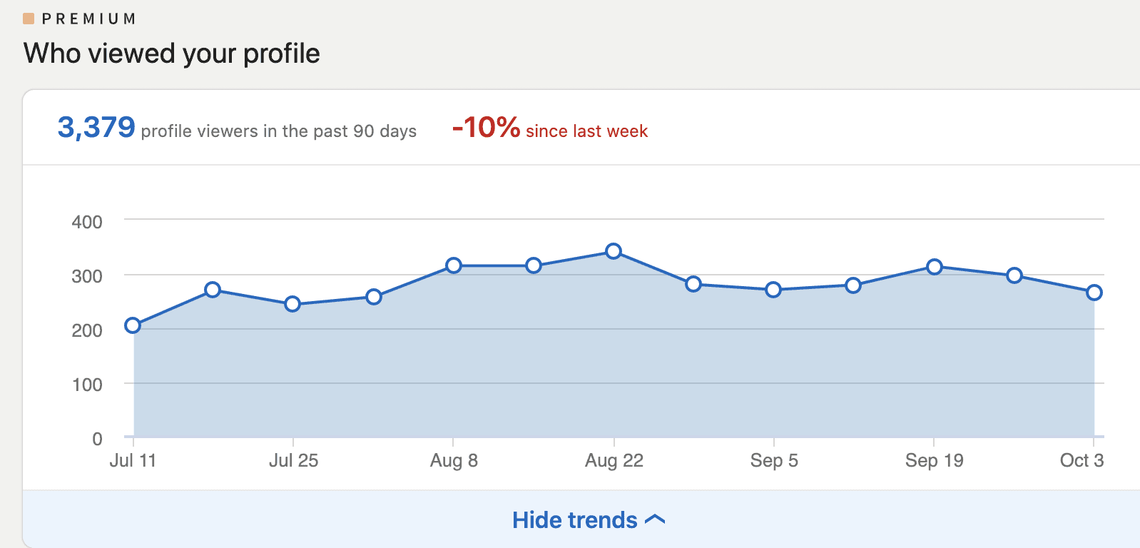
Eyeballing it, there is no “trend,” just fluctuation around a stable average. Some weeks the number goes up, some weeks it goes down.
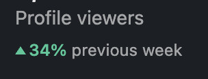
As you mouse over the data points, the chart cheerfully shows you a red or a green number each time (except for the one time when the number was exactly the same as the week before).
I was grabbing those exact data points because I, of course, want to build a “Process Behavior Chart” that would tell me even more about this data over time.
As a quick aside, this metric (how many people have viewed my profile) is absolutely a “vanity metric” (hat tip to Eric Ries) since I don't get paid for each view. If anything, the number of views is an indirect predictor of my success in getting more clients, speaking engagements, etc.
Here is the “X and MR chart” pairing that makes up the full-blown Process Behavior Chart methodology:

The average, lower limit, and upper limit of the X Chart (with the actual data points) are calculated (learn how here or in the Appendix of my book).
Do I see any evidence of a “signal” in either the X Chart or the MR Chart? No. There are no data points outside of the limits (Rule 1), no runs of 8 or more consecutive data points above or below the average (Rule 2), and we ALMOST see a “Rule 3” signal — if we saw 3 consecutive or 3 out of 4 data points closer to a limit than the average.
These 3 data points are ALMOST that signal, but the first two data points are a touch below that midway point between the average and the upper limit.
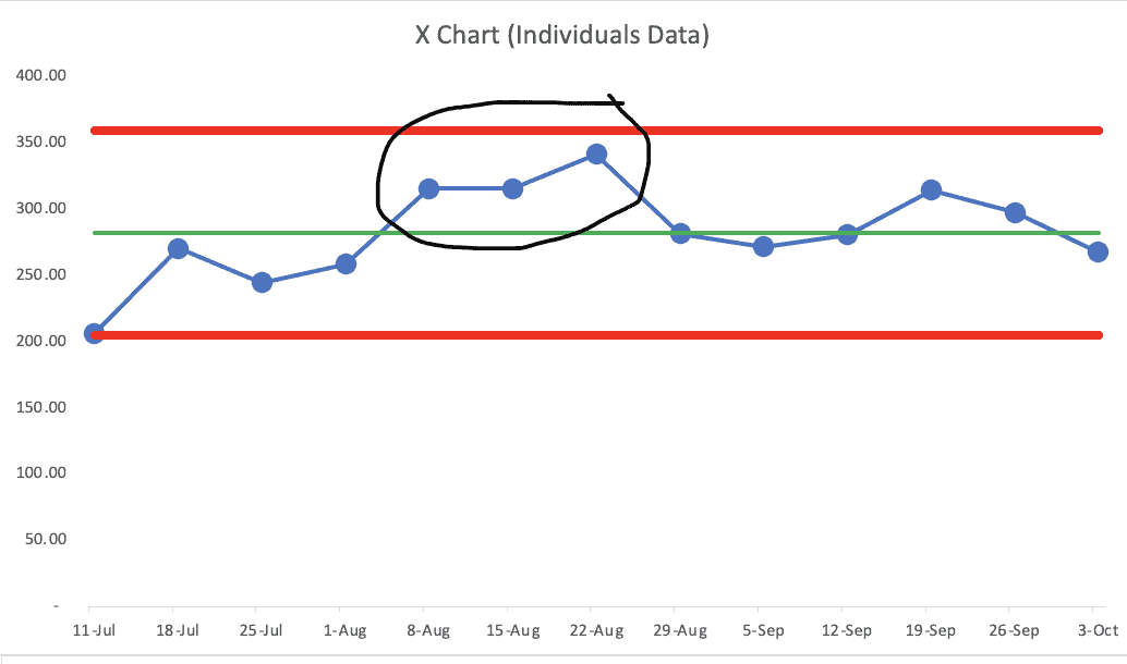
That's the week ending July 11, which might still have some effect from the 4th of July holiday.
Either way, I'm not going to worry about that data point. It would be a waste of time to try to ascribe any cause-and-effect relationships between any of my actions and that number.
Were the numbers higher some weeks because of the particular content I posted? Not in a statistically meaningful way.
Instead of worrying about or thinking about every up and down, if I really cared about this metric, I might take actions that would be intended to boost the AVERAGE over time. I'd look to see if there were any signals in the chart over time…


Hi Mark,
My name is Evan and I am a senior in college where I study Business, Computer Science, and Spanish. I am currently pursuing my Green Belt certification which led me to stumble upon your blog post here.
I found it very interesting how you applied Lean thinking to LinkedIn Profile views to demonstrate the difference between trend analysis and data point comparison. For example it was pretty comical how LinkedIn gives you the number of views in the past 90 days, and then tells you that your views decreased 10% in the past 7 days; there is no quick and easy way to even really make sense of that. Then, you demonstrate the line chart found in the “show trends” button. Here, you realized that there are minor fluctuations, but your profile views stay constant around 275 per week. The trend analysis shows that the single data point decrease of 10% does not really reflect any changes in your profile views.
Furthermore, I found it interesting how you acknowledged that profile views do not predict getting more clients or speaking engagements. I think this is an important point to emphasize because it shows how we sometimes associate our measures with predictions that cannot be made based on the data.
I found it insightful to read your post. My question for you is, is there ever a time where data point comparison serves a good purpose? In other words, wouldn’t it be a good idea to have those data points serve as quick indicators that something went wrong, or something changed? I understand trend analysis is better, and as lean thinkers we should focus on the long-term continuous improvement of the overall metrics, but your post really got me thinking about if there are pros and cons to each.
Anyways, I enjoyed reading your post. If you have the time to answer my question, I would love to see what more I could learn from you.
Sincerely,
Evan
Thanks for reading and thanks for your comment, Evan.
You asked:
Great question. The Process Behavior Chart methodology teaches us to react to a single data point WHEN (and only when) it is a SIGNAL. A data point outside the limits is worth reacting to (quickly) and investigating. The PBC filters out noise so we can find signals.
Hope that helps.
Mark