


I do enjoy watching football, so this headline caught my eye:
“Why Are N.F.L. Scores Scores So High This Season?”
If you know me and my book Measures of Success, you know my first question was:
“Is it a statistical signal worth explaining?”
From the article:
“N.F.L. teams have been scoring points at an unprecedented level in the season's opening four weeks, an augmented efficacy that if sustained will rewrite the league's 100-year-old record book.”
That's a long-winded and sophisticated way of saying “scoring is at an all-time high.”
Well, every data set (including business metrics) has a “highest number ever” but that doesn't mean it's a statistical signal worth explaining.
We need more data. We need more context, as Don Wheeler says.
The article continues:
“Through four weeks of the 2020 season, the average combined score of a game is 51.3 points, an increase of 16 percent over the same period a year ago…”
OK, those are facts. The math is right. Is 2020 a signal worth explaining?
Also, as the article does point out, we are only four games into the 2020 season, so it's not “apples to oranges” compared to other seasons (we aren't into the bad weather of early winter when scoring probably drops — I'd want to see the data that confirms that dispels that assumption I am making).
As always, we have to be careful with two-data-point comparisons. Scoring is up 16 percent from the year before. How much does scoring normally fluctuate from season to season? Show me the data! #PlotTheDots, as my NHS England friends say.
The Times adds another two-data-point comparison, saying:
“…roughly 20 percent increase in the average score of games since 2000.”
That's a fact, but is 2020 a signal??
The Times does show a chart (and it's, annoyingly, a column chart when I much prefer a run chart for time series data):
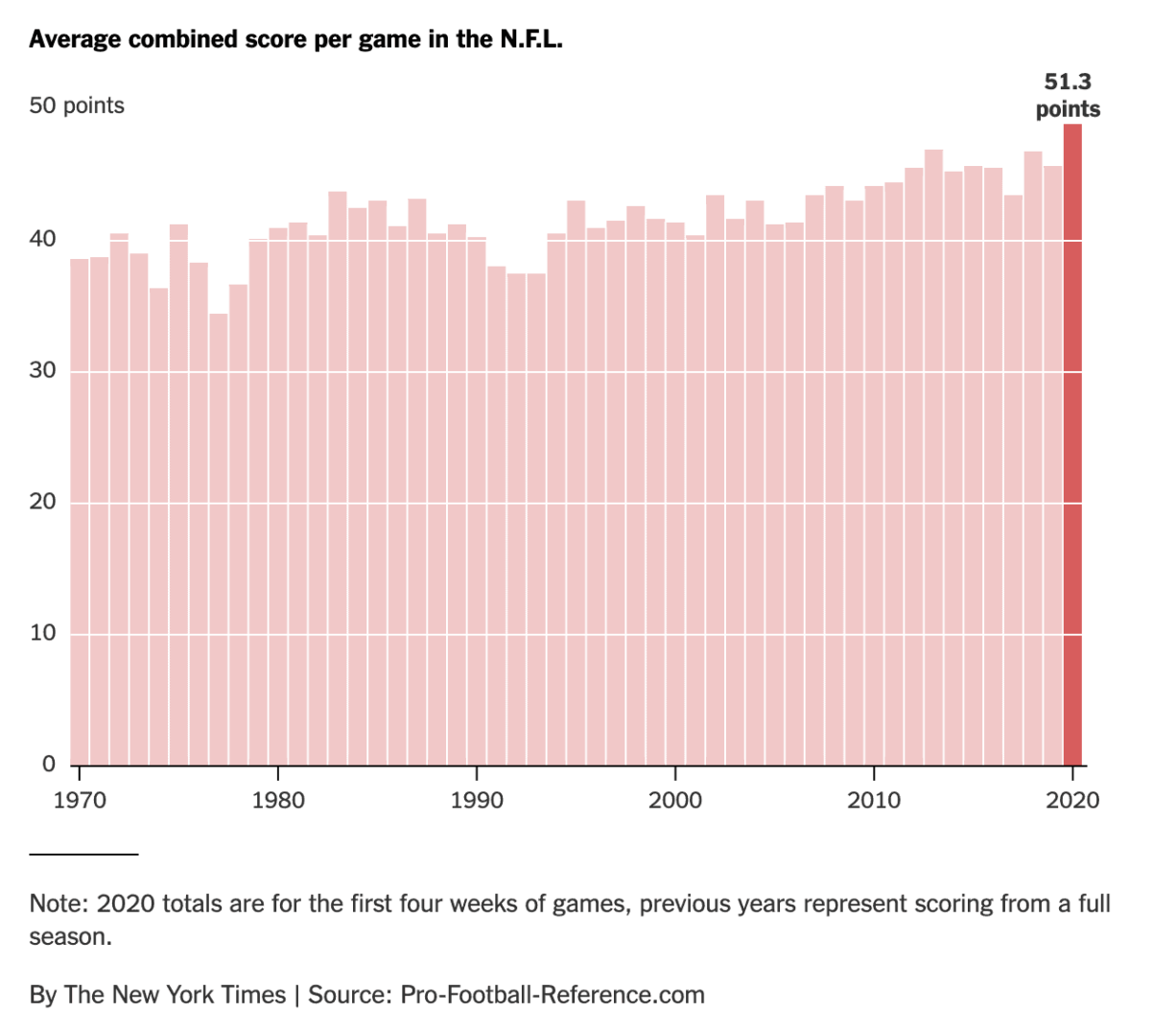
So is that last data point, 51.3 points (for both teams), a statistical signal? It's hard to eyeball it. There does appear to be an upward shift from scoring of the '70s and '80s.
I also went to pro-football-reference.com, but I started out simply creating a run chart… going back just as far as 1996 to start. 25 years, 25 data points.
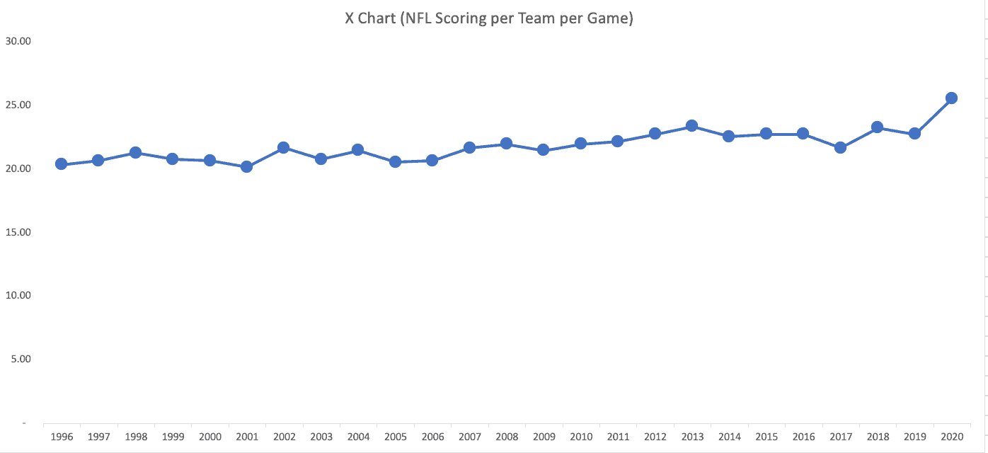
Is my chart better than the column chart? I think so. It uses less ink, well that is, if we are still printing newspapers.
What's more helpful is a Process Behavior Chart… where we calculate an average (in green), and two other lines called the lower and upper limits (in red). Learn more about how to do this.
Here is what's called the “X Chart” (not to be confused with the XFL, but it sounds cool like that):
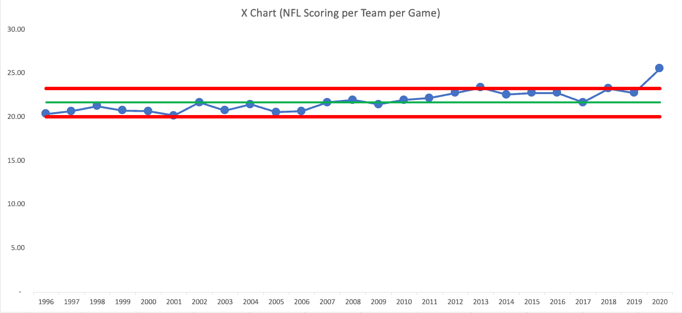
So 2020, so far, IS a signal. Often, when I do this analysis, the data point is within the limits, so I end up writing about how we shouldn't overreact to “noise” in a system or a metric.
There are three rules, per Wheeler, that I document in Measures of Success:
- Any data point outside the limits
- 8 or more consecutive data points on the same side of the average
- 3 of 3 or (3 of 4) consecutive data points that are closer to the limit than they are to the average
We can see that 2013 was also a signal (above the upper limit). I'll change the Y-axis to make some of this easier to see (and be careful to not make the Y-axis misleading in the workplace):
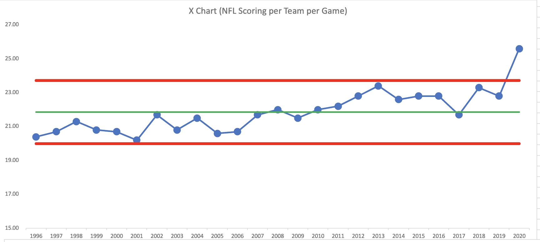
While 2013 was barely above the upper limit (creating the risk that it's a “false positive” signal, 2020 is a very strong signal.
Beyond that, the last three years are a “Rule 3” signal. The upward shift in scoring didn't really start this year.
Look at the totality of this chart… we have many years below the average followed by many years above the average (2017 scoring is 21.7 while the average is 21.71, so technically it's below average, but I think the trend is clear.
There's not a single “system” over time. It looks like two systems and maybe that new system starts in 2010. I can calculate averages and limits for two different time ranges… then the chart looks like this:
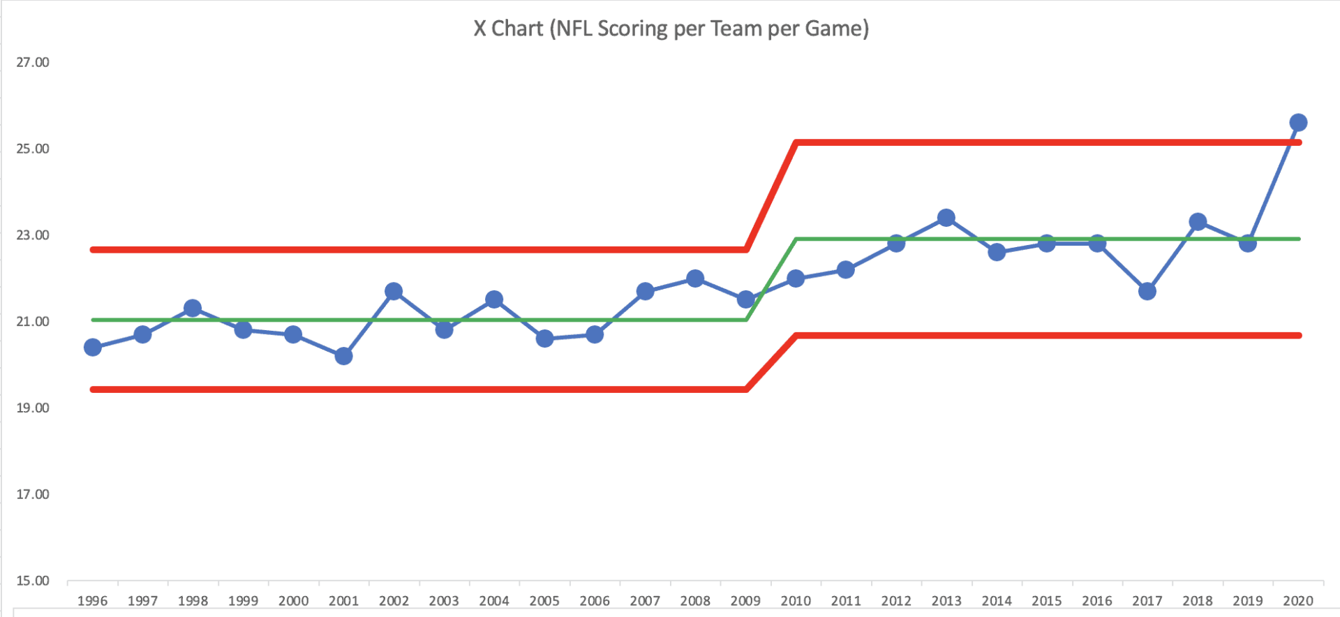
This chart shows how scoring had been fluctuating around an average… then it shifts upward… sort of fluctuating around an average and now 2020 is a signal (and these stats were not including the Monday Night Game).
Had I gone back further in time (maybe I will and I'll update the post), we'd likely see additional shifts in scoring — caused by rule changes or other factors.
There are many possible reasons for this “signal” — what we would call a “special cause.” As with any business metric, a signal in the Process Behavior Chart tells you the system changed… but it doesn't tell you WHAT changed. You have to figure out the cause-and-effect.
Possible causes of this signal include:
- No fans (or limited fans) reduces some of the home field advantage, so scoring is higher for road teams (we could look at the data on that)
- Lack of a pre-season means that defenses are at a disadvantage compared to offenses
And, from the Times:
“Theories on the cause of the scoring surge have proliferated, including the advantages afforded road teams since they are no longer tormented by raucous home crowds, a curious drop in the number of penalties called and a decline in tackling skills resulting from the cancellation of preseason games.”
I'd say this is all a bit premature, given that we are just four games into the season. A better comparison would be a chart that shows “points per game through the first four weeks of the season.”
Either way, the point for business metrics is the same… don't react to every up and down in a metric. Look for signals instead of reacting to all of the noise. Don't just compare two data points… instead look for the context that we get from additional data points.
Here is the spreadsheet that I used, via Dropbox.
Late December Update
It's not surprising that scoring has dropped a little bit as we get toward the end of the season… there have been more games with a lot of rain and/or win. The league scoring average is still an all-time high… of 24.8 points per game.
Updating that last chart makes it look like this… the upper limit is now calculated as 24.86. This last data point is now a smidge below that upper limit…
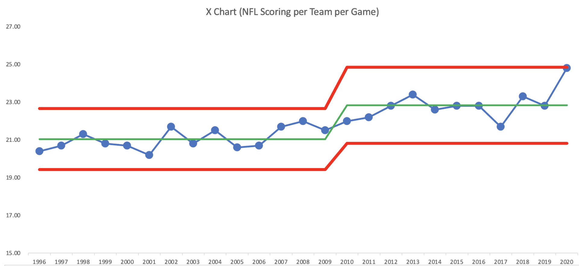
It's technically not a signal, but it's close. It's probably worth examining the question of “what's different this year?” It will be interesting to see if scoring regresses back to that mean next season.
END OF SEASON UPDATE: 24.8 is the final number for the regular season.
Please scroll down (or click) to post a comment. Connect with me on LinkedIn.
Let’s work together to build a culture of continuous improvement and psychological safety. If you're a leader looking to create lasting change—not just projects—I help organizations:
- Engage people at all levels in sustainable improvement
- Shift from fear of mistakes to learning from them
- Apply Lean thinking in practical, people-centered ways
Interested in coaching or a keynote talk? Let’s start a conversation.


Hello Mark,
This post really caught my eye since I love football. I also have realized how much more the total score has gone up. I feel like the major factor to this is the no fans. This takes away from a home and an away game feeling and gives the away team an advantage to other years. By looking at the charts you have made it looks like scoring has been slowly increasing over the course of the past 20 years but nothing compared to this year. Could 2020 be an outlier due to the change in atmosphere at the stadiums. Im curious to see what these stats compare to 2021 and to see if fans really have such a big impact.
The signal could be caused by “lack of fans” — but we’d have to run the data to see if road team scoring is higher this year and if that’s a statistical signal. There are also some NFL stadiums with some fans and some with no fans. We could run the numbers to make comparisons.
Thanks for sharing the data, it’s fun to use real-life sports examples to explain concepts. Since there appears to be a general upward trend, I created a control chart on a trend. Trend line is 7% increase each year, and it seems to fit pretty well. Image is in the website link (https://www.biz-pi.com/wp-content/uploads/2020/10/NFL_Scores_By_Year.jpg)
If this season continues, it does look like it might be an outlier, and those reasons seem likely. Might be interesting to validate some of these ideas around home/away, crowd sizes, missed tackles, etc at the end of the season.
1977 might also be an outlier, so I wonder if anything changed much that season. They did change the rules in 1978 to open up the offense, but I wonder if they were responding to an outlier or just noise…
Thanks, Brion, for making the linear increase PBC. There are still signals, as shown here:
So it’s still not a “predictable” increase — there are signals over that timeframe… and 2020 is (so far) a signal. But of what?
For comparison, here is the “horizontal” traditional PBC that I made going back to 1970:
Both charts show a signal (a shift upward) starting in 1979… the two charts tell pretty much the same story, but the traditional PBC method is certainly easier and less time consuming.
My math was wrong. Not 7% rate of increase. About 0.3% increase each year on the trend. I think you’re right, stages seem like a better way of displaying the chart, which likely corresponds with rule changes or changes in offensive or defensive schemes, not a gradual change over time. And your standard PBC is definitely easier to create!
Hi Mark. This is a really fascinating approach to an ever-changing situation. I saw these statistics on social media recently, and I’m glad you were able to break it down and make more sense of it with an analytical approach. The general prevailing theory I personally have seen is that Covid has impacted defenses much more than offenses, potentially resulting from the lack of film on opposing offenses. I would predict as the teams play more games and offenses show more plays, the defenses will respond. I am really interested in seeing this play out and potentially being revisited after week 17.
Hello Mark,
This article caught my attention because I am a big New England sports fan. Sports have definitely been different this year, and I do believe this change has definitely affected the scoring since there was a shortened preseason, practices changed, lack of fans and there is no home-field advantage. The charts show that scoring has slowly been increasing over the years, but not as dramatic as this year’s jump. But, is this year just an outlier because of the new COVID guidelines, or are scoring numbers slowly rising? There are still many questions surrounding this topic, but I feel as though only time will tell.
After 8 weeks, the NFL per-team–per-game scoring average is 25.2, compared to 25.6 earlier in the season… still a signal above the Upper Limit.