


The main subject of my book Measures of Success is “Process Behavior Charts” (see more in this blog post) and the thought process that's summarized in the subtitle:
“React Less, Lead Better, Improve More”
Chapter 7 talks about other commonly-used charting methods (and how PBCs are a better way). That chapter is titled:
“Chapter 7: Linear Trend Lines and Other Cautionary Tales”
One of the “cautionary tales” is “year over year” charts, as they are sometimes called. Now, I love seeing run charts instead of seeing lists of numbers. A run chart is much more visual — it's easier to look for trends and changes over time. A Process Behavior Chart is even better than a run chart because we don't have to guess about what seems like a meaningful change in the metric over time.
Here is an excerpt from the book… and as a reminder, the three rules for finding signals in a PBC are:
- Rule 1: Any data point outside of the limits.
- Rule 2: Eight consecutive points on the same side of the central line.
- Rule 3: Three out of four consecutive data points that are closer to the same limit than they are to the central line.
“Measures of Success” Excerpt: Year-Over-Year Charts
Since our systems and improvement efforts tend to continue across annual boundaries, it's helpful to display two years' worth of data on a chart. This is particularly true if we have a monthly metric, where 24 data points provide helpful context and a baseline for evaluating trends or shifts in performance.
I see many organizations post a chart that shows the data from two consecutive years as two different lines that are laid over each other, as shown below:
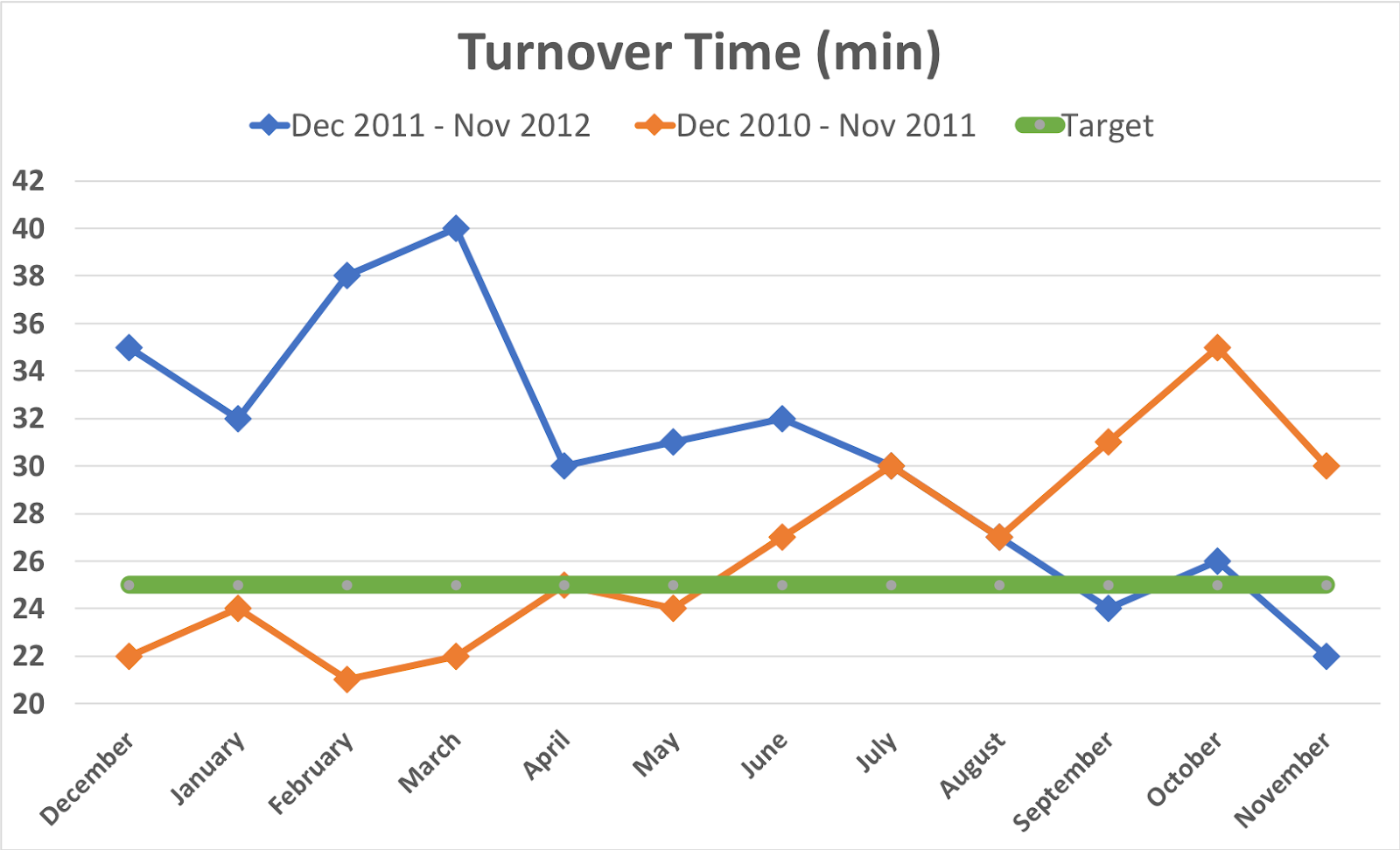
This chart is hard to read because some of the data points on the two lines overlap (in July and August). Its legend (underneath the title) confuses the reader by showing 12-month periods that don't go from January to January, as we might typically expect, and by listing the most recent year first.
Can charts like this help answer our core questions?
Question 1: Are we achieving our target or goal?
At a glance, it appears that there were more data points in 2011 below the target of 25 minutes than there were in 2012. But, performance at the end of the second year has reached the target again. There appear to be more data points above the target than below. So it seems not to be at the desired level.
Question 2: Are we improving?
I find it difficult to read the trend over time with the stacked lines. A chart like the one above is most useful if we are looking for seasonality in data, to see if there is a repeated pattern each year. It looks like the performance got worse and then improved.
It's much easier to read and interpret a Run Chart with a single line or a Process Behavior Chart. The Run Chart from that data looks like this:
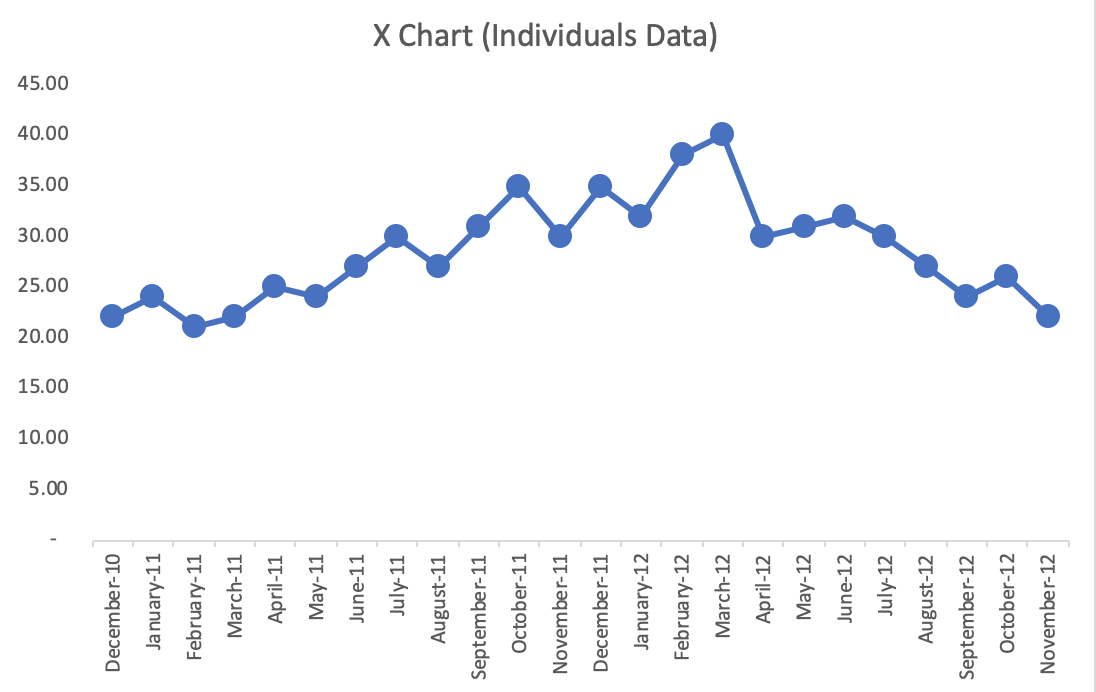
The up-and-down trend over the two years is more clear when it's plotted as a single line. This chart also has a vertical axis that starts at zero, to give a more appropriate scale to the chart and the data. Compared to the original chart, this chart more accurately shows the opportunity for improvement to potentially reduce the turnaround time to less than 20 minutes.
As Smith writes:
“One of the first rules of charts is that if you have to do any mental gymnastics to get the information you want from a chart, it's not a good chart.”
Meaningful Graphs: Converting Data into Informative Excel Charts, James M. Smith (https://amzn.to/368s8a6)
An X Chart for this data looks like this (where the MR Chart, not displayed, has no signals):

What signals do we see? First, there are 11 consecutive data points above the average (Rule 2), starting in September 2011. Secondly, we have data points above the Upper Limit (Rule 1). This is not a predictable system. We also find a few Rule 3 signals. In the MR Chart, the highest data point is below the Upper Range Limit, so it's not a signal.
We can ask, “What was different from September 2011 to August 2012?” What caused the average turnaround time to shift from an average of 25 minutes to an average of 32 minutes? Did that cause disappear in September 2012? Has performance been restored to its previous level? Was it because of a change we made to the system? Or, did we discover the apparent downward shift in the data that leads us to investigate a cause?
Since the metric does not show a predictable system, it's hard to predict what performance would be in December 2012 and other future months. We could represent two shifts in the system in this chart:
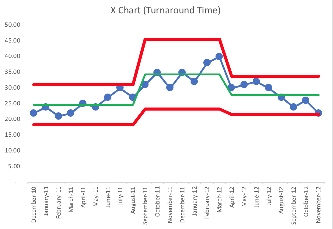
We have three different systems over time. Starting in September 2010, the average was 25. Starting in September 2011, we even see Rule 1 and Rule 2 signals, which tells us the system has changed and it then fluctuated for about a year around an average of 31. Then, starting in April 2012, we see a run of eight consecutive points below that second average (Rule 2), which suggests a shift down to an average of about 28.
We don't know what changed or got worse in that shift from the first average to the second, higher average. When the average number of falls went back down, the chart alone won't tell us if the problem or circumstances that led to the increase went away or if that problem still exists and another improvement was made that countered the effect.
When in doubt, plot the dots, and look to see what the voice of the process is saying. The process is talking to you. The question is, “Are you listening?”
OK, so that's the end of the excerpt. But I'd like to share some other thoughts and a different example of a Year-over-Year chart that can be misleading.
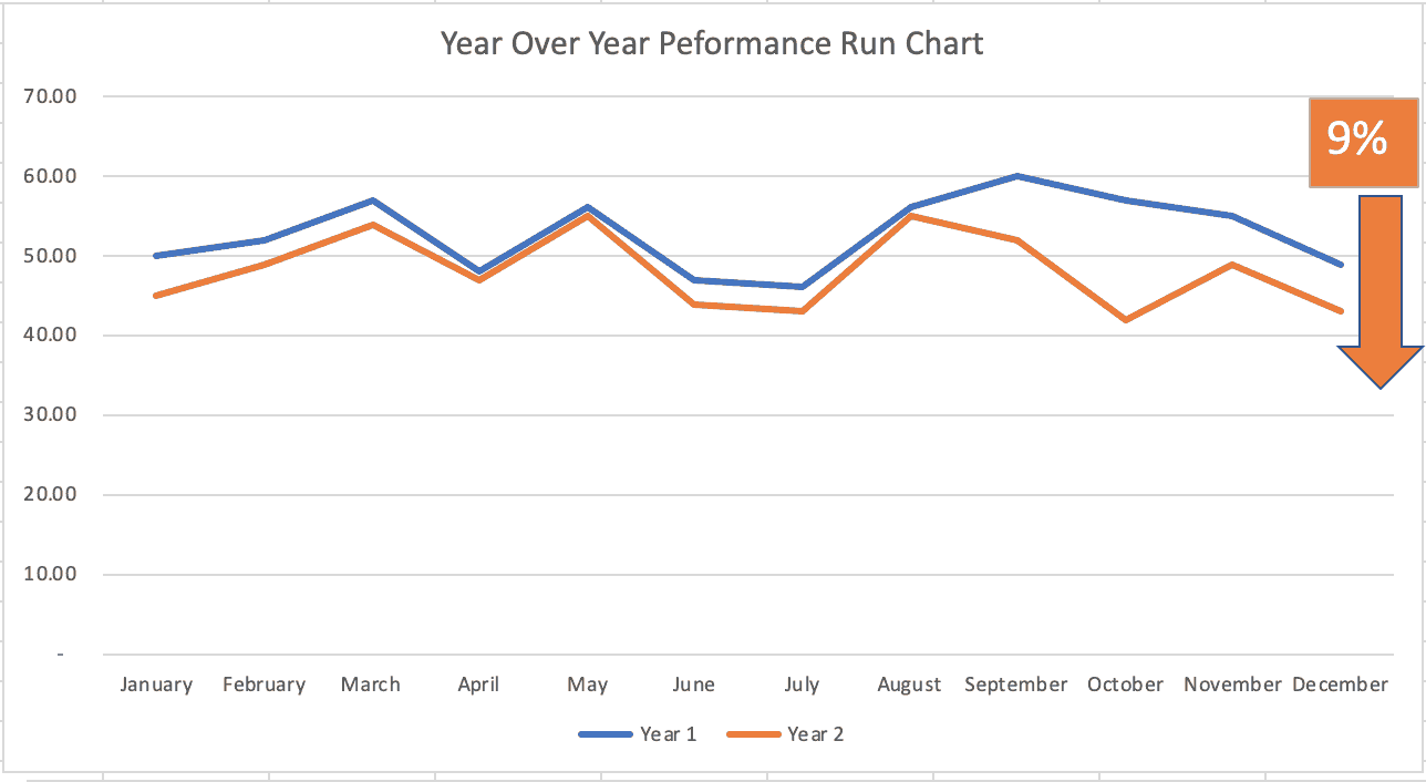
A chart like this is often shown as “evidence” of improvement. Every data point in Year 2 is below that same month in Year 1. The Year 2 average is 9% lower than the average of Year 1. Is that proof of improvement? Is it a statistically-meaningful difference? Should we expect the number to keep getting lower / better?
If we take that same data and put it in into a single Run Chart, it looks like this:
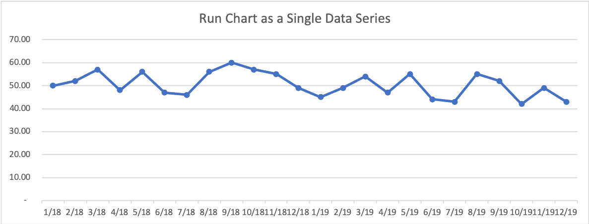
Does that now look like improvement or, perhaps, fluctuation around an average?
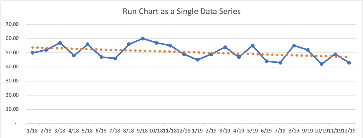
If we add a linear trend line, it might look like it's going to continue to improve.
Here is the Process Behavior Chart:
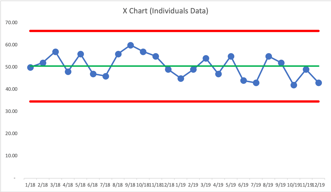
The PBC shows us there are NO signals. This is all “routine variation” around an average. All we can do is predict that future performance will continue fluctuating around the lower and upper limits.
The danger in thinking the metric has improved by 9% is that we might slack off on our improvement efforts. The linear trend line might convince us that improvement in the metric will continue automatically.
Does your organization use year-over-year charts? Have you converted those into Process Behavior Charts?
Please scroll down (or click) to post a comment. Connect with me on LinkedIn.
Let’s work together to build a culture of continuous improvement and psychological safety. If you're a leader looking to create lasting change—not just projects—I help organizations:
- Engage people at all levels in sustainable improvement
- Shift from fear of mistakes to learning from them
- Apply Lean thinking in practical, people-centered ways
Interested in coaching or a keynote talk? Let’s start a conversation.


The discussion generated by the post on LinkedIn: