


tl;dr: Red/green metrics and single-point comparisons hide important signals in your data. Time-series charts and Process Behavior Charts reveal when systems actually change–and when leaders should learn instead of overreact.
In many organizations, leaders rely on
The red/green mindset is simple, but maybe it's too simple to be helpful.
The idea is:
- Green is good
- Red is bad
Keep in mind that the red/green threshold is usually an arbitrary target. Arbitrary targets cause other problems (as Deming warned us about and I've blogged about).
I've heard some say that if a metric is green, then “there's nothing to look into.” That's actually not true. Not all “green” data points are created equal.
Let's look at an example that I use in my “Measures of Success” workshop and other settings.
In the scenario, a call center measures the “call abandonment” rate. They have a whiteboard where they write yesterday's number, and they compare it to the goal. Instead of color-coding, people sometimes use emojis. But it's the same idea. Sometimes that 5.6% would be written in green marker.
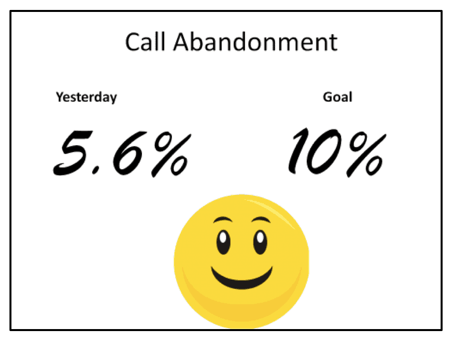
How would this visual help you manage (or, better yet, improve) that system?
I once heard a manager say, in a situation like this:
“…the results are OK because it's below our goal.”
That might be true in a sense. But what do they mean by OK? Does OK mean that no senior leader will be asking questions or getting upset about the number being in the “red” that day?
Is our performance aim really just limited to wanting to not get yelled at?
Who decided that it's “OK” if 10% of our callers get so frustrated that they hang up before being served? Is that goal
When we only see that single data point, we can only react. Again, the red/green school of management says:
- React if it's red
- Don't react if it's green
That's, again, simple but problematic. We don't know if that 5.6% number is typical. There's not much context for that number other than “it's better than our goal that day.” We can assume that the number is going to have some variation
Even a rule of thumb like “React when you see two or more red days in a row“ isn't helpful (and it's not likely to be statistically valid). The same is true if the rule is “three consecutive red numbers,” as I've heard some advice in the context of Lean management.
Sometimes, we might compare 5.6% to the day before. The number is always going to be better than or worse than the day before (it might look “the same” based on the number of decimal points we are using). That fact (up or down) isn't necessarily meaningful, but managers also often react to better or worse the same way they might react to red or green.
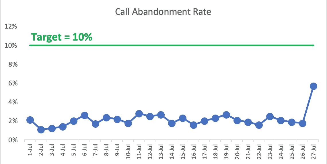
What if the 5.6% number is the best it's ever been… by a wide margin? Even a simple run chart helps us see the 5.6% is an outlier there (see the last data point):

The 5.6% is “green” but, again, not all green data points are created equal. This most recent data point seems like something to learn from.
On the flip side, what if the 5.6% day was the worst day we've seen by a wide margin? We'd want to learn from that, even if it's still green. The run chart, below, helps illustrate this:
The X Chart (as part of a full Process Behavior Chart approach) helps us confirm that the 5.6% data point is indeed a “signal”. See below. The last data point is below the calculated Lower Natural Process Limit. The last data point seems to not the product of random variation or fluctuation. I could eyeball that in a Run Chart, but I'd rather use a PBC:
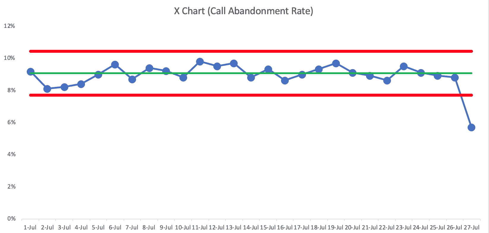
Something has changed. There is a “special cause” worth identifying.
The calculated Lower and Upper Limits in that chart are 7.7% and 10.4%. Even within the realm of routine fluctuation. that metric is almost always going to be in the green — unless something changes in the system.
And something did change… but in a good direction. The PBC tells us something changed, but it won't magically tell us what changed. We need to use our Lean mindsets and methods to go figure out what happened.
- Was it something we did or was it something that just happened to us externally?
- If it's something we did, can we understand that and make it part of the standardized work as to get that same level of performance every single day?
The X
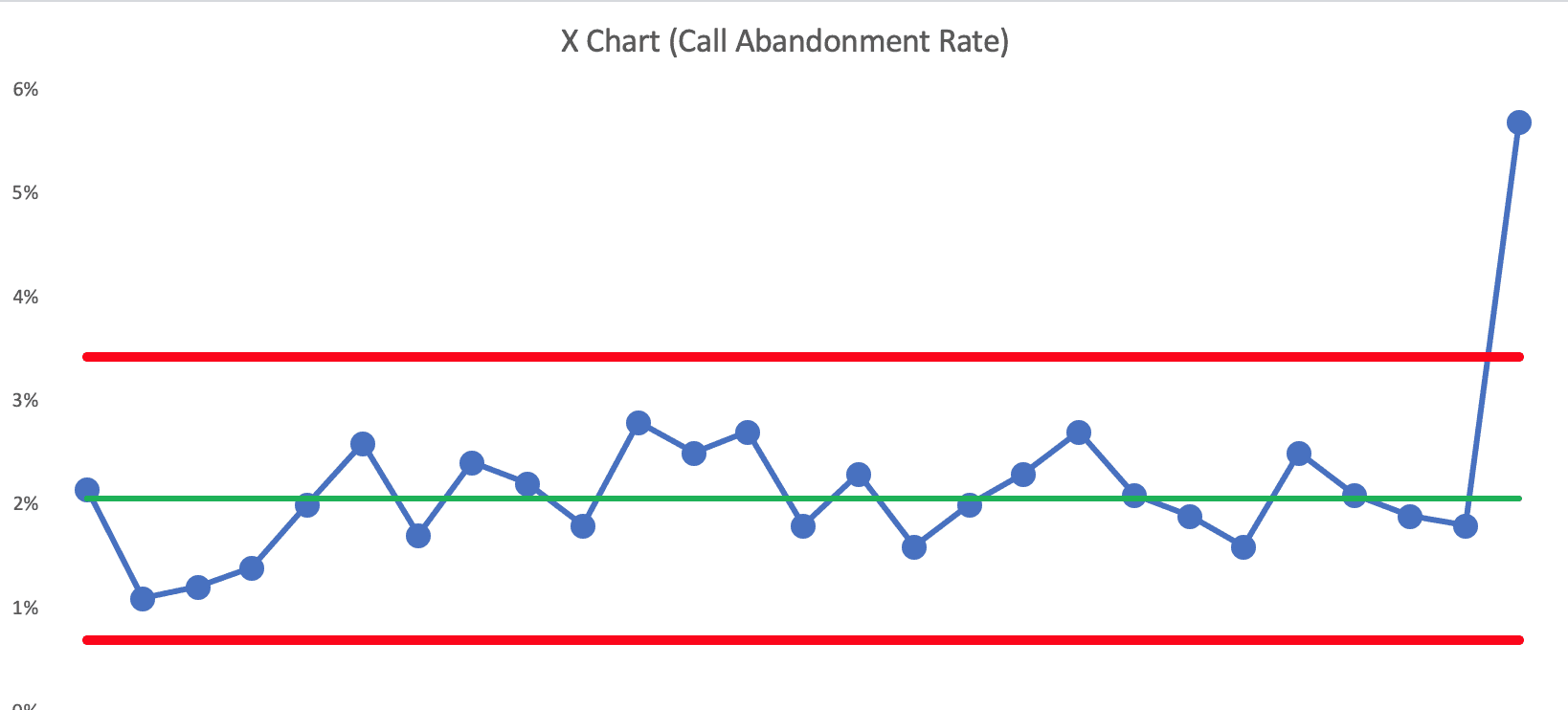
That data point is well above the Upper Natural Process Limit of 3.4%.
We should basically ask the same questions:
- Was it something we did or was it something that just happened to us externally?
- If it's something we did, can we understand that and fix the process so that performance goes back to where it had been? Can we eliminate that special cause and prevent it from happening again in the future?
If we ignored those data points because they were still “green,” then our organization is probably worse off as a result.
There's another scenario I use in my book and my workshop about a metric that's consistently in the green — we'd call this a predictable and capable process:
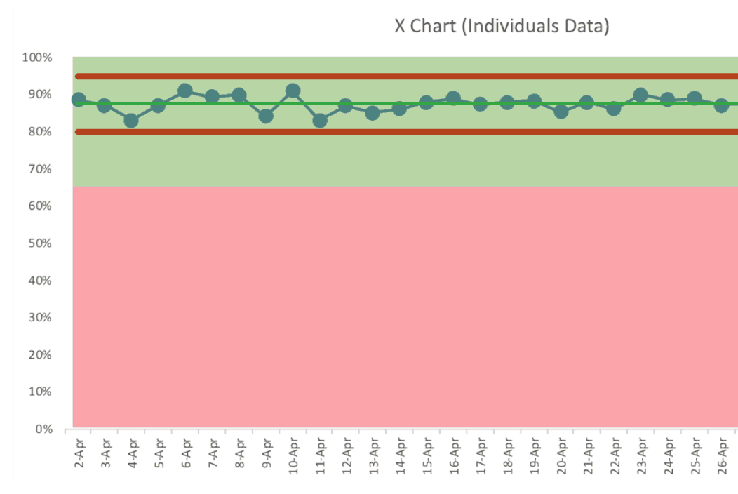
But there are two types of green data points that are worth reacting to. Nothing to see here? In the above chart… there are no signals. There's nothing worth explaining and nothing worth reacting to.
That said, we could still try to improve performance even more in systematic ways (start an A3 instead of just being reactive). We aim for continuous improvement, not just being in the green, right?
So here is that same chart with more data points:
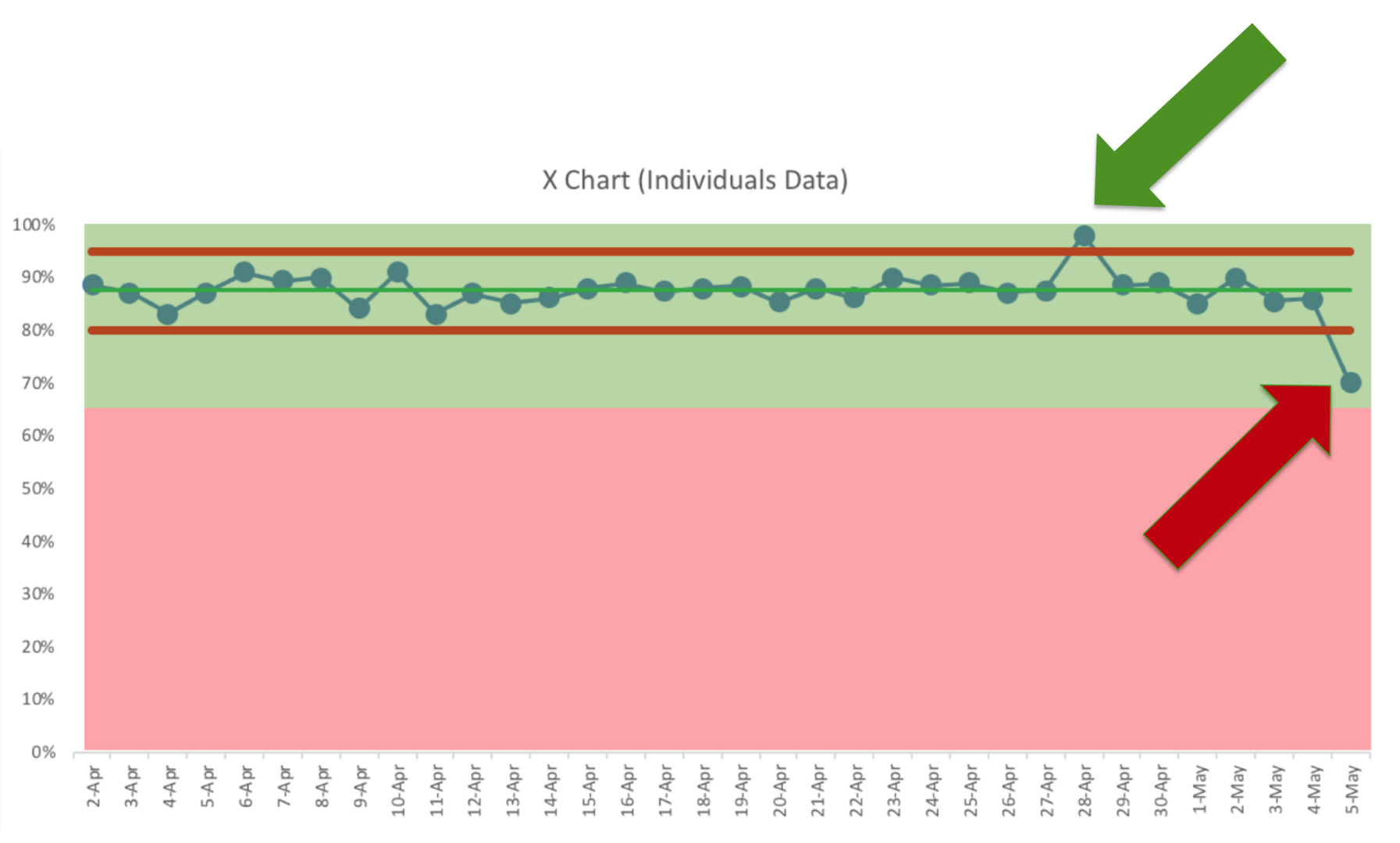
The point that's the above the Upper Limit is something to learn from. What was different that day? Why wasn't it sustained?
The point that's below the Lower Limit is also something to react to. It's still green, but it's no longer the same system. Something has changed — but what?
Is that day going to be a temporary downward blip or is that the start of a bad downward shift in performance? Again, the chart tells us when to investigate — it doesn't tell us why performance changed.
The subtitle of my book Measures of Success is “React Less, Lead Better, Improve More.” Note that the subtitle isn't “Never React.”
As Don Wheeler teaches us, we should stop reacting to noise or common cause variation in a system. We should react to signals in a metric.
A simple red / green analysis can't do that, whether it's a whiteboard or a so-called “bowling chart”
Here's a metric from an organization that shows ALL GREEN.

That “nothing to see here” analysis would lead us to miss an important shift in the metric, as evidenced by their Process Behavior Chart:
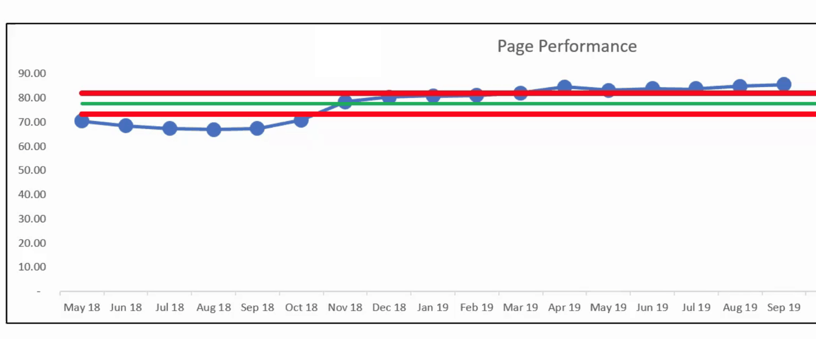
That's clearly not a single predictable system over time. There's been a shift upward. It's all green, but something has changed.
I hope this helps. I know I've got this mission to do away with overly simple red/green analysis. I hope calling it “overly simple” seems like a fact-based description and that it's not insulting…
Conclusion: Lead Beyond the Colors
Red/green metrics may seem helpful, but they often nudge us toward reactive leadership. They give us false confidence when things are “green” and trigger unnecessary action when they're “red.” That's why we need to move from color-based management to behavior-based leadership–looking at time series data, listening for signals, and learning before reacting.
Process Behavior Charts give us that lens. They help us know when something truly changed–and give us time back by reducing wasted explanations and knee-jerk responses. As I say in Measures of Success, it's not about reacting more or faster–it's about reacting smarter.
If we want to lead better and improve more, we need to look past the surface and start seeing our systems clearly.


The discussion on LinkedIn:
Great comment from Ryan McCormack:
I think you made very interesting points in this article, and provoked the thought process behind generating proper metrics. In my experience I have seen the use of these analyses to determine problem areas, but as seen with the idea of continuous improvement there is always progress to build upon. Meeting the goal should not be validation that there is no longer a need to look for ways to be more efficient, and I believe you demonstrated how various charts could assist in this realm.