


We have to be careful with text descriptions of business metrics — this is true when it's numbers in the news or performance measures in our own organization.
From my use of “Process Behavior Charts” (see my book Measures of Success), I've learned to look beyond the headline to see if the ups and downs (or all-time lows) are statistically significant or not. Thankfully, this is easy to do and it can lead to more effective decision making and better performance over time.
This headline caught my eye the other day:
“Ratings for College Football Playoff national championship hit new low“
That statement is factually correct, but is it meaningful? What conclusions should we draw if we were in charge of the CFP or ESPN, the network that airs the games?
As Donald J. Wheeler, Ph.D. says, “without context, data have no meaning.” This was just the fifth CFP game over the past years. One of them is going to be the lowest TV ratings of “all time.” One of them was the highest, too. Is this the type of metric that just fluctuates around an average — up some years, and down others?
The NBC article tries to give some context, but through a lot of text:
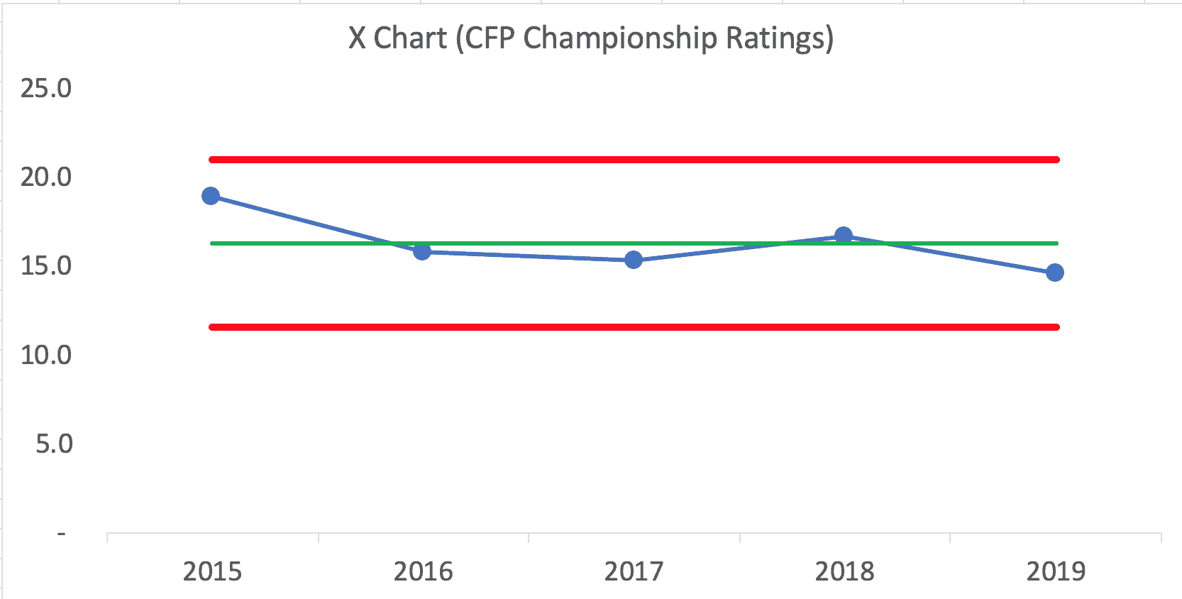
“The inaugural College Football Playoff national championship game between Ohio State and Oregon drew a Nielsen rating of 18.9 with 33.4 million viewers in 2015. The 2016 championship game between Alabama and Clemson scored a 15.8 Nielsen rating. The rematch the following season drew a 15.3 with 26.0 million viewers. Last year's national championship game between Alabama and Georgia saw an increase with a 16.7 Nielsen rating.”
Here is a Process Behavior Chart:
Here is the Excel spreadsheet that I used to create the chart. Click here for a blog post and video tutorial about creating PBCs.
What does the Process Behavior Chart show? My reading of it is that TV ratings are just fluctuating around an average (the green line). Next year's ratings might very well regress back to the mean.
Each of these data points
I also wouldn't want to spend time trying to explain each data point, but the news media will, of course, tend to do that (it fills up space in an article, but the speculation probably isn't worth the effort). Wheeler refers to this as “writing fiction” and it's a waste of time when we do this in an organization (read one of my other blog posts about this, in the context of KaiNexus).
NBC posited that ratings were lower due to causes such as:
- “Real fatigue” over “another Alabama vs. Clemson matchup”
- “The game was not particularly close”
- “Two teams from the same general region”
- “Clemson… not quite the national brand that will lure in casual viewers”
The Process Behavior Chart tells us that next year's ratings will likely fall between the calculated Natural Process Limits — between 11.54 and 20.98. Any data point outside of those limits would tell us there was some meaningful difference. That would be a good time to ask, “What changed?” If, in the future, we saw eight consecutive data points below the average, that would also be a “signal” that there was some other meaningful shift.
When we have a predictable metric like this (one that's just fluctuating), we can still try to improve the system, thereby improving the results. But, we have to do so in more systematic way than asking, “Why was that data point low?”
Now, it's not ideal to use just five data points for a Process Behavior Chart. Ideally, we'd have 15 to 20 data points to establish our baseline average and limits. With most workplace data, we can have more than one data point per year. Using five data points for the baseline means the limits are not quite as valid than they'd be after 15 years of CFP games and ratings numbers. But, using the Process Behavior Chart is still better than mindless reacting to every up and down.
As we
When I posted just the chart on LinkedIn, there was a surprising amount of discussion:
What do you think?
Please scroll down (or click) to post a comment. Connect with me on LinkedIn.
Let’s work together to build a culture of continuous improvement and psychological safety. If you're a leader looking to create lasting change—not just projects—I help organizations:
- Engage people at all levels in sustainable improvement
- Shift from fear of mistakes to learning from them
- Apply Lean thinking in practical, people-centered ways
Interested in coaching or a keynote talk? Let’s start a conversation.


Is it useful to incorporate more (related) data when you don’t have enough data that is specific to the scenario? What does Super Bowl viewership look like over time? (I expect the nielsen rating has declined as more options become availble, but it still gets a heck of a lot of viewers…) What about other “big” college bowl games? What about college bowls in general?
I have a recent defects example where the defect rate is in the neighborhood of 5-sigma — they are making noises like this is outside their customer tolerance. (I’m also worried they are reacting to noise in the system.) But with a new line they don’t have enough samples/data to know if they have an incapable process, random variation or what. I was hoping they could get additional evidence of “almost defective” parts by looking for additional indicators and hints of defects that don’t fully qualify as defective. This might give them more data to work from – from which they could draw more conclusions.
Great point. I’ve done analysis (with more data points) about TV ratings for the Oscars:
Previous blog post
This was an important question and exchange from LinkedIn, I think:
Greg McFalls
President, McFallsTech:
I replied: