Search Results for wheeler

Ratings for “The Oscars” Were Lower in 2018? Should We Ask Why or Look for Longer-Term Trends?

Downward trending line graphic over gold trophy figures representing decline in success or performance.

As I blogged about yesterday, things went well at the Oscars... or, at least, no errors were made in the announcements. But that thing that didn't go well was the TV ratings.

Two Data Points Are Not a Trend
The headlines I saw had a lot of two-data-point comparisons. Headlines sometimes gave the percentage decrease in viewers or how many million fewer viewers there were. Many talked about "record low" but if you're tracking a metric "record low" or "all-time high" doesn't mean there's a "special cause." That "record low" could still be noise in the system.

Every Metric Has Variation – What Can We Learn from NCAA Football Attendance?

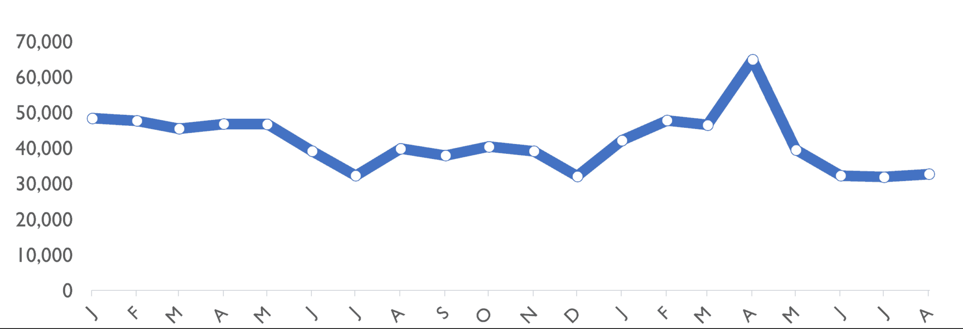
football attendance analysis chart

Last week, I saw a headline about a drop in NCAA college football attendance.

I wasn't satisfied with the two data point comparisons or other written descriptions of the metrics. I wanted to see data. SHOW ME THE DATA, JERRY! (with apologies to "Jerry Maguire"). I wanted to see a chart. So, I found the data on to NCAA website and created "process behavior charts" that tell you much more about the data than text numbers ever could.

“Why?” Not “Who?” Fixing Systems, Not Blaming Workers

Today's post is the first contribution from Shrikant Kalegaonkar, a frequent commenter here on the blog, LinkedIn, and Twitter. We had a chance to meet in Austin last year and I appreciate his shared interests in Lean, statistical process control (ala Deming and Wheeler), and quality improvement. He initiated this piece and I ended up collaborating with him on it. I hope it sparks some healthy discussion...

Two Data Points Don’t Make a Trend: Why Headlines Mislead Us

Gun pointed downward, hidden behind a tape measure, with a large grey downward arrow overlay.

When looking at data, whether it's the number of homicides in San Antonio or some of our workplace metrics, it's tempting to overreact to a "headline" that says a measure went down in 2017 compared to 2016. But do two data points really help us understand what the real trend is? This blog post explores an approach we can use to make better decisions about our data.

Highlights from a Great Book: “The Leader’s Handbook”

"If we stopped wasting people’s time, what would they do with it?"

I've been going through the book by the late Peter Scholtes: The Leader's Handbook: Making Things Happen, Getting Things Done. His work builds upon the legendary W. Edwards Deming and Russell Ackoff, among others.

I often quote Scholtes (something also attributed to Peter Senge and others) as saying:

"People don't resist change, they resist being changed."
I think that's very insightful and that thought has led me to study change management, "motivational interviewing" and other related topics. It turns out that having the right answer and pushing it on others isn't the best strategy for effecting sustainable change. I had to learn those lessons the hard way and I'm still learning.

Don’t Turn Your Performance Metrics into Success Theater

TL;DR: Cherry-picked metrics can make performance look better without actually improving it. Process Behavior Charts help leaders distinguish real improvement from noise, stop overreacting, and focus on improving the system instead of explaining fluctuations. One of the phrases and concepts…

Not All Improvement Ideas Require “Projects”

In this post, I share some thoughts and build upon one of the presentations at last week's Lean Healthcare Transformation Summit, where, Tim Pehrson, a regional CEO for Intermountain Healthcare, talked about how they piloted a continuous improvement process in one region... and how they're now spreading it throughout the system. This leads to confusion, in online discussion, about terms like projects, suggestions, ideas, and such...