


It's surprising to see how often this awful UI / UX design is used on the web. A website (Forbes) wanted me to enter my date of birth by clicking a left arrow 601 times (I turned 50 last month), as shown in the image below.
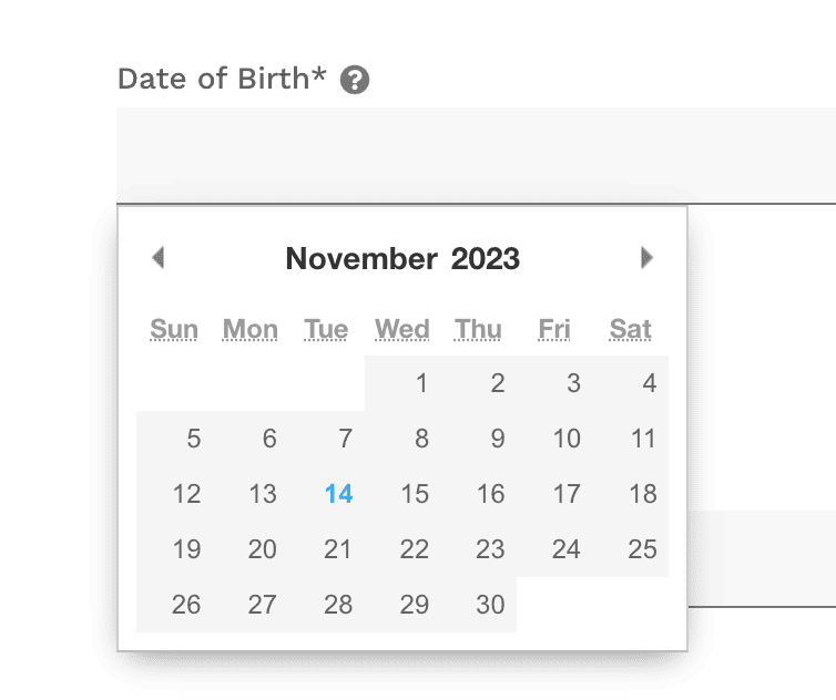
There's no way to just type in 10/XX/1973. That would probably be the easiest way — 10 keystrokes. That would certainly have been faster.
There are some websites that have dropdowns for Month, Day, and Year. At least with those, you can usually click on the month and type “10,” click the date and type “XX,” and click the year and type “1973.”
Even the version of the Forbes interface where I'd have to click the Year's left arrow 50 times would annoying enough.
So much wasted motion with all of that clicking.
Just let us type. And feel free to validate the data entry if it doesn't seem like the form of a birth date.
So, Forbes, I won't be filling out this form.
Understanding UI/UX: The Foundation of Web Interactions
After diving into the specifics of the birthdate entry issue, it's crucial to understand the core principles of User Interface (UI) and User Experience (UX) design. These two elements are fundamental in crafting any digital product, especially websites.
I think there are connections to Lean in terms of:
- Customer focus
- Reducing wasted motion
- Showing respect for people, in this case the user of the website.
Hopefully, Forbes can also utilize some continuous improvement to make that form easier to use.
User Interface (UI): UI focuses on the visual aspects of a website or application: the buttons, text, images, sliders, entry fields, and other items a user interacts with. Good UI is not just about aesthetics; it's about creating intuitive, clear, and easy-to-navigate interfaces. This means that users should be able to understand how to use a website without much thought or effort.
User Experience (UX): UX, on the other hand, is all about the overall experience a user has when interacting with a website or application. It's not just what they see, but how they feel while navigating. UX design considers the ease of use, accessibility, and efficiency of the interface. A good UX design makes users' tasks simpler and more enjoyable, leading to higher satisfaction and better overall engagement with the product.
The Interplay of UI and UX: While UI is the toolset and UX is the end result, they are deeply interconnected. An attractive interface (UI) that's hard to navigate or understand leads to a poor user experience (UX). Conversely, a site might be easy to use but unappealing visually, which can also detract from the overall experience.
Importance of Efficiency and User-friendliness: In the context of web interfaces, efficiency means enabling users to accomplish their goals with minimal effort and time. This is where UI/UX design becomes crucial. For instance, a well-designed date entry field should allow users to input their birthdate quickly and without confusion. This not only saves time but also reduces frustration, enhancing the overall experience of using the site.
Current Trends in UI/UX: The modern web is increasingly user-centric. This means designs are focused on meeting user needs as seamlessly as possible. Trends like minimalistic design, mobile-first approaches, and voice user interfaces are all part of this shift towards more intuitive and user-friendly web experiences.
By understanding these principles, we can better appreciate the significance of simple yet often overlooked elements like a birthdate entry field on a website. It's not just a minor detail; it's a reflection of how well a site adheres to the core principles of good UI and UX design.
If you have UI/UX suggestions for my blog here, let me know!
Please scroll down (or click) to post a comment. Connect with me on LinkedIn.
Let’s work together to build a culture of continuous improvement and psychological safety. If you're a leader looking to create lasting change—not just projects—I help organizations:
- Engage people at all levels in sustainable improvement
- Shift from fear of mistakes to learning from them
- Apply Lean thinking in practical, people-centered ways
Interested in coaching or a keynote talk? Let’s start a conversation.


I am with you on this one. One of my peeves is old manual forms where the spacing to enter the information is too small. For example, a space for a phone number that is about the length of the word information. How many digits do phone numbers have? Or to fill out CC info with line spacing about 3/16 of an inch. Who has handwriting that is 6 pt font? I think that people who create forms- either digital or manual never actually tried to use them. And FYI I would have had to click 182 more times than you!
Those “old manual forms” live on — in many doctor’s offices and clinics!
It’s like the forms were created by people who never tested filling them out, exactly.