


Thanks to the Measures of Success reader who reached out with a question about their hospital's display of data in units and departments.
They shared the current state method for displaying data and asked me to compare it to a Process Behavior Chart. As I write in Chapter 9, it's easier to create a technically-correct PBC than it is to gain acceptance of a new method.
In one unit, a chart like this was displayed (I've re-drawn it to help anonymize the data). It's a metric that measures elapsed time in a process and lower is better.
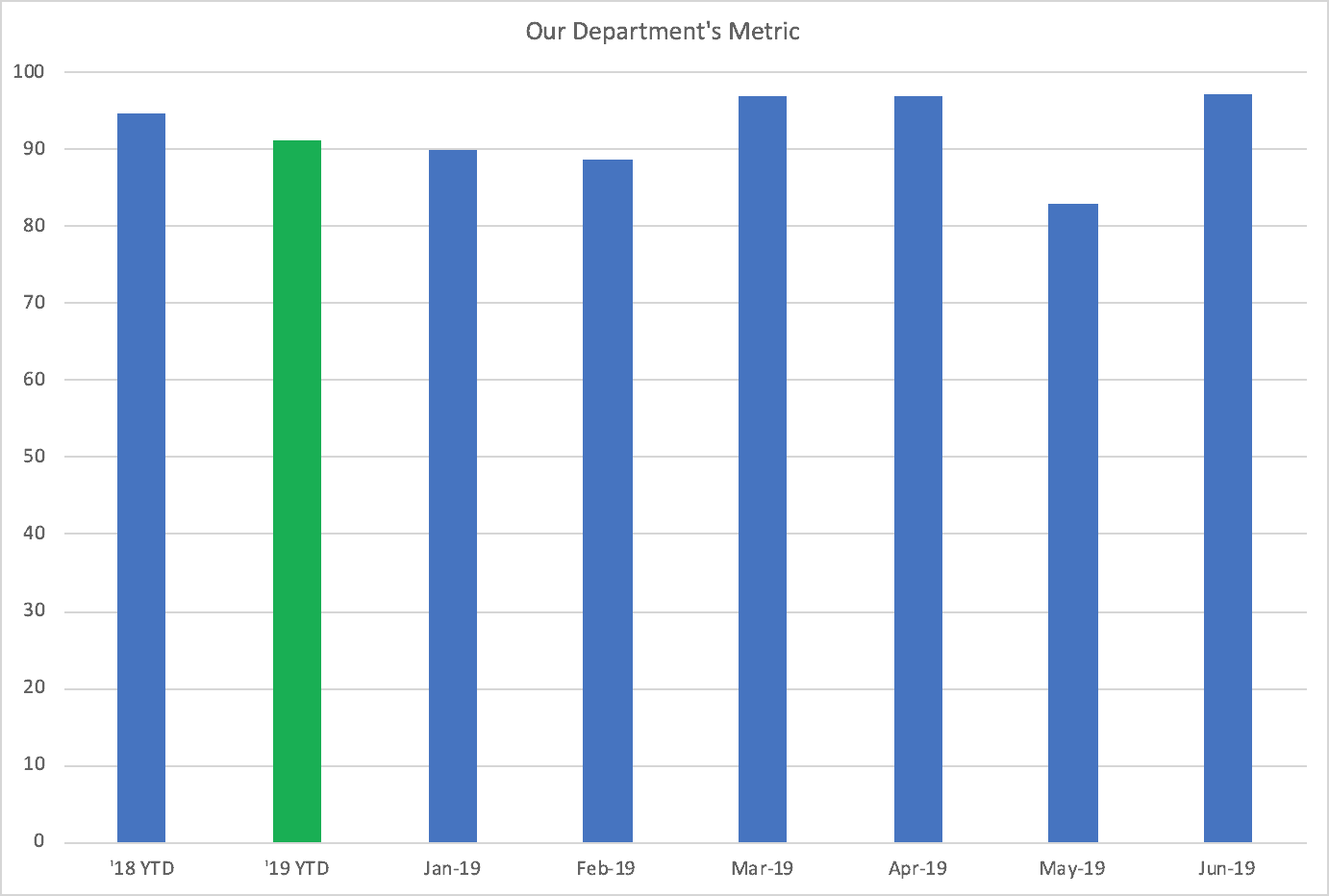
One thing that throws me off on this type of chart is that it's not eight months. The first two data points are “YTD '18” and “YTD '19.” The second column is colored green because the number is better (lower) than last year.
Personally, I'd rather see:
- A line chart instead of a column chart (the eye is drawn to the middle of the column, when the data is actually the top edge)
- If we had 18 months or more, we don't need the simple comparison between this year and last
Many organizations would look and say, “Well the metric is better than last year, so we're improving… there's nothing else to see or do.”
If that's the case, do the monthly data points add anything? Why not just display a simple “before and after” if that's what decisions about improvement are going to be made off of.
In this scenario, there are only six data points. But here is what a Process Behavior Chart looks like with just those six (it's better to have more data, but this is still valid, statistically):
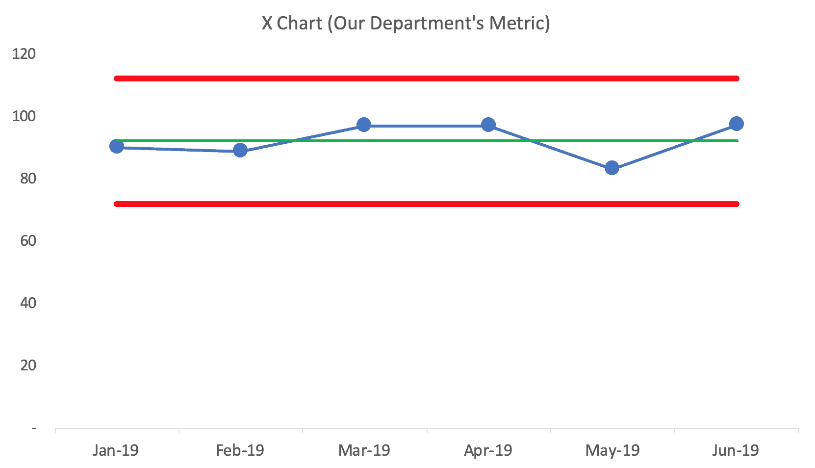
The chart shows that the department is just fluctuating around a stable average so far in 2019. That average is 92.07 — and last year's number was 94.6. Yes, 92.07 is lower than 94.6, but is that difference meaningful? Is there really evidence of improvement or just continued fluctuation?
The department team could work on improvement through an A3 methodology (something the reader says their department uses). This chart doesn't show the goal or target. The time still might decide to work on the metric using an A3 to try to get the time down. Sometimes red/green signifies “comparison to last year” and sometimes it's “comparison to target.”
A Second Case
The reader sent a second case that thankfully included monthly data points from 2018. That's super useful.
Here is the column chart, where the red column means the metric is “worse” than last year. I put “worse” in quotes because a two-data-point comparison is not convincing.
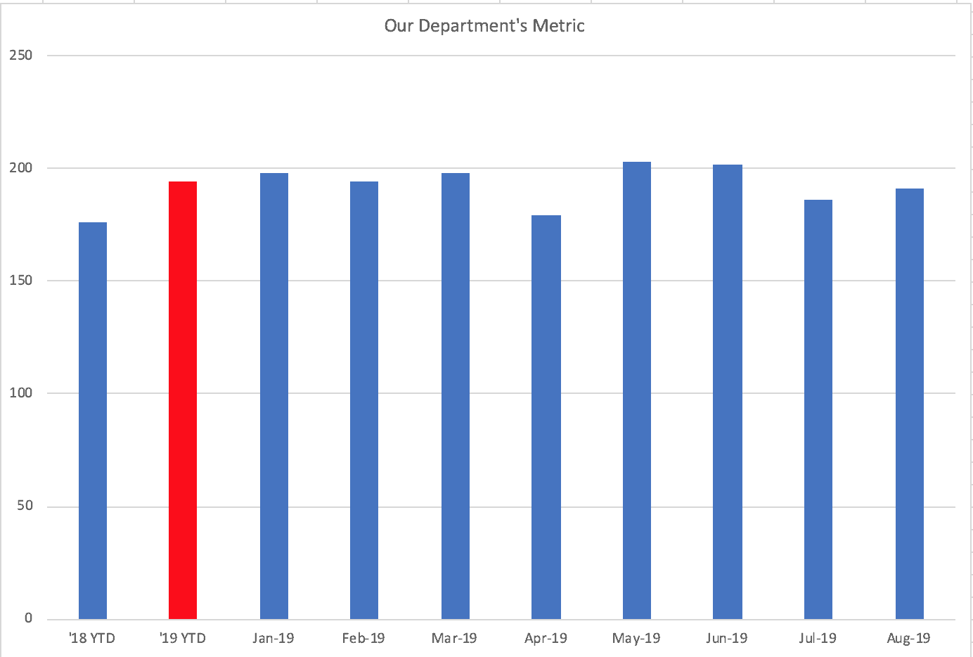
Since the metric is “red” compared to last year, they are actively working on an improvement A3. The reader said the team is good about not reacting to every up and down in the metric — so that's good. But if they assume that things got worse in 2019, that might throw off their investigation. Back to this in a minute.
One quick comment… these column charts tend to be “reset” at the start of the year. I'd expect here that 2020 would start with a blank chart, other than the “YTD '19” column. Why start with a blank slate when 2020 is a continuation of the system that we ended 2019 with? I've written about this before.
Back to the second case, a Process Behavior Chart with monthly data points going back to the start of 2018 is super compelling (showing both the X Chart and the MR Chart):
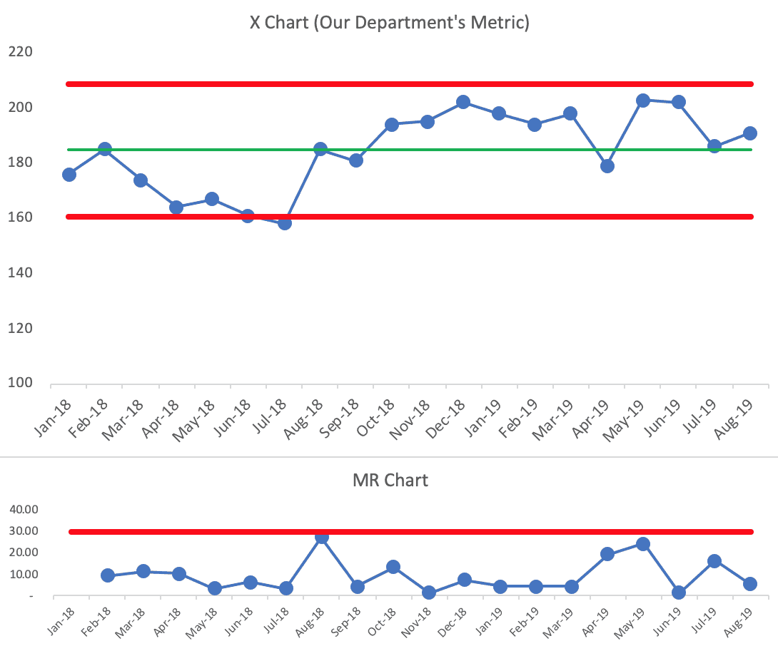
You can see there are some signals in the chart (see below). It's not simply fluctuating around a stable average. It looks like performance shifted up in August 2018? Or there had been a temporary improvement from April to July 2018 that wasn't sustained.
It looks like performance is just fluctuating from August 2018. It doesn't look like “something changed in 2019.”
As always, a PBC will tell us that something has changed. It might even show when it changed. But the chart won't magically tell us what exactly has changed.
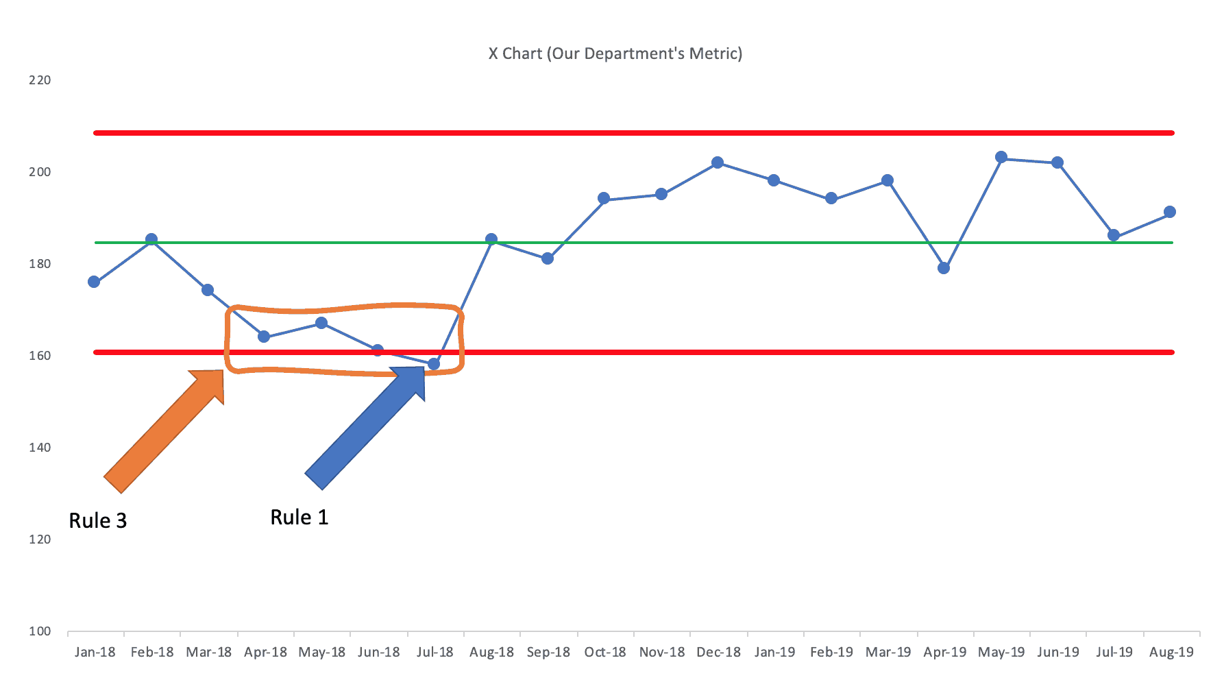
Remember our three rules for finding a signal:
We later see six consecutive points above the average. Not a signal, but more evidence that this metric isn't just fluctuating.
The Process Behavior Chart view points us back to August 2018. It might be too late to investigate “what happened” but maybe somebody knows or remembers.
If we calculate limits for time frames before and after August 2018, it confirms what we see visually in the chart above… it's just fluctuating.
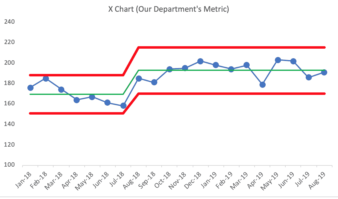
A PBC with 18 data points shows us so much more than six data points with a comparison to last year's average.
I wish the reader luck in convincing leaders to take a look at a different way of tracking and visualizing metrics. What do you think?
Please scroll down (or click) to post a comment. Connect with me on LinkedIn.
Let’s work together to build a culture of continuous improvement and psychological safety. If you're a leader looking to create lasting change—not just projects—I help organizations:
- Engage people at all levels in sustainable improvement
- Shift from fear of mistakes to learning from them
- Apply Lean thinking in practical, people-centered ways
Interested in coaching or a keynote talk? Let’s start a conversation.


I, for one, am guilty of using the sort of column based charts discussed in the article,. I definition like the process behavior charts and will be a proponent moving forward. I think I was in the mind-trap that process control charts were for the factory floor and that the office needed something different. That was clearly false thinking. What goes on in the office processes could be viewed in the same manner as the shop.
Thanks for your comment, Stephen!