


Each time I teach my “Measures of Success” workshop for Catalysis at one of their events, they give me feedback scores from the attendees.
I try to practice what I preach — around reflection, the voice of the customer, continuous improvement, and the use of metrics to better understand if I'm really improving or not.
I do read all of the free-form comments, whether they are positive or include constructive criticism.
But, the “customer satisfaction” results gets summarized in some questions that Catalysis consistently asks. Consistent questions allow for better comparisons from class to class. When I run my own independent workshops, I've been using a consistent form… but it's different than the one from Catalysis. I sort of regret that, but maybe the Catalysis healthcare audience is a different “system” than the other workshops that are done for a broader, less-industry-specific audience.
The response rate is usually about 75% since it's a paper form that's available right in the moment. But, it's a weakness in ANY customer (or patient) satisfaction metric when you're really measuring your success with “those who chose to fill out the survey” (which is not the same as all customers).
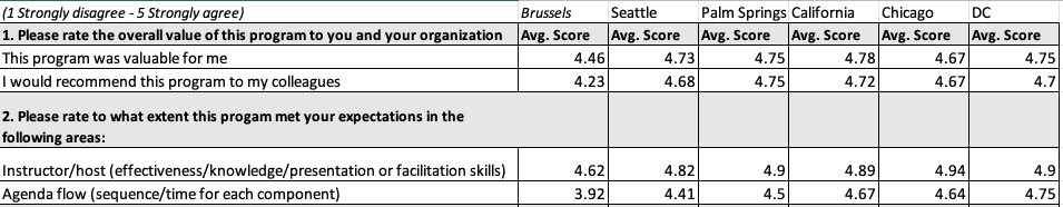
A table of numbers shows the results and some context (5 is best):
Sometimes, the metrics look like this, showing each up (green) and down (red) in the numbers:
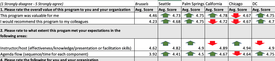
Some organizations do that with their metrics (adding the color-coded arrows)… “for managers who cannot read numbers,” Don Wheeler would say with a smile.
Paraphrasing Homer Simpson, “Metric goes up, metric goes down, metric goes up, metric goes down.” :-)
The list of numbers (with or without arrows) is not as useful as “run charts” for each metric. You can start to see if there are trends:
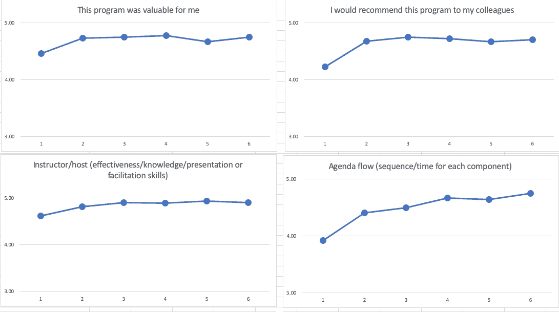
Those run charts tell me that the first class was the “worst” — noting that I scaled the Y-axis from 3 to 5, instead of 1 to 5. It looks like I improved a lot from the first to the second — also maybe not surprising, either. But, from the 2nd workshop through the 6th, it looks like performance is fluctuating or maybe getting a bit better
Even better are four “Process Behavior Charts.”
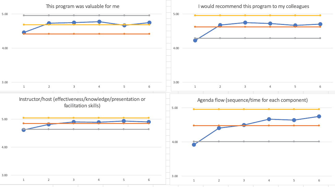
The grey line is the “lower limit,” the red line is the average, and the yellow line is the “upper limit.” Read more about how these are calculated.
The Process Behavior Charts confirm that the first workshop wasn't as good as the rest (that's not surprising, right?).
That first data point is right at or just below the calculated Lower Natural Process Limit. I used all six of my data points here to calculate the limits, which is OK per Don Wheeler, and using just six data points is, to quote the mini-series “Chernobyl,” — not great… not terrible.
The grey line is the “lower limit,” the red line is the average, and the yellow line is the “upper limit.” Learn more about how to do these calculations — or check out my book.
The last five data points show either fluctuation or, in the case of the “agenda/flow” question, I've gotten better more often than not, but there's not really a signal of any significant change.
If I remove the first data point from the calculations (since that had significantly different results), the limits and the last five workshop data points look like this:
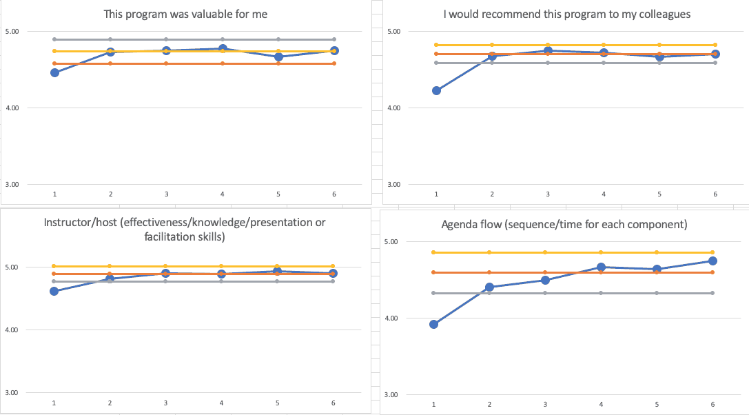
The PBCs tell basically the same story… I improved and am not fluctuating around averages. The averages are pretty high and the variation is pretty tight.
So, when I look at feedback scores, I've learned to NOT overreact to every up and down. As with most every metric, sometimes things just fluctuate. I can always try to get better, but I might not be able to significantly move the need on the metrics. I do try to practice what I preach.
Please scroll down (or click) to post a comment. Connect with me on LinkedIn.
Let’s work together to build a culture of continuous improvement and psychological safety. If you're a leader looking to create lasting change—not just projects—I help organizations:
- Engage people at all levels in sustainable improvement
- Shift from fear of mistakes to learning from them
- Apply Lean thinking in practical, people-centered ways
Interested in coaching or a keynote talk? Let’s start a conversation.


")


LinkedIn discussion:
On the question of “are four (or six) data points sufficient?”
Here is an excerpt from Wheeler’s textbook “Making Sense of Data.” He says four data points “are certainly a minimal amount of data to use in computing limits” but these “soft limits” are “sufficient” and we do not need “perfect limits” for this method to help us detect a change to the system.
Click to view larger
Further to the question “are four (or six) data points sufficient?”, what do we learn if we do not make a chart based on just a few data? We might wish we had more data, but better to create the chart and learn something. If/when we get more data we can always update the limits.
Imperfect limits, or “soft” limits, with the data interpreted in context, is likely to be better than no limits (so no PBC)…
Agreed. Well said.