


Let's say you have a metric where a lower number is better, such as:
- manufacturing product defects
- the number of patients who get an infection
- customer complaints
- the number of SaaS software customers who don't renew
I see a lot of cases where a company shows just a few data points. I saw some charts recently that showed four data points as a “run chart.” It's better to see a graph than a table of numbers, but is four data points enough to prove anything?
Here's a table of numbers, below. The last month is better than the first. Are we improving?
| Month 1 | 13 |
| Month 2 | 9 |
| Month 3 | 12 |
| Month 4 | 7 |
Here's a short run chart… what does this imply visually?
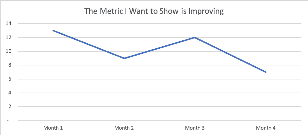
Wow, that's almost 50% improvement from the first point to the fourth. If I'm a consultant, I'd say this proves my effectiveness. If I were running an internal Lean Six Sigma project, I might show this as proof that my project was a success and that you should certify me for whatever “Belt” color I'm being trained for.
All right, end of story… good talk.
But wait…
What happens if we pull data from the previous three months to show more historical context?
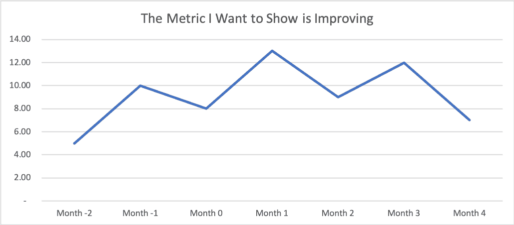
Uh oh. the metric used to be lower… (a value of 5 in “Month -2”) and then it went up… and then it went down. Did our consulting work or our Lean Sigma project really have the effect that we wanted? Is the “voice of the process” telling the story that we hoped it would tell?
Is this metric just fluctuating around an average? Maybe our intervention wasn't really an improvement after all? Maybe it had no effect? Or it had no significant effect?
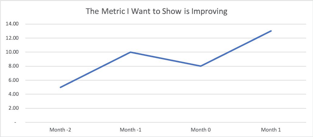
If I wanted to emphasize something like, “Look at the huge problem we were facing” as a way of setting up our later “success,” we might choose to show these four data points… look the metric is clearly getting worse from these four data points, right?
I think that when we see the “four data points” (or some limited comparison of data), it's more often or not a case where people are intentionally manipulating data (“lies, damned lies, and charts”). We just have to be careful that we don't draw bad conclusions from limited data (data that is lacking context).
Each of these sets of four data points are taken from a more complete data set of 24 points from when I ran and facilitated my version of the famed Deming Red Bead Experiment during a team learning event at the offices of the firm Value Capture in Pittsburgh on Wednesday (I sometimes do consulting subcontract work with them and their healthcare clients).
As you might know, one punch line of the Red Bead Experiment (aka the Red Bead Game) is that the same consistent “process” will produce variable results. Here is a photo from a workshop I ran last year in Belgium where we played the game:

In the game, different workers take turns dipping a paddle with 50 holes into the bead box. The red beads are considered defects in the process. Clearly, people are not being set up to succeed here.
Here is the table of numbers or “scorecard” from the different draws of beads from the other day:
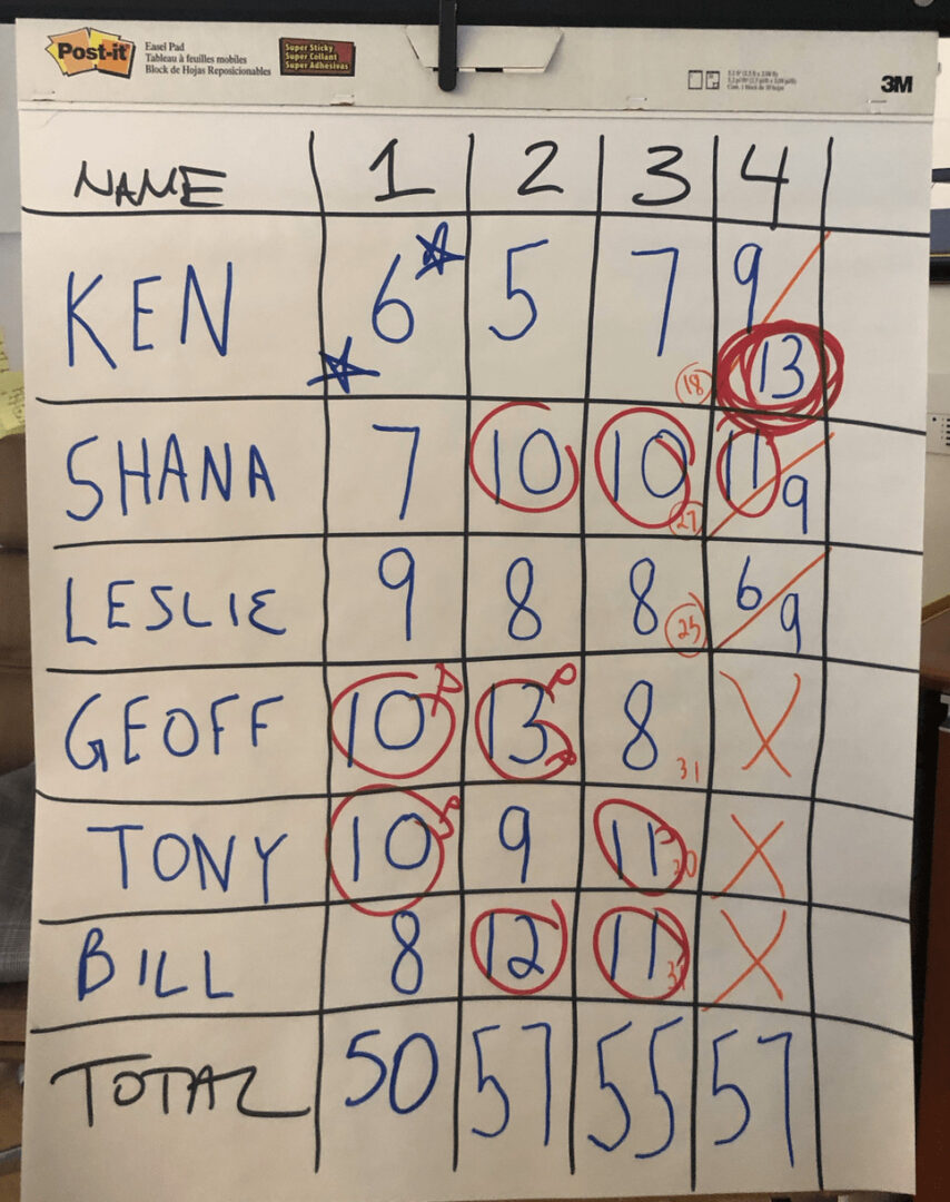
At the end of the game, I circled the numbers that were worse than average. In the role playing of the game, I was browbeating those who drew a big number, rewarded and praised those who drew fewer “defect” beads (red beads)… it's all a sham, since each number is basically a random result of the system.
Every system produces the results that it's designed to produce. That's true, as is the idea that every process and metric will have variation… it's just a question of how much variation is routinely occuring.
Each of those short run charts that I showed earlier in the post come from a subset of the Red Bead data. If we plot all 24 data points as a run chart, we see this:
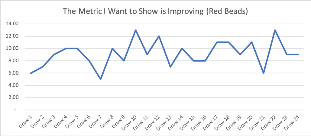
Is that a metric that's improving? No… I think it's more clearly fluctuating around an average over time.
Here's a case where we have to be careful with “linear trend lines” (something that's easy to add with two clicks in Excel). Look what happens (see the dashed blue line):
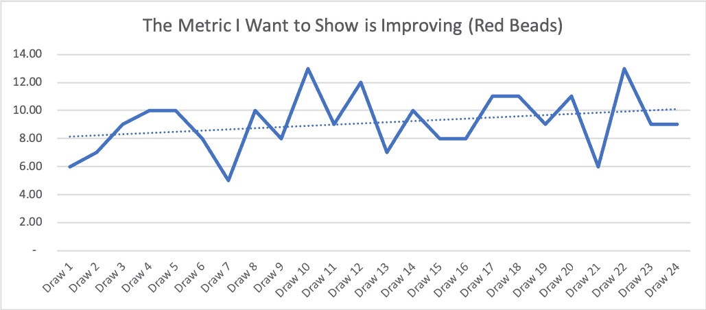
The linear trend line implies things are getting worse. But if we keep playing the Red Bead Game, the number of red beads won't trend upward like that. The linear trend line is influenced too heavily by the fact that the first few draws in this running of the game on Wednesday happened to be below average.
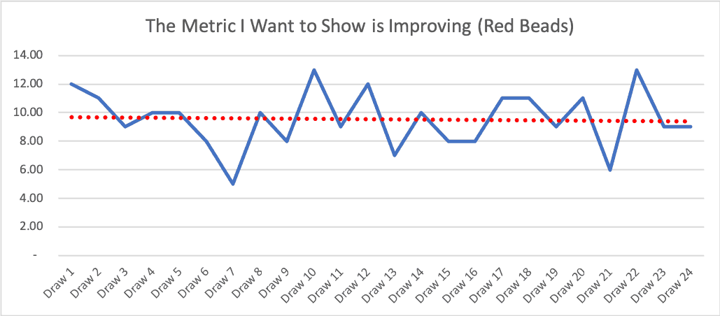
Let's say the first few draws had been slightly above average (which is quite possible), then we'd see a downward-sloping linear trend line, which would be equally misleading:
What's less misleading is a “Process Behavior Chart,” as I explain in my book Measures of Success. Also see this explanation of the method I created for KaiNexus.
Here is a PBC for Wednesday's running of the beads:
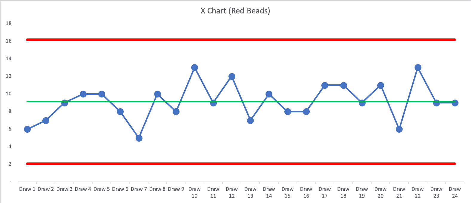
The PBC shows a metric that's “predictable.” That's not surprising since the Red Bead process is predictable. Predictable doesn't mean “zero variation.” In this running of the game, the average number of red beads was 9.125. We calculated the lower and upper “natural process limits” to be 2.07 and 16.18.
The PBC tells us that if we keep drawing beads, we'll expect between 3 and 16. When I offered an incentive program reward for anybody who drew three red beads or fewer, that's possible… but the incentive can't influence results (unless somebody cheats in the game).
Each of my earlier four-data-point run charts can be found in the PBC. “Month 1” in the charts is “Draw 10” from the middle of the game. Any four data points might give the appearance of improvement, when it's really just part of the longer-term fluctuation. The appearance of improvement might lead to flawed cause-and-effect analysis, which hampers our improvement efforts.
What's my conclusion? Using just a few data points can be misleading, even if we draw a run chart. We need to be careful that we don't allow ourselves to be fooled by a few data points (or a linear trend line). We should also be ethical in not misleading others with data. When in doubt, look at more data and more context. Don't just show one data point from before your change, with three data points after the change. It's really hard to draw good conclusions from four data points… when in doubt, “plot the dots” and “show me the data.”
Please scroll down (or click) to post a comment. Connect with me on LinkedIn.
Let’s work together to build a culture of continuous improvement and psychological safety. If you're a leader looking to create lasting change—not just projects—I help organizations:
- Engage people at all levels in sustainable improvement
- Shift from fear of mistakes to learning from them
- Apply Lean thinking in practical, people-centered ways
Interested in coaching or a keynote talk? Let’s start a conversation.


