


Today, I'm teaching my “Better Metrics” workshop for Catalysis in Long Beach. I'll also be teaching this as a pre-Summit workshop at the Lean Healthcare Transformation Summit in Chicago this June. And, you can bring it to your organization – it's fun and useful. But, the workshop challenges “the way we've always done metrics.”
Once you learn how to “understand variation” (h/t to Don Wheeler), you don't look at data (or news reports) the same.
Last week, I saw a headline about a drop in NCAA college football attendance.
I wasn't satisfied with the two data point comparisons or other written descriptions of the metrics. I wanted to see data. SHOW ME THE DATA, JERRY! (with apologies to “Jerry Maguire”). I wanted to see a chart. So, I found the data on to NCAA website and created “process behavior charts” that tell you much more about the data than text numbers ever could.
I wrote about it on LinkedIn (and take a deeper dive, in some ways, here in this post):
Bad, Better, and Best Ways to Look at NCAA Football Attendance Numbers
As I summarized:
- Bad: Two data point comparisons and lists of numbers
- Better: A “run chart” that visualizes the data
- Best: A “process behavior chart” that helps us make better decisions
How do our organizations treat metrics?
The Bad
Does your organization show tables of numbers with comparisons to last year or last month?
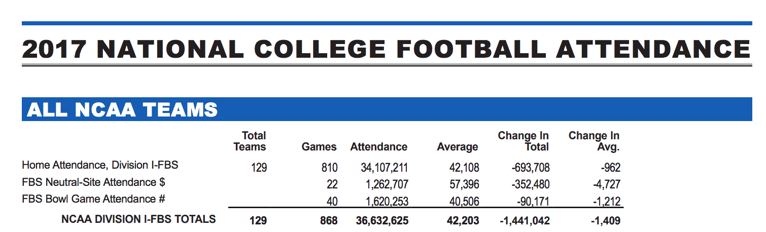
Do you just put numbers in a grid or a “bowling chart?”

Do either of these approaches really help you see trends?
Better
Better is making a run chart – plot the dots!
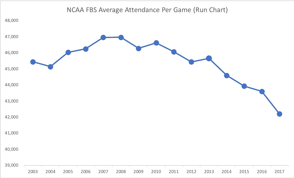
Now, that's starting to really tell you something about attendance numbers (although the impact is less pronounced if the Y-axis goes from zero to 50,000.
Best
I still think the “process behavior chart” (PBC) is the gold standard for looking at metrics and data.
Here is the PBC for FBS attendance:
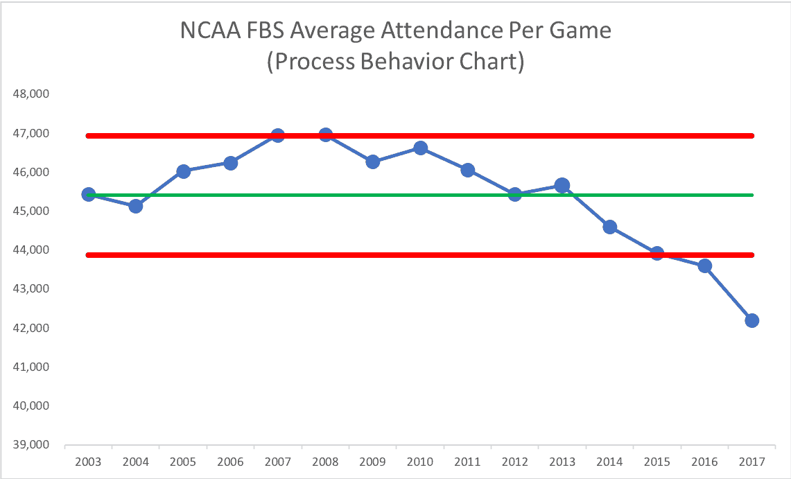
As I describe more in the LinkedIn piece, it's not what we'd call a stable and predictable system.
What about Big Ten attendance at the conference level?
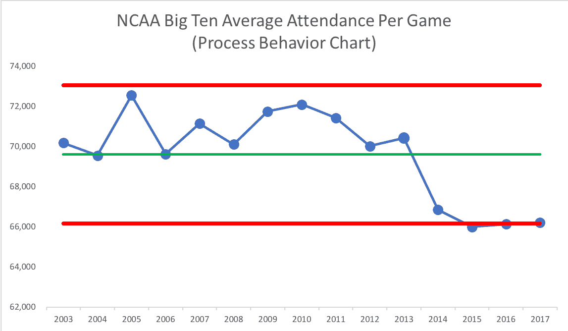
As I mentioned in a comment on the article, there's a clear and understandable special cause for that drop (the addition of Rutgers and Maryland to the conference).
Northwestern
And what about my alma mater, Northwestern?
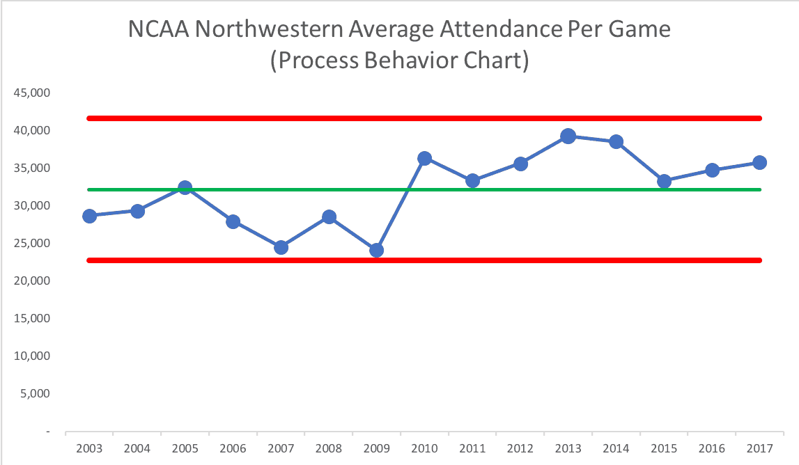
Instead of asking “why did attendance go up in 2013” (which could be described as “the highest in recent history,” this looks like two systems with two averages and sets of limits over time:
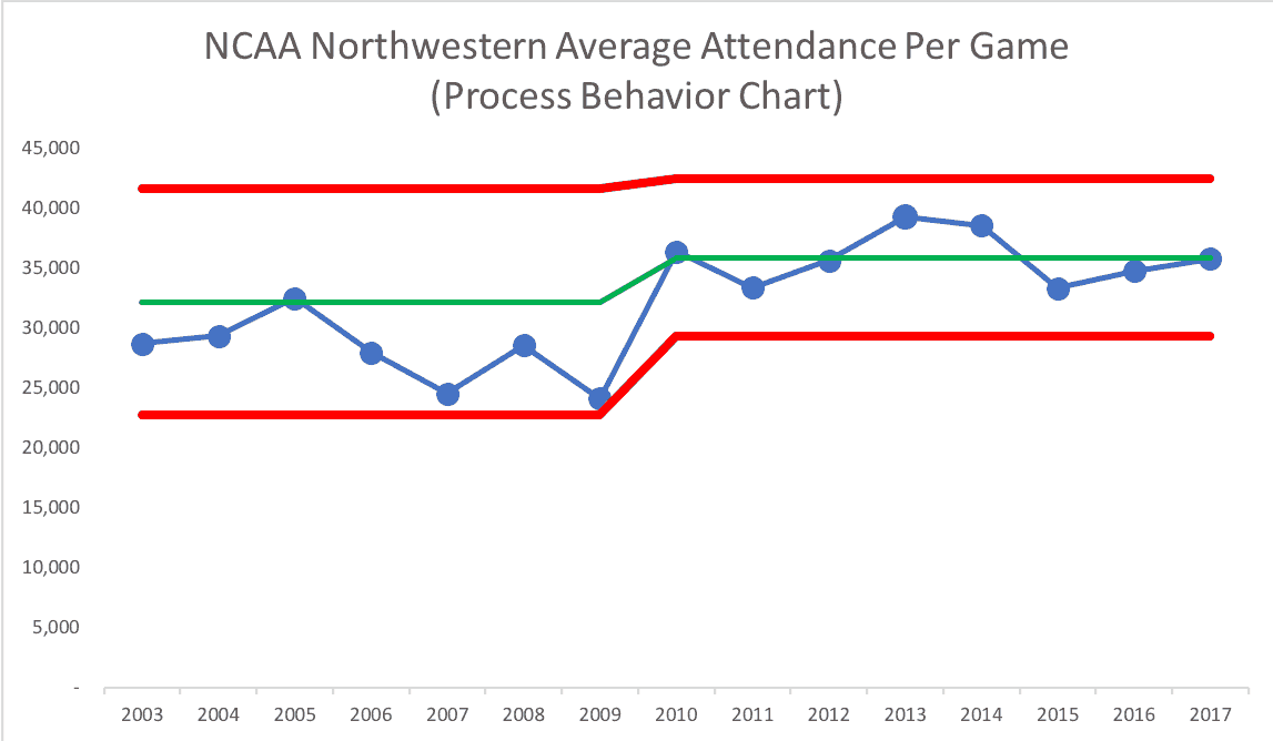
We could predict that 2018 attendance would be between 29,367 and 42,515 unless something changes in the system.
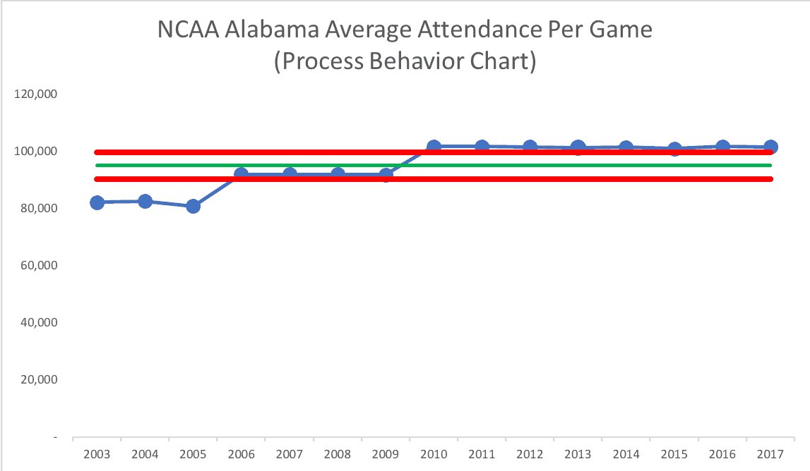
Alabama
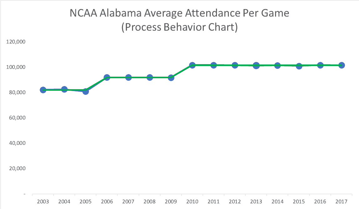
Is football attendance down at Alabama? No! And the chart shows the years when they expanded the capacity of their stadium — special causes!
If we charted just the years 2010 to 2017, that's a very stable and predictable process (or there's actually three such processes with three averages over time). Here's a run chart with three averages (the green line):
There's far less variation than there is in Northwestern's attendance.
Here's a PBC for the seasons with the newest, highest stadium capacity:
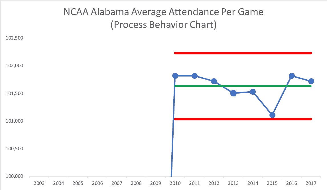
For 2018, we could predict that Alabama's average attendance will be between 101,034 and 102,231. The listed capacity, though, is 101,821 and that was the average in 2010, 2011, and 2016. That's the real “upper limit,” I suppose.
What Data Would You Examine?
Here's a Google Doc process behavior chart template (or Excel template) if you'd like to download data for your favorite conference or team. What does the voice of the process tell you? I'd love to see your charts and what you see – what conclusions do you draw?
Please scroll down (or click) to post a comment. Connect with me on LinkedIn.
Let’s work together to build a culture of continuous improvement and psychological safety. If you're a leader looking to create lasting change—not just projects—I help organizations:
- Engage people at all levels in sustainable improvement
- Shift from fear of mistakes to learning from them
- Apply Lean thinking in practical, people-centered ways
Interested in coaching or a keynote talk? Let’s start a conversation.


