Search Results for wheeler data context without

Ratings for “The Oscars” Were Lower in 2018? Should We Ask Why or Look for Longer-Term Trends?

Downward trending line graphic over gold trophy figures representing decline in success or performance.

As I blogged about yesterday, things went well at the Oscars... or, at least, no errors were made in the announcements. But that thing that didn't go well was the TV ratings.

Two Data Points Are Not a Trend
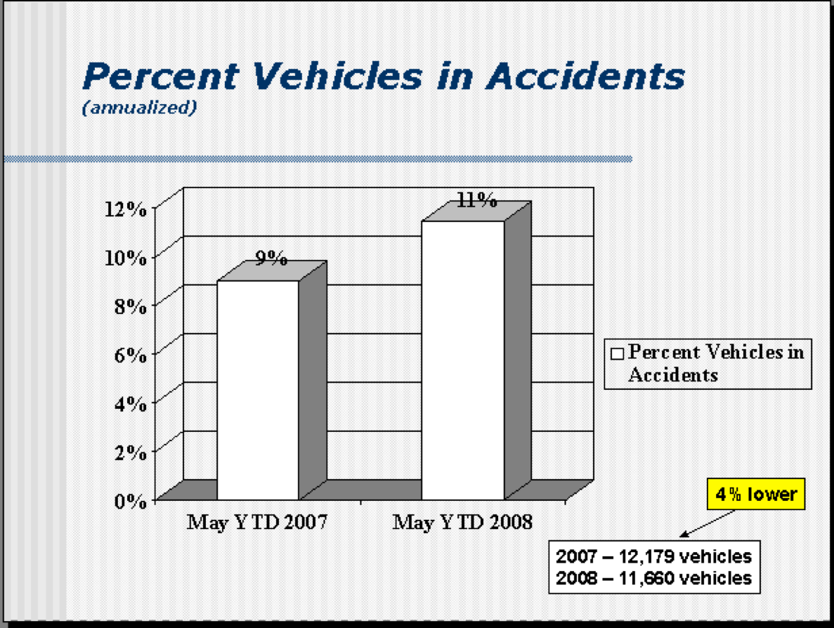
The headlines I saw had a lot of two-data-point comparisons. Headlines sometimes gave the percentage decrease in viewers or how many million fewer viewers there were. Many talked about "record low" but if you're tracking a metric "record low" or "all-time high" doesn't mean there's a "special cause." That "record low" could still be noise in the system.

Every Metric Has Variation – What Can We Learn from NCAA Football Attendance?

football attendance analysis chart

Last week, I saw a headline about a drop in NCAA college football attendance.

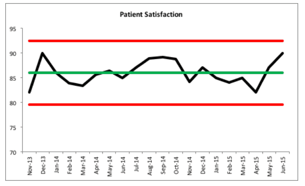
I wasn't satisfied with the two data point comparisons or other written descriptions of the metrics. I wanted to see data. SHOW ME THE DATA, JERRY! (with apologies to "Jerry Maguire"). I wanted to see a chart. So, I found the data on to NCAA website and created "process behavior charts" that tell you much more about the data than text numbers ever could.

Not All Improvement Ideas Require “Projects”

In this post, I share some thoughts and build upon one of the presentations at last week's Lean Healthcare Transformation Summit, where, Tim Pehrson, a regional CEO for Intermountain Healthcare, talked about how they piloted a continuous improvement process in one region... and how they're now spreading it throughout the system. This leads to confusion, in online discussion, about terms like projects, suggestions, ideas, and such...