Search Results for two data points not a trend

Are Reshoring Trends Real? Using Process Behavior Charts Instead of Headlines

Bar graph with upward trending arrow inside an industrial space, highlighting business growth and Lean principles.

I started my career in manufacturing, so that's just one reason I'm interested in the topics of offshoring (sending manufacturing work overseas) and what's now called "reshoring," or bringing jobs and factories back to the U.S.

Somebody at A.T. Kearney sent me a link to their recent report on reshoring, with the headline:

Reshoring in Reverse Again
US manufacturers are not exactly coming back in droves. In fact, the 2018 Reshoring Index shows that imports from traditional offshoring countries are at a record high.

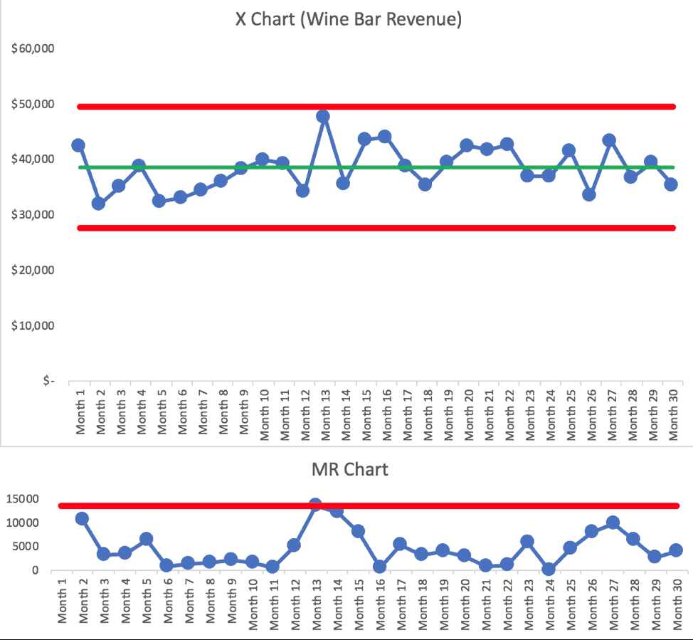
When you learn to look at data and workplace metrics through the "Process Behavior Chart" methodology, you learn to be skeptical of text descriptions like "a record high." Does "a record high" mean that the data point is statistically meaningful? Not always.


Ratings for “The Oscars” Were Lower in 2018? Should We Ask Why or Look for Longer-Term Trends?

Downward trending line graphic over gold trophy figures representing decline in success or performance.

As I blogged about yesterday, things went well at the Oscars... or, at least, no errors were made in the announcements. But that thing that didn't go well was the TV ratings.

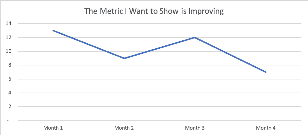
Two Data Points Are Not a Trend
The headlines I saw had a lot of two-data-point comparisons. Headlines sometimes gave the percentage decrease in viewers or how many million fewer viewers there were. Many talked about "record low" but if you're tracking a metric "record low" or "all-time high" doesn't mean there's a "special cause." That "record low" could still be noise in the system.