


Recently, I was asked to give a virtual presentation to the process improvement team at a health system. The focus was on topics from my book Measures of Success: React Less, Lead Better, Improve More – namely, “process behavior charts” and the connections to Lean management systems.
This health system was kind enough to share a few data sets that I could use as examples in my presentation. Thankfully, the data sets helped illustrate a few different key points about the methodology.
From the data sets, you could pull out a few statements of the kind that might be said in meetings or put on status reports.
These statements could include:
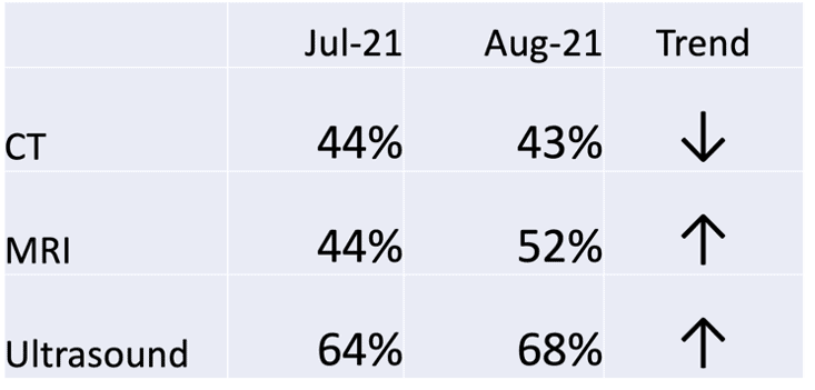
- MRI on-time starts went up from 44% to 52% last month
- Nurse Communication was 75% in August, which is below target
- It jumped from 75% to 83% last month
- That's the highest it's been for two years
- Ultrasound on-time starts were at an all-time high in October
- CT on-time starts % has decreased for four consecutive months
As I said in the presentation, being a bit provocative (in an intentional and somewhat apologetic way)… all of those statements are true… but meaningless.
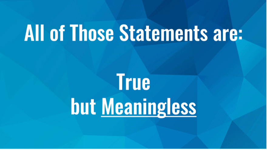
Well, they're potentially meaningless. I'll hedge the provocative statement just a bit. We don't know they are meaningful, just because they're true.
Would we make management decisions based on those true statements? Should we? I wouldn't make decisions based on those statements. I'd want to, as always, see more data points – I'd want to see more context over time.
Two Data Points Are Not a Trend
Sometimes, management summaries or “dashboards” will show two data point comparisons. Often, there is an up or down arrow that tells us if the last data point is higher or lower than the comparison data point (which could be last month or last year). Labeling that arrow as a “trend” doesn't mean that there's a statistically-meaningful trend worth reacting to or explaining.
The so-called “trend” isn't a trend. That assertion of trend can't be proven (or disproven) with just two data points.
OK, what if we showed more numbers in a similar format? What if we added red / yellow / green color coding to those numbers to show how performance compares to various thresholds?
It might look like this (totally easy to read, right??):

The numbers are fluctuating between yellow and red. Does that mean there is a statistically-meaningful trend? It's hard to tell.
What would really help us would be doing what my friends within NHS England would recommend: #PlotTheDots. Yes, plot the dots (whether you use a hashtag or not).
#PlotTheDots
We can create a run chart (aka a “line chart” in Excel) and that can better visualize the data in a way that our brains can more easily comprehend.
The run chart is helpful. Somebody might choose to do two clicks in Excel, to add a “linear trendline,” as shown below:
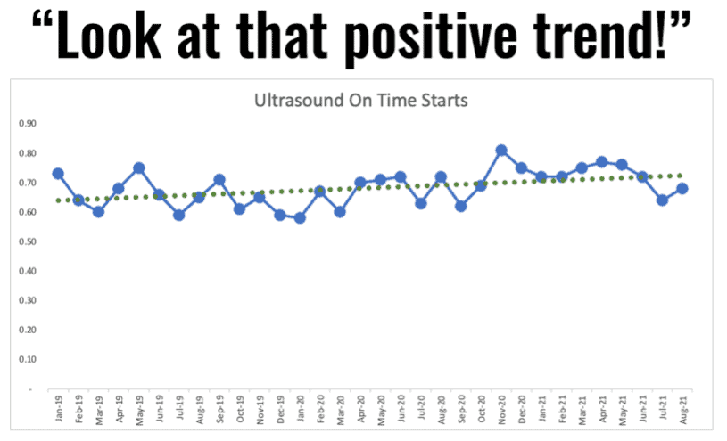
But is that really an upward trend? The linear trend line is mathematically correct, but the implication it makes could be false. The linear trend line suggests that improvement will continue and, if we just wait long enough, we'll eventually hit 100% on time ultrasound starts. I don't know if I would believe that assertion.
Process Behavior Charts Are More Helpful
If we create a “process behavior chart” using the data points, we'd calculate an average along with the lower and upper limits. Again, those limits are calculated, not chosen. Goals and targets can be arbitrary, but the PBC limits are not.
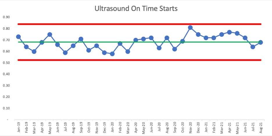
What does the PBC show us? We see a lot of data points fluctuating around an average, within those limits… until we then see a “signal” of eight consecutive data points that are all above the average, starting in November of 2020.
Those eight consecutive data points are extremely unlikely to be randomly occurring. The chart tells us that something changed in the system – the on time starts metric is better for some reason. It's not a gradual and consistent linear increase – it appears to be a step function increase.
But now look at those last two data points. Has performance shifted back to where it had been before? Was the change to the system temporary and not sustained?
We can do a new version of the PBC with the first average and limits being calculated based on the data points through October 2020, and a new average and limits being calculated for the last points. It would look like this:
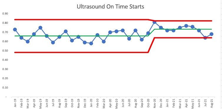
We see that July 2021 is right at the new lower limit of 64%. Has the system shifted back to its old level and range of performance? Maybe. We can only tell as we get more data points over time. This is a case where weekly metrics would allow us to determine if there's been another change to the system more quickly – weekly data points means we can detect “signals” in our PBC more quickly.
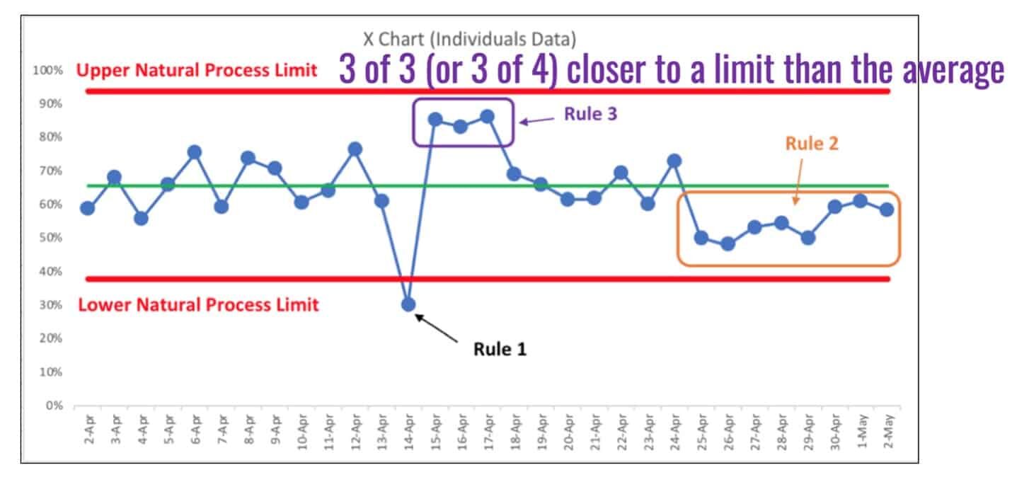
As a reminder, here is a visualization of the three rules for finding signals that tell us the system has changed, with Rule 3 being spelled out in the purple text.
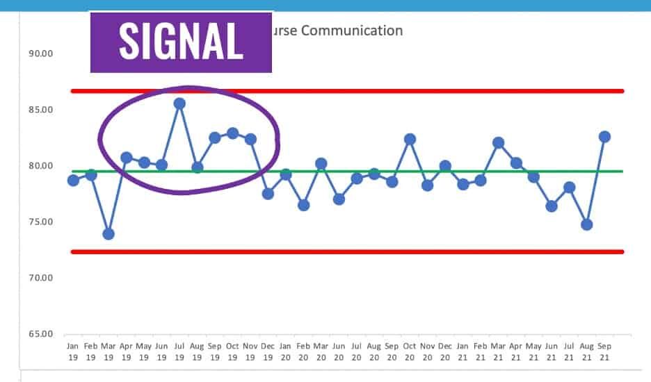
The chart for the Nurse Communication patient experience score tells us that something was better between April 2019 and November 2019… eight consecutive data points above the average. But, more recently, the number is just fluctuating around an average of about 80%.
In this case, we have a “stable and predictable system” from December 2019 on. Some data points are above the average and some are below. We shouldn't go trying to explain any of the individual data points, whether they are better or worse than the previous data point.
If we take the apparent shift into performance, our PBC might look like this:
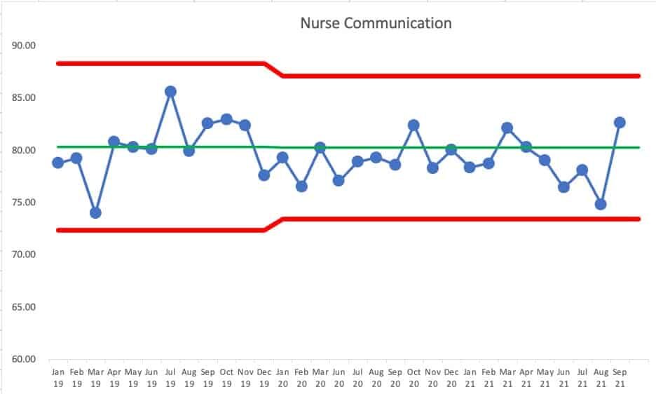
We can predict, with pretty good certainly, that the next month's number will fall between the limits of roughly 73% and 87% — unless the system changes. If we got a single data point outside of those limits (“Rule 1”) then we'd know the system changed, for better (being above the upper limit) or for worse (being below the lower limit).
#PlotTheDots
If we look at CT starts, the number is clearly not just fluctuating around a stable average over time.
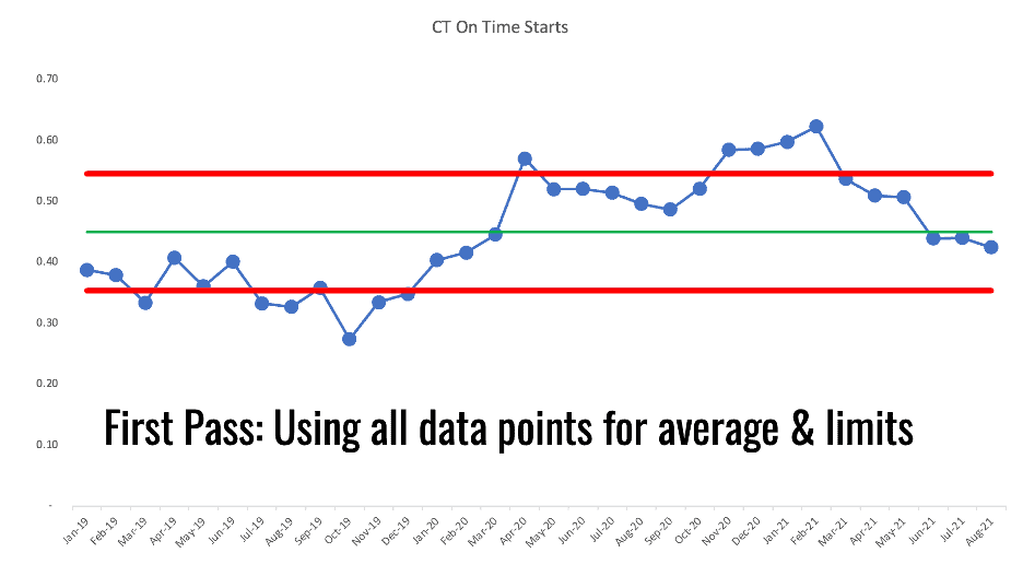
It looks like there was a shift in performance that might have starting around April 2020. Is this a pandemic effect? We don't know. The PBC tells us that something changed. It's up to us to figure out what changed.
We could calculate a new average and limits based on that shift. Did performance shift from fluctuating around one average to now fluctuating around a higher average?
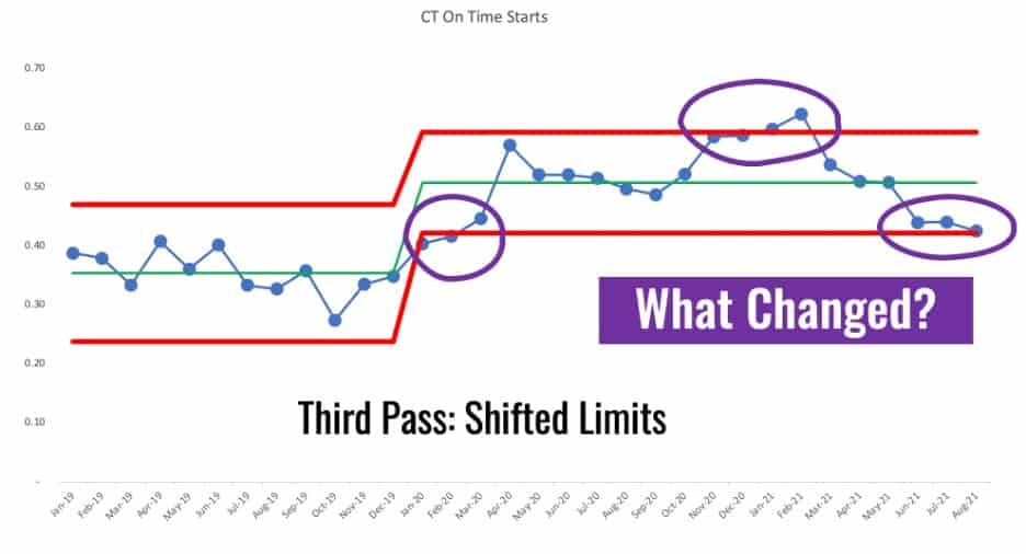
It's not really a stable and predictable metric post January 2020. I chose that point for calculating new limits since that's the first data point out of the 8+ that are all above the baseline average. That's a rule of thumb that I learned from Dr. Don Wheeler.
We see those four data points that are above or near the upper limit. We see some Rule 1 signals combined with a Rule 3 signal. Something changed. But, then the system changed back? And then with that Rule 3 signal in the last three data points, has the system changed yet again?
Those are things worth reacting to, those signals. Don't react to non-signals or “noise” in the data. DO react to signals and try to understand what has changed in your system.
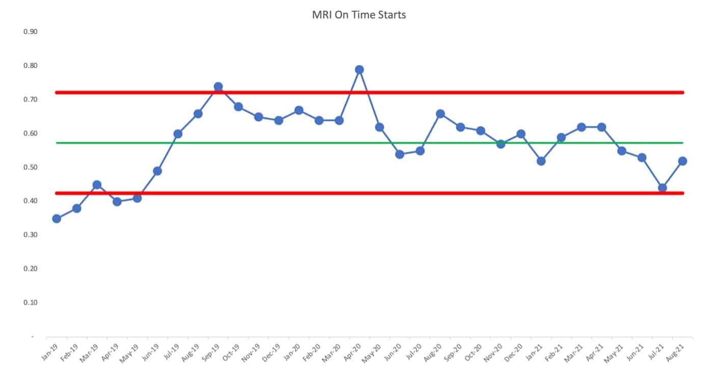
The chart for MRI on-time starts isn't a simple predictable system over time. There's been a shift up and then a shift back down.
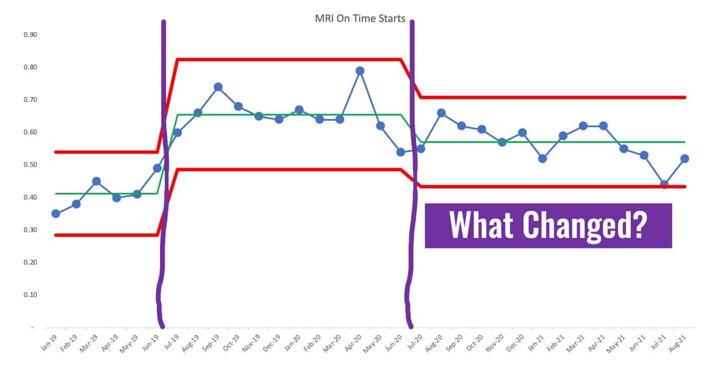
We could re-draw the PBC using different averages and limits based on apparent changes to the system, looking like this. It would be a good use of time to ask why performance shifted upward and why it shifted back down. It's not a good use of time to ask why the last data point is higher than the one before it – that's noise.
I hope these examples are useful… is your organization wasting time and energy by reacting to every up and down? Or, are you plotting the dots, looking for real trends or shifts in performance? Does this help you better understand cause-and-effect between changes you're testing in an effort to improve the system, thereby improving performance?
To learn more, please check out my book Measures of Success: React Less, Lead Better, Improve More and/or the free resources on the book's website.
Please scroll down (or click) to post a comment. Connect with me on LinkedIn.
Let’s work together to build a culture of continuous improvement and psychological safety. If you're a leader looking to create lasting change—not just projects—I help organizations:
- Engage people at all levels in sustainable improvement
- Shift from fear of mistakes to learning from them
- Apply Lean thinking in practical, people-centered ways
Interested in coaching or a keynote talk? Let’s start a conversation.


