


Original Blog Post from 2020:
An update from 2021 is at the bottom of this updated post
Another year, another evening of the Academy Awards, a.k.a. The Oscars. I don't watch the show, but I do pay attention to the inevitable headlines about TV viewership or ratings being up or down — usually a two-data point comparison, which isn't very helpful.
Many of the headlines emphasized this year's data point (23.6 million viewers) being an “all-time low” or a “new low” or a “record low” number for the telecast.
When we think in terms of statistics and longer-term trends, having a data point that's “an all-time low” doesn't mean that data point is a “signal” or that it's statistically significant.
Even if the number of viewers was just fluctuating around a stable average over the last 20 years, there's going to be an “all-time low” data point there out of those 20, by definition. That doesn't mean the “all-time low” is worth explaining. The “lowest ever” doesn't mean anything has changed.
Some of the headlines blamed the “politically charged” event and some headlines call for a solution of “bringing back the host.”
We shouldn't jump to root cause analysis, nor should we jump to countermeasures — unless that number on Sunday was a “signal” that the system (the system that generates a number of people watching) has changed.
Some headlines and articles did a two-data-point comparison that's mathematically correct but potentially unhelpful.
“… plummet almost 6 million viewers from 2019”
What does that tell us? What does it mean that viewership was:
“… a 20% drop-off…”
The 2019 ratings were a 12% increase from 2018.
We could continue the two-data-point comparison game (as many of our workplaces do):
- 2018 ratings were down 19% from 2017
- 2017 ratings were down 4% from 2016
- 2016 ratings were down 6% from 2015
- 2015 ratings were down 16% from 2014
Oh, so maybe there is a trend. Was the 2018 increase an exception to a recent rule?
As I wrote about in Measures of Success, the media often tries to explain every up and down in the number, which can be a fool's errand.
Ratings were up in 2019 — some speculated it was because it was the first year without an official host. But, they repeated the “no host” experiment and ratings were down. Ratings were lower than the last year with a host (2018). So, who knows, right?
What is helpful is visualizing more data points into even just a simple “run chart” (or what's called a “line chart” in Excel):
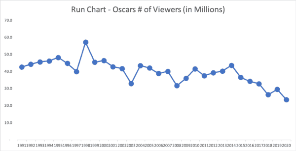
What do we see? Whoa! Instead of quibbling over or explaining the last three years and the up/down pattern, look at the big picture.
There's a pretty significant long-term downward trend… the numbers each decade get lower. The averages for each of the last three decades:
| 1991-2000 | 46.2 million |
| 2001-2010 | 39.2 million (down 15%) |
| 2011-2020 | 34.4 million (down 12%) |
My advice: Stop explaining each year's numbers and look at longer-term causes. The downward trend in ratings is often attributed to the rise of streaming platforms… what the Academy actually do about that? They're never going to “fix” the Oscars if that means restoring past glory (and high viewership). It seems that there is a new reality.
Better than a “run chart” is a “Process Behavior Chart,” as shown below:
The PBC makes it a bit more clear that there's been a downward shift. The number of viewers was originally fluctuating around an average, but then we saw 8+ consecutive data points below the average (a shift in performance).
Since 2004, the number of viewers was fluctuating around a lower average… until the past few years when we see evidence of another shift.
What has changed the last three years to trigger two “signals” (data points below the Lower Limit of the PBC)? That's a better question than, “Why is the 2020 number a little bit below 2019's?”.
Here is a LinkedIn post that I shared the other day that triggered a little bit of discussion on the data and the chart:
2021 Update
Ratings cratered even more last night.
Oscars Ratings Crash To All-Time Low; Viewership Falls Under 10M For First Time Ever
In delayed fast national results just released by Nielsen, the 93rd Academy Awards were watched by a mere 9.85 million, with a dismal rating of 1.9 among the 18-49 demographic.
That is an all-time low for Hollywood's biggest night — by a huge margin.
Down 58% to 9.85 million… so here is the updated chart:
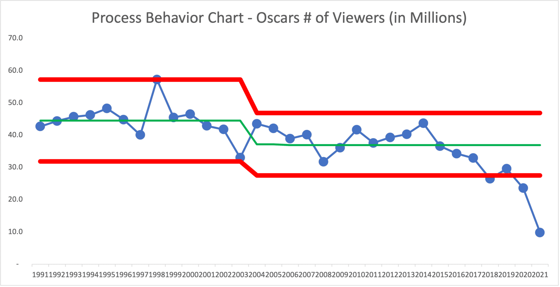
Note: the “final” numbers came in at 10.4 million.
Was 2021 the effect of the pandemic? A chart like this will tell you something has changed… but it doesn't tell you what the cause is.
When we don't have a “predictable system” (meaning the number is no longer just fluctuating around an average), is this the continuation of a trend or a one-off pandemic blip? We'd have to make a prediction — the chart won't tell us that.
The question going forward is will 2021 be the Pompeii of awards show ratings or a tremor of sorts due to the particulars of the past year?
I will update the chart and the post with the “final numbers.”
ABC plans to release its official 2021 Oscar data tomorrow, when the final numbers are in. As other broadcasters have done with similar big-ticket events during the past year or so, those numbers will incorporate at home viewing across all domestic time zones, as well as out-of-home viewing.
There's also the impact of streaming via Hulu, ABC.com, and other online services. 9.85 million viewers on traditional TV doesn't mean just 9.85 million people watched total.
Please scroll down (or click) to post a comment. Connect with me on LinkedIn.
Let’s work together to build a culture of continuous improvement and psychological safety. If you're a leader looking to create lasting change—not just projects—I help organizations:
- Engage people at all levels in sustainable improvement
- Shift from fear of mistakes to learning from them
- Apply Lean thinking in practical, people-centered ways
Interested in coaching or a keynote talk? Let’s start a conversation.


I wonder if the “number of viewers” is what Eric Ries would call a “vanity metric”??
ABC doesn’t make money from “viewers,” they make money from advertisers.
Oscars 2021: Advertisers Spend Millions On Least-Watched Ceremony Ever