


Note: This post was revised slightly and updated in December 2023 after original publication in 2018.
Back in 2017, I looked at the free throw statistics of Andre Drummond of the Detroit Pistons. News headlines talked about how much he had improved his free throws, so I looked at one of his performance metrics (free throw percentage) to see if the increase was “signal” or “noise.”
Why write about basketball? Well, there are lessons that we can learn and apply to our own workplace metrics, as I write about in my book Measures of Success: React Less, Lead Better, Improve More.
My conclusion, based on the statistical analysis of a Process Behavior Chart was:
“Yes, Andre Drummond IS a significantly better free throw shooter this season. A better process has led to better results.”
The other day, I saw another article about Dwight Howard, now of the Washington Wizards, and his improved free throw shooting.
I thought, let me look back at Drummond to see how the season turned out and if he's sustaining the improvement in the first part of the 2018-2019 season.
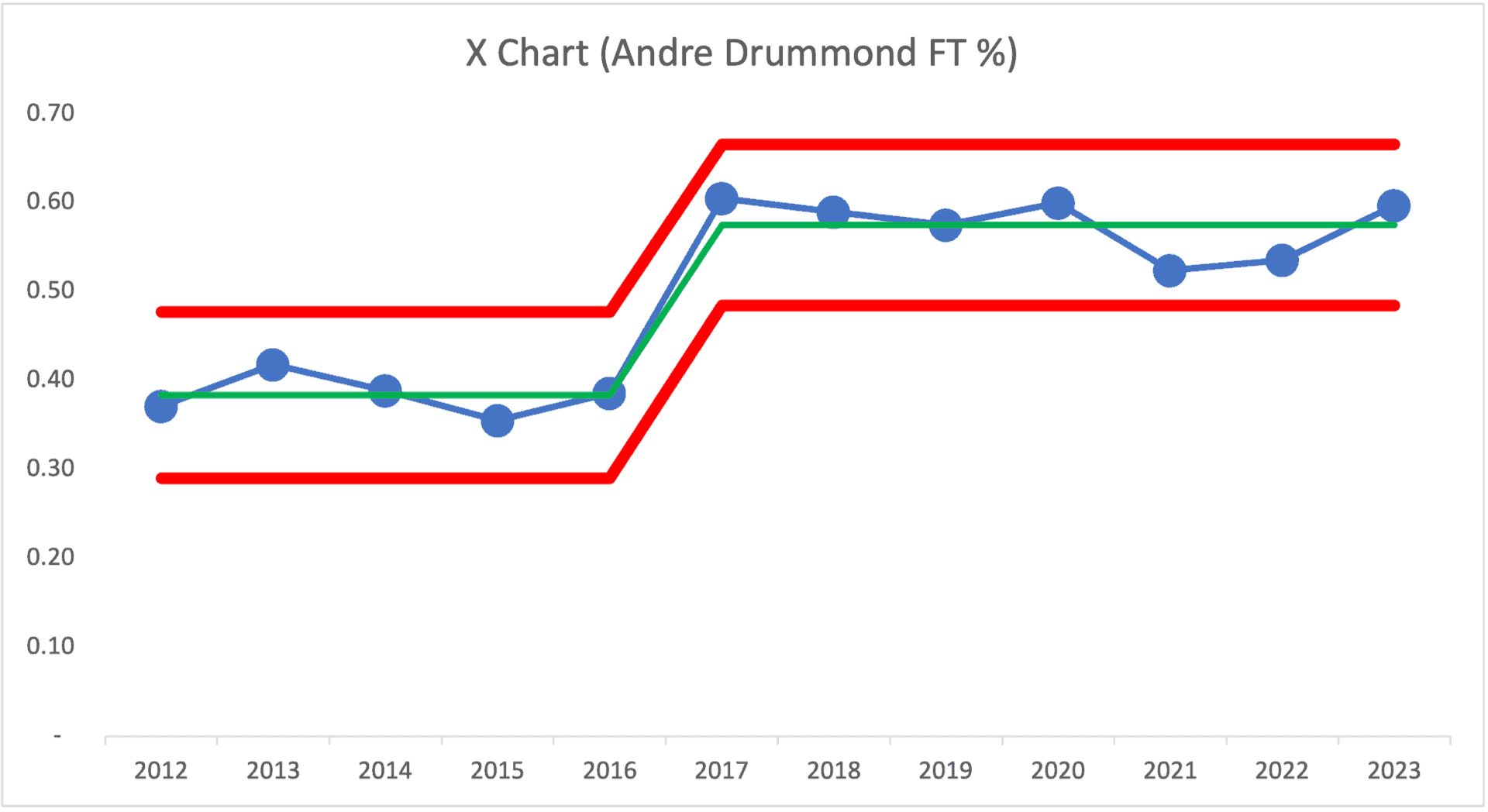
For 2018-2019, his percentage has dropped a bit so far, but it's still above the average for Drummond's career. The Lower and Upper Natural Process Limits were calculated using the first five seasons as baseline data points (see the spreadsheet). We do that because it was claimed that Drummond's method for shooting free throws changed… so it's arguably a new system that he established last year.
For the season that started in 2017, his free throw percentage is what you might call a “signal.” It's above the Upper Limit (what I call a “Rule 1 signal” in my book). 2017 and 2018 are both above the Upper Limit, indicating that he hasn't regressed to fluctuating around the old average. The Process Behavior Chart limits would have predicted that his 2017 season's free throw percentage would have fallen between the red lines… unless something changed… but clearly, the process changed, and we see the shift in results.
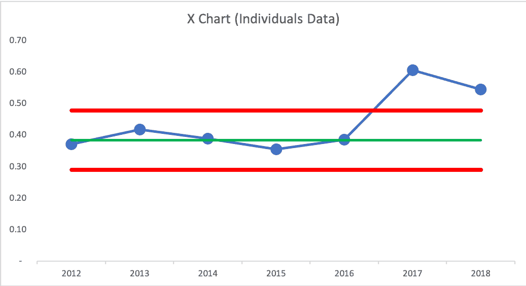
Either way, it looks like his free throw percentage was fluctuating around an average from 2012 to 2016 and it might now be fluctuating around a higher average, starting in 2017. When we analyze metrics, it's important to look for shifts in the average performance instead of just looking at each data point compared to the last.
Drummond's free throw percentage is lower than last season. But, again, it doesn't look like he's regressed to the old average. We shouldn't react to every up and down in a metric, as there is always variation in a metric. The 2017 data point was worth reacting to and explaining because it was a signal. The previous year's changes were just noise in the system.
But, looking at a metric annually doesn't give us many data points. We can do better by looking at Drummond's monthly percentages throughout his career. More data points means having Limits that are statistically more valid (using 15 or 20 data points as a baseline is ideal) and we can detect signals more quickly when we have more data points.
Here is the monthly chart, which includes seven October games and six November games to date in this current season:
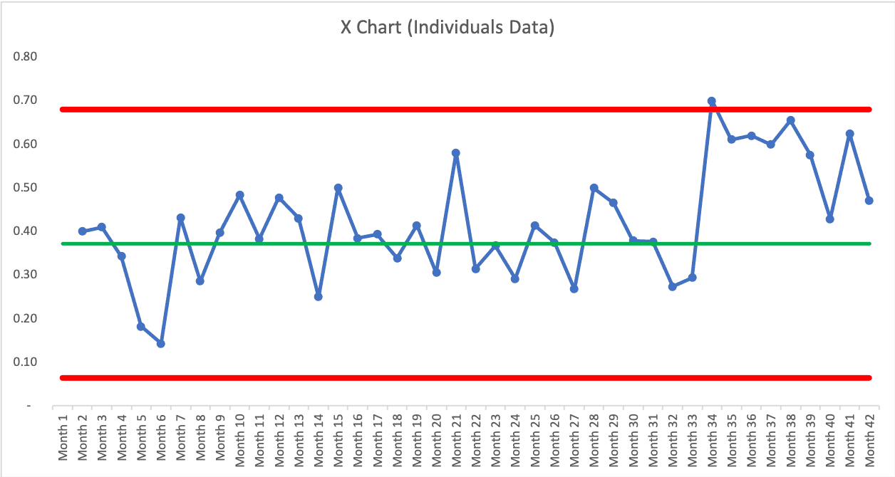
This chart makes the shift more clear. The first month of last season was a single data point above the baseline average (which was established from the first 26 months of his career). We also see a “Rule 2” signal of eight consecutive data points above the old average — more evidence of a shift in the metric. Drummond has significantly increased his percentage and he has sustained it. The last month of last season was low (was he tired at the end of the season?) and this November's number is lower too.
We can calculate a new average and new limits that illustrate the shift in performance and how it's now fluctuating around a higher average. See the spreadsheet, if you like.
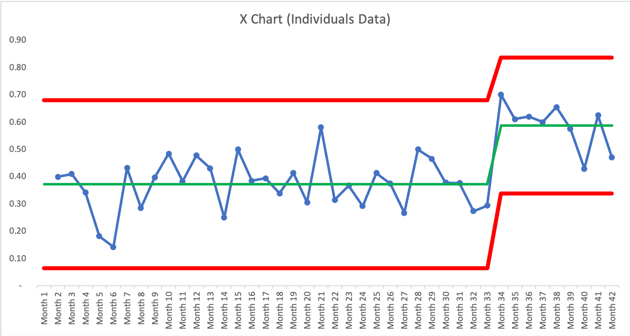
We'd expect his monthly percentage, going forward, to fall between the red lines unless he can improve his system again. Neither of those two lower data points are signals. So, it's probably not worth explaining. He could have been fatigued… or injured… or it's just fluctuating.
Congratulations to Andre Drummond!
2023 Update
Here is an updated X Chart with partial stats for the 2023-2024 season… 33 games for Drummond so far:
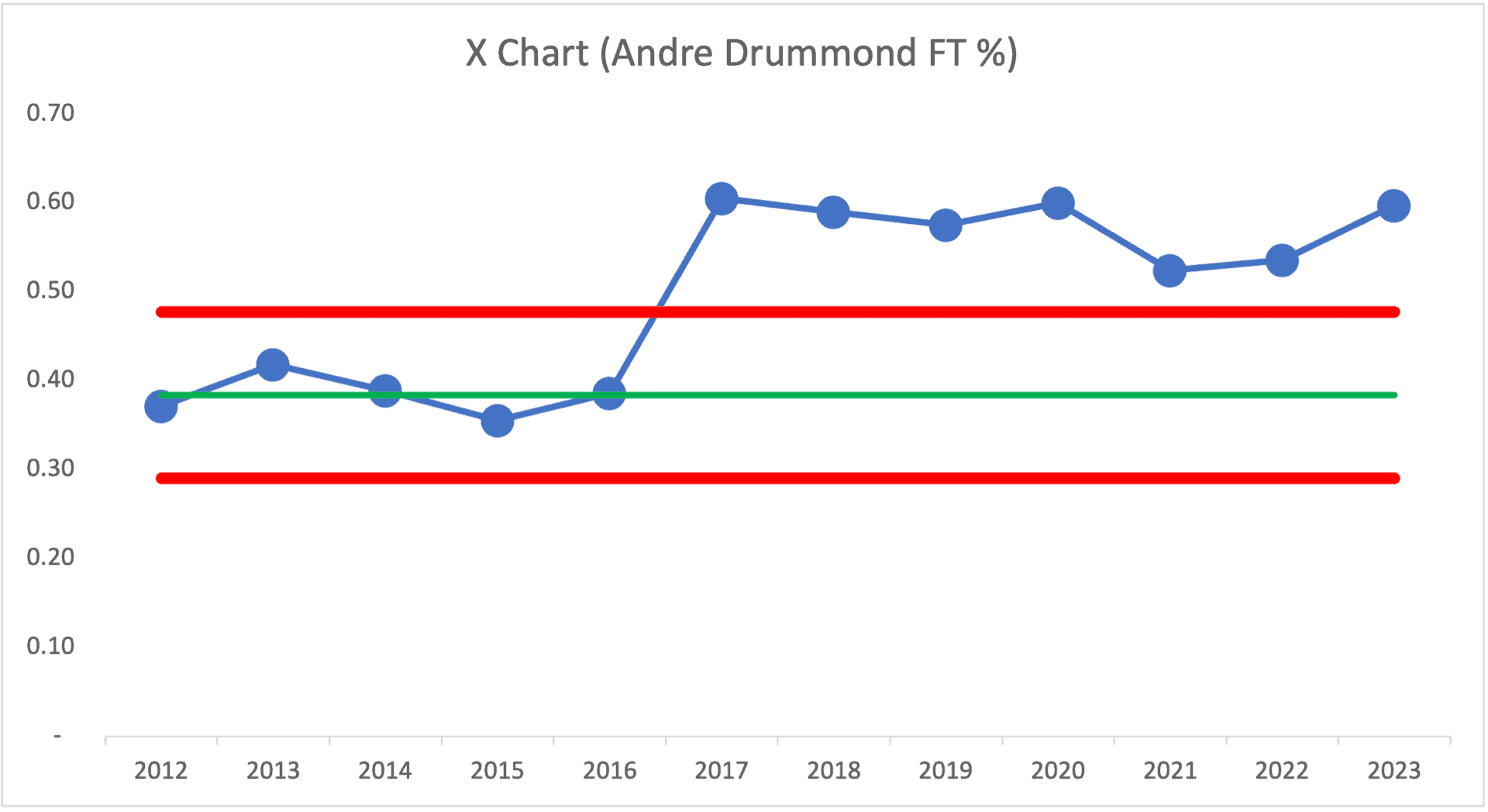
While there is year-to-year variation, as expected, he has pretty well sustained this better free-throw shooting for more than six seasons now. He's established a new average… and new lower and upper limits as shown here:
Congrats to Andre for his sustained free-throw shooting improvement!
He's now with the Chicago Bulls:
Embed from Getty ImagesDwight Howard's Stats and Chart
I saw an article that said Howard's free throw percentage was the highest it had been since his rookie season.
Since Howard is older, we have more season data points to play with (all data is from basketball-reference.com).
What does the Process Behavior Chart say, using his whole career as the baseline for calculating the average and the limits? If we see nothing but noise in the chart, it would tell us that his free throw shooting is a single “predictable system” — or do we see signals?
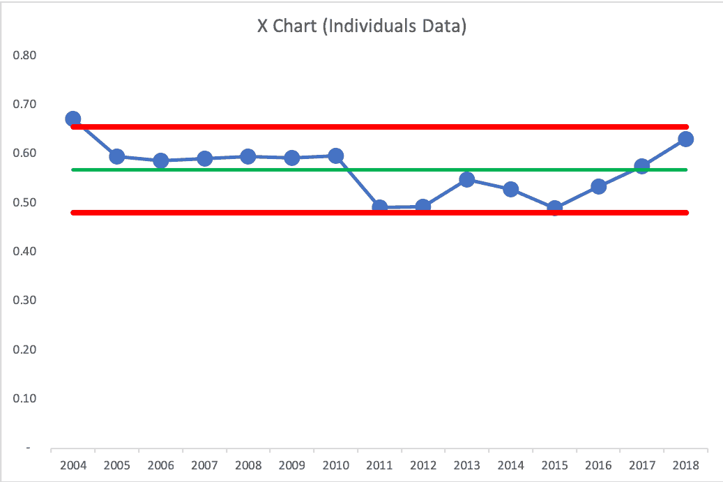
His first season is a “Rule 1” signal. Something was different that season. We see seven consecutive points above the career average, then six consecutive points below the average. Those are close to being “Rule 2” signals…
It looks like there was a big drop, though, at the start of the 2011 season. If we bring in the “MR Chart,” the companion to the X Chart, what do we see? The MR Chart plots the “Moving Range” or the difference between each two data points (the Average Moving Range tells us how much point-to-point variation is normal and that average is used to calculate the Upper and Lower Limits on the X Chart – see more here or in my book).
The MR Chart is below. Technically speaking, the Process Behavior Chart methodology uses the pairing of the X Chart and the MR Chart together. In practice, many use just the X Chart that shows just the actual data. But knowing about the MR Chart teaches us to look for large swings in the X Chart data that are unlikely to be noise in the system.
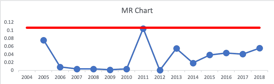
That 2011 season is an MR data point that's barely below the MR Upper Limit. We can see how there had been low variation for a number of seasons, then it jumped up. Why?
I could buy an argument that something changed in Howard's game starting that season. The question is “what changed?”
Process Behavior Charts are helpful in evaluating “has something changed?” It just doesn't tell you what changed. That's where you need to use your process knowledge or investigation in the workplace to find answers to the “what changed?” question.
In most organizations, people react to every up and down in the metric. Asking “what happened?” when we see a “noise” data point is a waste of time. So, we need to react less. When we react only to signals (or maybe ask questions about a “near signal” then we can learn more and improve more.
Please scroll down (or click) to post a comment. Connect with me on LinkedIn.
Let’s work together to build a culture of continuous improvement and psychological safety. If you're a leader looking to create lasting change—not just projects—I help organizations:
- Engage people at all levels in sustainable improvement
- Shift from fear of mistakes to learning from them
- Apply Lean thinking in practical, people-centered ways
Interested in coaching or a keynote talk? Let’s start a conversation.


Nice use of data to understand the system results (and if there is a measurable improvement or not). I still want to see these chronically poor free throw shooters use the pretty clearly better underhand free throw style. I wrote about this previously in Why Do People Fail to Adopt Better Management Methods?
https://management.curiouscatblog.net/2017/02/02/why-do-people-fail-to-adopt-better-management-methods/
It really is remarkable how much effort is put into so many aspects of gaining small advantages yet a fairly obvious big advantage (underhand free throws continues to be ignored).
A change in approach to free throws should be easy to check “has the process changed?”
I wonder if he shoots them like this now?…
Nice article Mark – swish!
Here’s an article about his method for improvement. We can’t just hope to improve… we need to have a method (as Dr. Deming would ask… “By what method?”)