


TL;DR: One good data point doesn't prove improvement. Process Behavior Charts help healthcare teams distinguish real system change from normal variation when evaluating interventions like reducing blood culture contamination.
Here is another case example that uses the “Process Behavior Chart” methods from my book Measures of Success: React Less, Lead Better, Improve More.
This isn't really a post about blood culture contamination. It's about a much more common Lean leadership mistake: confusing random variation with real improvement — and declaring victory too soon.
You might ask, “Why does he keep blogging about this topic? I thought this was a blog about Lean.”
Well, for one, I'm promoting my new book :-)
This case study shows why healthcare improvement efforts need Process Behavior Charts–not single data points–to determine whether an intervention truly reduced blood culture contamination.
Secondly, I think these methods are very important for people doing Lean improvement work. There's a risk that people might declare victory too soon when they are evaluating the impact of an attempted improvement. Does one data point prove that the intervention has improved the system significantly?
Why One Good Result Is Not Proof of Improvement
Many Lean leaders don't fail because they avoid data — they fail because they misread it. Declaring improvement too early creates false confidence, locks in weak countermeasures, and can actually slow learning instead of accelerating it.
A Real Healthcare Example: Blood Culture Contamination Rates
Here is a chart from a team in San Antonio, where I teach a class on Lean for quality and patient safety twice a year. This team was basically using the “A3” improvement methodology to look at a problem that really impacted patients. My understanding is that a contaminated blood culture bottle leads to false positive results that indicate that a patient has a bloodstream infection when they really don't.
As it says here:
“These contaminated blood cultures may result in the administration of unnecessary antibiotics, prolonged hospital stays, and significant increases in hospital costs.”
This isn't just a data or reporting problem. When leaders misinterpret results in situations like this, patients can receive unnecessary treatment, teams may stop improving too soon, and real system problems remain hidden.
Here is a chart the team had:

In Measures of Success, I cite the book Meaningful Graphs that makes the case that time-series data, like the chart above, should really be drawn as a Line Chart (a.k.a. a Run Chart). I agree with that, as I agree with the idea that a Column Chart draws your eye to the middle of the bar, when it's the top of the bar that matters as the data point. Plus, a Run Chart uses less ink.
Here is a simple Run Chart. I think this is more clear. The blue dashed line is the target.
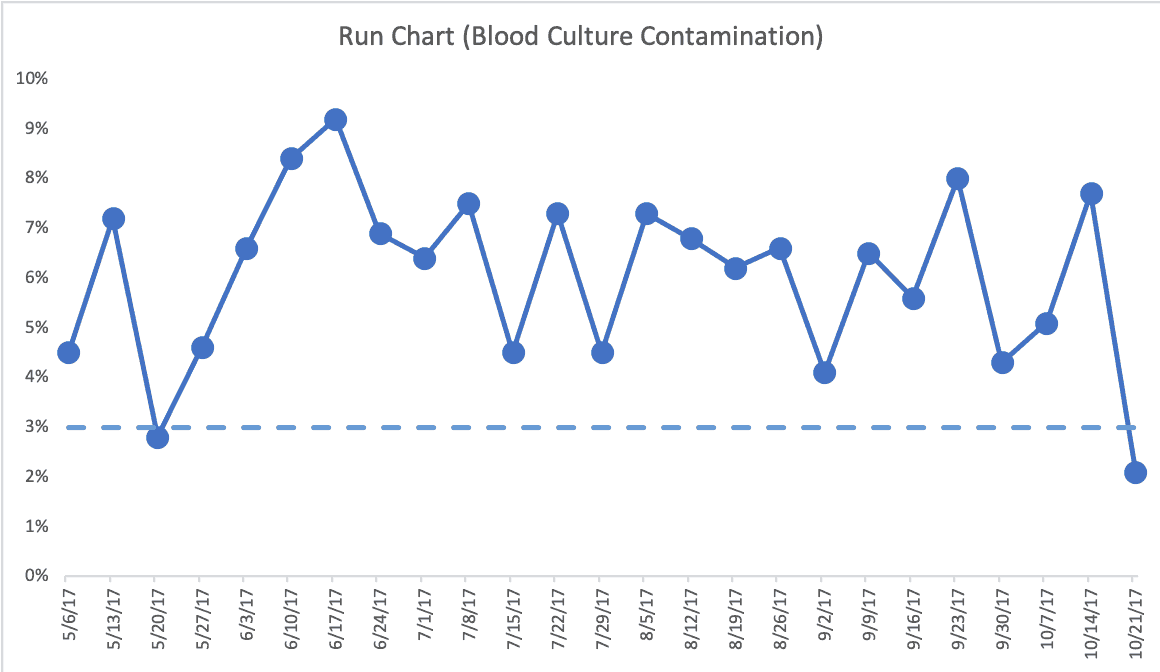
Either way, we see a target of 3.0%. The color coding (and the bars) make it clear this system is not capable of reliably beating the target. Hence, the improvement project. And, thankfully, the team was looking at this in a systematic way, as I discuss in Chapter 4 of my book. Throughout the book, I try to make the case that the answer to systemic problems won't be found in asking “what went wrong last week?” when we have a predictable system with results that predictably fluctuate around an average.
Why Targets and Green Dots Can Be Misleading
The week of 5/20/2017 was green in the column chart, being a bit below the target. We can see it's below target in the Run Chart without color coding.
This is a familiar Lean trap. A single green data point often gets celebrated as proof that the problem has been solved, even though the underlying system may be completely unchanged.
The team said that week was actually different because there was an intervention to the system. But, for some reason, that process change couldn't be continued. I don't know or remember the circumstances around that. It's a shame that they might have had something that could bring the average contamination percentage down but couldn't continue it. I'd hate to think it was some cost-related factor, since blood culture contamination has its costs, as well.
The last data point, also better than the target, was the first week of the new interventions they were trying in the system. Is that data point “signal” (meaning that the change had a significant impact) or “noise?”
Is This Improvement — or Just Random Variation?
If leaders don't pause to ask this question explicitly, optimism tends to fill the gap. Hope replaces evidence, and teams move forward before they actually know whether the system has improved.
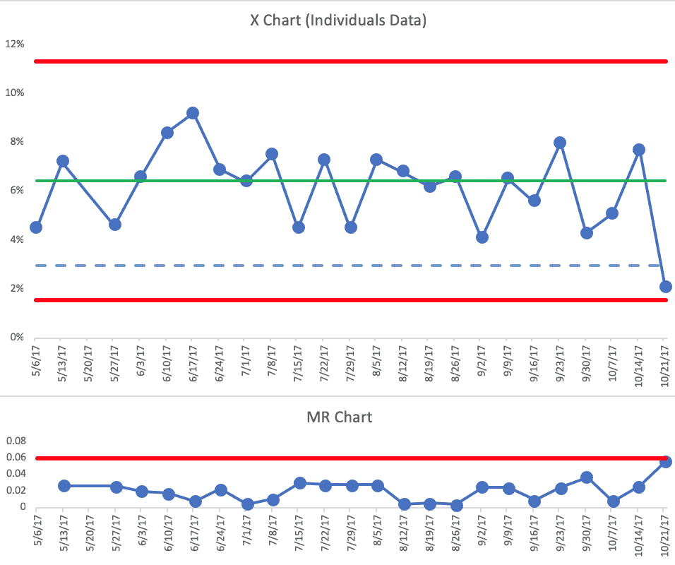
To answer this question, I created a Process Behavior Chart, using the first 20 data points to calculate the average and the Natural Process Limits (see the spreadsheet, if you like). This is the full combination of X Chart (the data) and the MR Chart (the “Moving Ranges” being the difference between each two successive data points).

Each of those below-target data points is “noise.” There are no signals in the chart.
Calling this improvement would not just be incorrect — it would actively mislead leaders about whether the system had changed at all.
The Risk of Declaring Victory Too Soon
This is where false victories do real harm. Leaders may congratulate the team, move on to the next priority, or standardize a change that hasn't actually improved performance. The mistake isn't celebrating improvement — it's celebrating before improvement has occurred.
Had the 10/21/17 week been below the calculated Lower Natural Process Limit of 1.1%, then the team could declare victory (one rule for finding a signal is any data point outside of the Limits). It's possible the system has changed in a way that will lead a sustained lower average (something lower than the old average of 6%). It would be a different signal to see eight consecutive data points below the old average.
I would find that single data point to be encouraging. But, it's also possible that the old system could have generated that data point on its own. It's within the bounds of expected variation.
If you wondered about that 5/20/17 data point that they said was a different process, excluding that data point from the Process Behavior Chart and the calculations doesn't really change anything significantly. I wouldn't draw any different conclusions from this PBC:
What I suggested to the team, even without having a PBC handy, was that they collect more data points before drawing any before/after conclusions.
What Real System Change Would Look Like in the Data
If the future data looked like this, it would be better proof of a significant improvement to the system, showing just the X Chart:
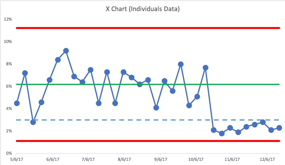
A single data point below the arbitrary target isn't what tells us that the system has changed. Our PBC evaluation rules do.
- Rule 1: Any data point outside of the limits.
- Rule 2: Eight consecutive points on the same side of the central line.
- Rule 3: Three out of four consecutive data points that are closer to the same limit than they are to the central line.
Seeing eight consecutive data points below the old average is great. We'd actually see the third type of signal sooner… the third consecutive data point there that's closer to the Lower Limit than it is to the average. That's also unlikely to happen randomly as the result of the old system. I'd conclude that the system has changed. We could calculate new Limits and see if it's a new predictable system:
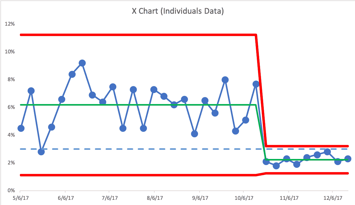
This would be great to see. The average is lower and the amount of week-to-week variation has also been reduced. This means that the new Upper Natural Process Limit is now 3.2%. This means most, but not all, weeks would likely be below the 3% target — unless something else changes in the system again (and we'd use our three rules to find any signal).
Lean leadership requires patience, humility, and the discipline to wait for evidence — not just results we want to see. Process Behavior Charts help leaders avoid false victories, resist overreaction, and stay focused on real system change. If we're serious about improvement, we have to be just as serious about knowing when improvement has actually happened.
Learn more in my book: Measures of Success: React Less, Lead Better, Improve More.
Beware of False Victories: When “Improvement” Is Just Noise
One of the most damaging habits in Lean work is celebrating a win that isn't real.
A single data point below target feels good. It looks like progress. It gets reported upward. Leaders relax. Teams move on. But without understanding variation, that “success” may be nothing more than noise from the same old system.
This is how organizations fool themselves into thinking they've improved–when nothing has actually changed.
Process Behavior Charts exist precisely to prevent these false victories by helping Lean leaders distinguish signal from noise over time. They force us to slow down, look at data over time, and ask a harder question: Has the system truly changed, or are we just reacting to randomness? Without that discipline, Lean risks becoming a cycle of overreaction, premature celebration, and eventual disappointment.
For Lean leaders, this is an uncomfortable but essential lesson. Real improvement means resisting the urge to declare success too soon. It means staying curious instead of congratulatory, and patient instead of reactive. When teams learn to distinguish signal from noise, they stop chasing short-term results and start building systems that reliably perform better for patients and staff.
In other words: if your improvement story depends on one good week, it's probably not improvement at all–it's just luck.


Another great read, Mark! This was the first process behavior chart I created as a new lab supervisor years ago – blood culture contamination rates!! The previous supervisor had communicated the previous month, and that was it. No visual of… anything, just the percentage. When I became supervisor we began logging month after month… over time we were able to see the month to month and YOY process behaviors, which helped us cut-off what appeared to be seasonal spikes by putting mitigation plans in place. It was very helpful.
Thanks so much for that example, Matt.
That goes to show the benefits of “plotting the dots” over time instead of just reporting the previous month’s number. Even without the full-blown Process Behavior Chart methodology, a simple Run Chart just showing the data points over time gives so much more context and perspective.
I hope others will follow your lead (and that my book is helpful).
Mark, I would love to see the spreadsheet, but the link didn’t work for me. Can you help?
Hi Caitlin –
I just checked the link and it works fine. Does your organization block Dropbox? I’ll email you the file.
Mark