


Headlines about reshoring often point to record highs, sharp increases, or sudden reversals. But without historical context, those claims can be misleading. Using Process Behavior Charts, this post examines reshoring statistics to distinguish meaningful system changes from routine year-to-year variation.
TL;DR: Headlines about reshoring often focus on record highs or single-year changes, but those claims lack context. When reshoring data is viewed using a Process Behavior Chart, the year-to-year ups and downs appear to be normal variation rather than meaningful signals. Without evidence of a sustained shift, reacting to short-term changes risks drawing the wrong conclusions and making poor decisions.
I started my career in manufacturing, so that's just one reason I'm interested in the topics of offshoring (sending manufacturing work overseas) and what's now called “reshoring,” or bringing jobs and factories back to the U.S.
Why “Record High” Headlines Deserve Skepticism
Somebody at A.T. Kearney sent me a link to their recent report on reshoring, with the headline:
Reshoring in Reverse Again
US manufacturers are not exactly coming back in droves. In fact, the 2018 Reshoring Index shows that imports from traditional offshoring countries are at a record high.
When you learn to look at data and workplace metrics through the “Process Behavior Chart” methodology, you learn to be skeptical of text descriptions like “a record high.” Does “a record high” mean that the data point is statistically meaningful? Not always.
Highlighted in the report:
- The largest one-year increase in imports from Asia to the US, a staggering $55 billion dollars (up 8% from 2016), since the economic recovery in 2011.
Is a One-Year Change in Reshoring a Statistical Signal?
Again, I'm not sure whether an 8% increase is a “signal” in the data or just part of the “noise” in the metric. Did it go down 8% the year before? How much does this number commonly fluctuate? That context matters; we're just reacting to every up and down, which might lead to bad conclusions or decisions (as I write about in my book Measures of Success).
- The Reshoring Index has dropped 27 basis points since rising to a 5-year high in 2016
I'm also not sure if a 27-point drop is signal or noise. I asked the A.T. Kearney rep if they had more data to share and, thankfully, they did.
What the Reshoring Index Actually Measures
About the “Reshoring Index”:
To calculate the Index, At Kearney first looks at the import of manufactured goods from the 14 Asian countries that have traditionally been offshore trading partners: China, Taiwan, Malaysia, India, Vietnam, Thailand, Indonesia, Singapore, Philippines, Bangladesh, Pakistan, Hong Kong, Sri Lanka, and Cambodia. Next, we examine US domestic gross output of manufactured goods. Then, calculate the manufacturing import ratio (MIR), which is simply the quotient of dividing the first number by the second. The US Reshoring Index is the year-over-year change in the MIR, expressed in basis points. A positive number indicates net reshoring, which occurs if gross domestic output grew relatively faster than imports from the 14 offshore countries.
So, a drop in the number means LESS reshoring. Is this a meaningful trend, though?
Adding Context With a Process Behavior Chart
The chart from A.T. Kearney has a bit too much going on:
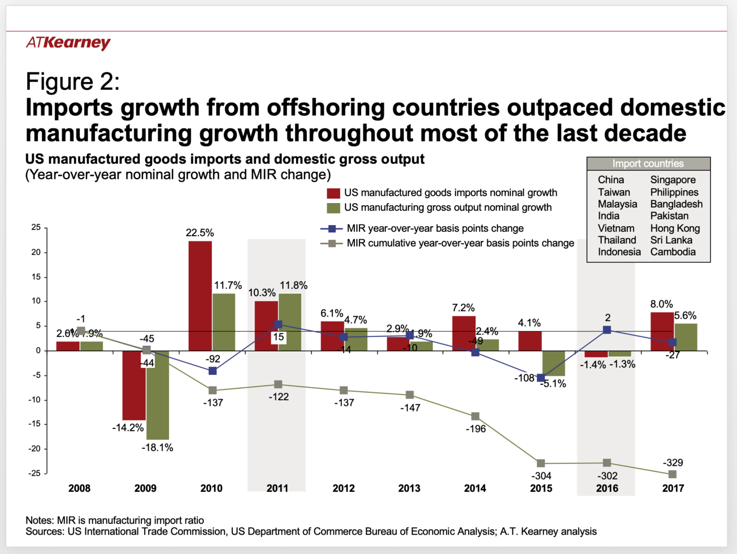
The blue dots and the line chart represent the reshoring index. Now, we can see better context. The number is up and down. I'm not sure the Y-axis is lined up properly, either. But, if I extract the data points, I can draw a Process Behavior Chart that is easier to digest.
With the ten data points, from 2008 to 2017, I can calculate an average and the “Natural Process Behavior Limits” for the metric (see my spreadsheet). Here is the “X Chart”:

What the Process Behavior Chart Reveals About Reshoring
This chart shows that the average “Reshoring Index” over those years was -32.9, indicating a net offshoring effect. The number was positive in 2011 and 2016, meaning there was net reshoring in those years. But, was that ever a “trend” to begin with?
The Natural Process Behavior Limits are calculated based on the amount of “routine variation” in the system — how much does the number normally fluctuate from year to year? That's important context.
A Predictable System, Not a Trend
It appears to be what we'd call a “predictable system.” None of those data points is the result of a “special cause” that's worth investigating, explaining, or reacting to. The index dropped in 2017 after increasing in 2016. This number is fluctuating. There's no real need for headlines or press releases about it going up or down. Those changes aren't significant and the Process Behavior Chart shows us that.
Because it's a predictable system, we can expect the 2018 number to fall between the Lower Limit of -171 and the Upper Limit of 105. The 2018 number is predictable unless something has changed significantly in the system (and I don't mean for this to veer into the political realm with talk of tariffs, etc.).
Why Two-Point Comparisons Lead to Bad Decisions
This Process Behavior Chart methodology isn't that complicated. It's really powerful. We can:
- Ask for additional data points if somebody makes a two-data-point comparison
- Ask for additional data points if somebody says, “This is the highest number in X years”
- Plot the dots (#PlotTheDots) and see what the voice of the process is telling you
- Stop overreacting to noise in the metric
I do think the A.T. Kearney report drew some accurate conclusions:
“The 2017 Reshoring Index shows that reshoring continues to be a drop in the bucket, and US manufacturers are not exactly coming back in droves.”
The overall negative index over the last ten years tells me that reshoring isn't really happening.
They also wrote:
“When we launched the Reshoring Index in 2014, much of the evidence for reshoring was anecdotal, often highlighting no more than a handful of high-profile cases, and the conclusions seemed to reflect wishful thinking or political agendas more than hard facts.”
We see this a lot in workplaces. Somebody has a PowerPoint slide that “proves” there is an improvement, but it's based on a comparison of two data points or a dubious linear trend line. Often, it's “wishful thinking” more than an attempt to intentionally mislead anybody.
Process Behavior Charts offer a disciplined way to work with hard facts–by putting data in context, resisting overreaction, and listening to the true voice of the system instead of what headlines or wishful thinking suggest.
That's why I wrote Measures of Success: React Less, Lead Better, Improve More. I hope you'll check it out.


")

