


Recently, we held our fun “cover reveal” party and streaming event. Thanks to everybody who attended and thanks to Elisabeth Swan for hosting! The recording is now available.
For those who don't want to watch a video, I'm going to lay out the iterations that the cover designer, Don Coon, and I went through over a few months for the cover of my upcoming book, The Mistakes That Make Us: Cultivating a Culture of Learning and Innovation.
Get a free PDF preview of the book.
Here's a short video with me holding the first “proof” copy that was printed:

The Kindle version of the book is also now available for pre-order via Amazon! The book will also be available in print versions (paperback and hardcover).
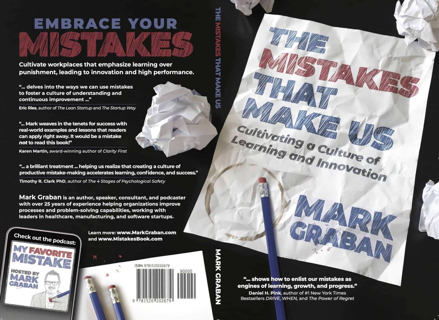
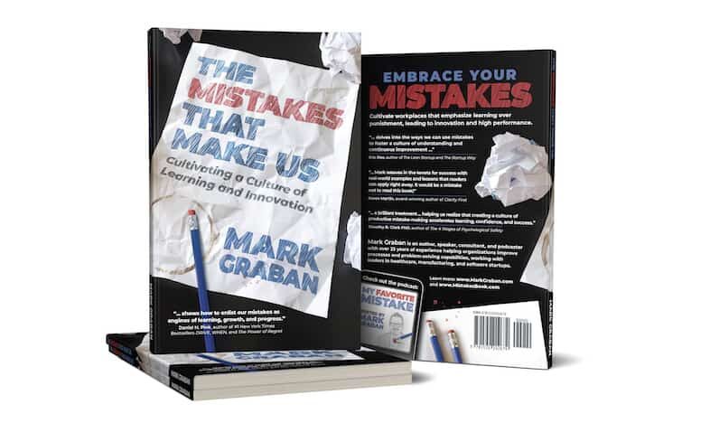
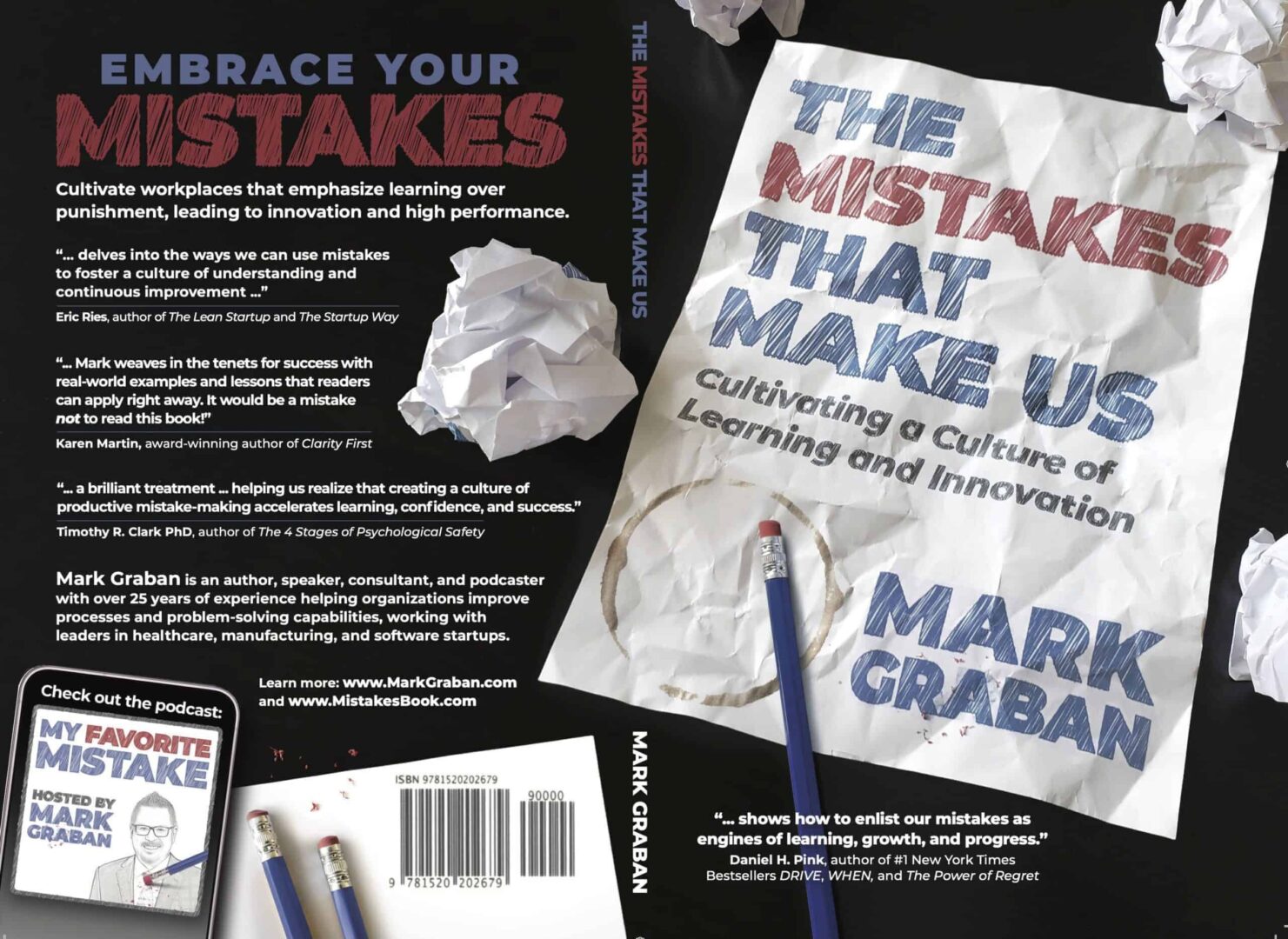
Below, you can see the full paperback book cover and how it wraps around from the back of the book to the spine to the front. The Kindle and eBook versions will have a front cover that's basically the same. I think it's pretty spectacular, and I credit Don for the concept and the execution. The iteration was definitely a collaborative effort.
I've known Don, the cover artist, since elementary school! He was a year ahead of me and we became close friends when we played drums in our high school's marching band. And we've been good about keeping in touch and catching up.
He's a professional graphic artist and design director, usually working on things more important than my little book. But he volunteered to work with me on this after first doing the cover artwork for the “My Favorite Mistake” podcast (which also creatively serves as the “author photo” on the back of the book).
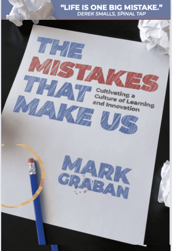
Knowing that the book is about learning from mistakes (accepting them, improving, and moving forward), there are elements of that visible on the cover. I think the book is about some pretty serious workplace topics, but I try to make it lively and fun — and I wanted the cover to reflect a book that can be light-hearted at times, as it's not a formal academic tome.
Chapter Seven in the book is titled “Iterate Your Way to Success.” I hope that's what we've done with the cover! At the very least, we've iterated our way to completion.
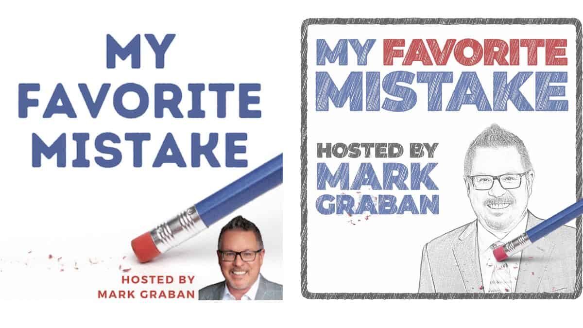
The “My Favorite Mistake” Podcast Logo
Don's collaboration with me actually started when he suggested an improved version of my podcast logo — far better when done by an actual artist instead of me.
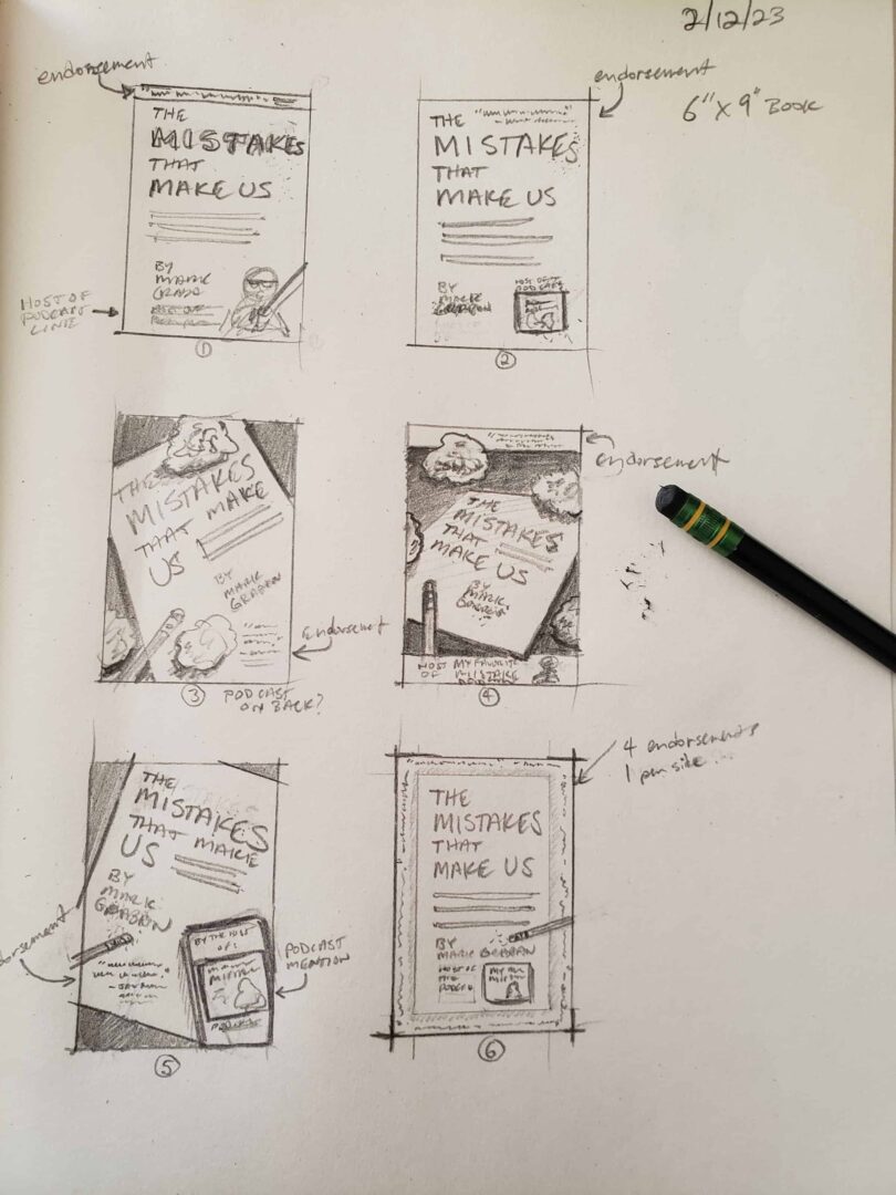
Original Pencil Sketches by Don Coon
When it came time to work on a book cover, my only direction to Don was to do something that evoked the podcast cover.
Don started with a set of pencil sketch concepts — a bit of visual brainstorming and an opportunity to see what we liked and what had potential. We could have gone in many directions.
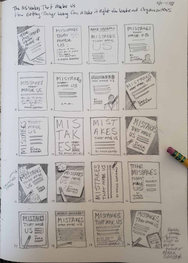
Getting input from some trusted advisors, we narrowed it down to a smaller set of options:
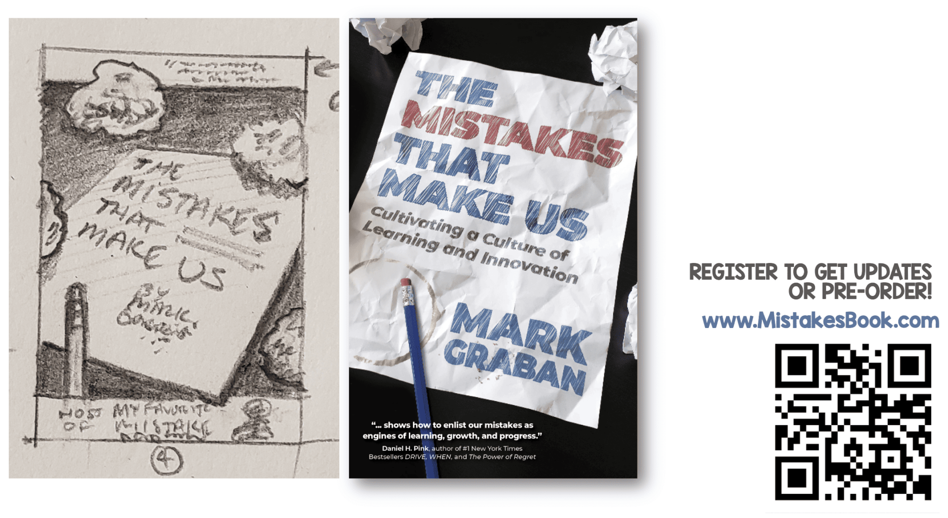
As you can tell, we liked the fourth concept and started to explore the design of the actual cover to be — through Don's use of photography. I'll go through some of the iterations, but here is the concept sketch compared to the “final” front cover:
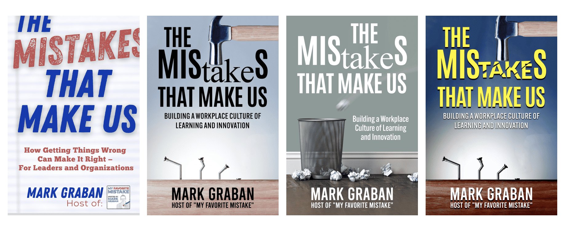
Covers By Others I Never Really Considered Using
Until I had a cover that had moved along enough through the design process, I needed something to use as a placeholder — even if I knew they weren't really under consideration.
On the left, I created something on Canva (with an older subtitle version). The next three were creations of people on Fiverr.com. I never really shared those other three. It was interesting to see what designers would come up with based on a description of the book.
The cover for my previous book, Measures of Success, was a collaboration with a designer on Fiverr.com. Pro tip: When working with designers, make sure you have properly licensed the images for use on a book cover and other commercial purposes. Doing that is far less expensive than a copyright claim.
More Iterations on the Chosen Design
You can see Don's original concept on the left, with the blue blurb bar at the top (say that three times fast).
The next iteration was shifting the subtitle down to fill some space below the title instead of being wedged in (lest somebody mistakenly read it as “The Mistakes That Cultivating a Culture of Learning and Innovation Make Us” (unlikely, but possible).
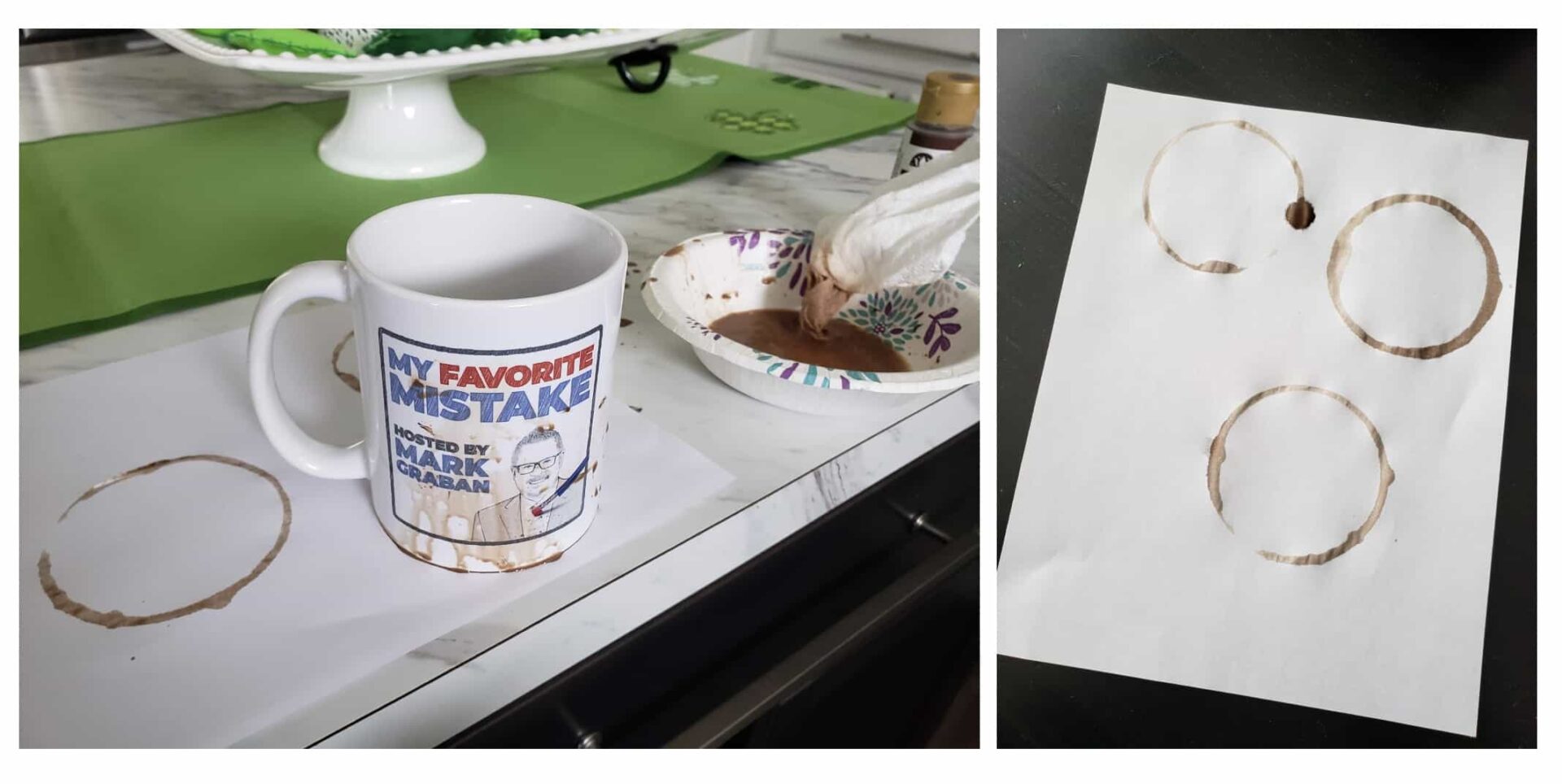
In the next iteration, the blue bar went away, and a coffee stain was added, at my suggestion — representing a mistake that an artist might make while working with a design on paper.
Here is my rough prototype of the coffee ring idea:
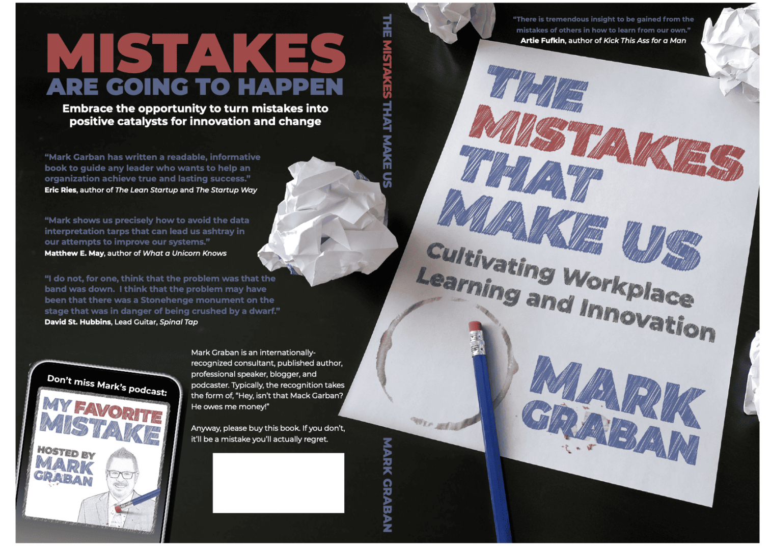
This was also the first time I saw Don's vision for how the front cover would wrap around the spine and the back, with placeholder quotes and text.
Most of the placeholder blurbs over time were quotes or references from our favorite movie, “This is Spinal Tap.” Don and I first watched this together on VHS tape while in high school, and it's, to this day, a common connection point between us.
You can see how Don had the idea of using the podcast image as my author photo:
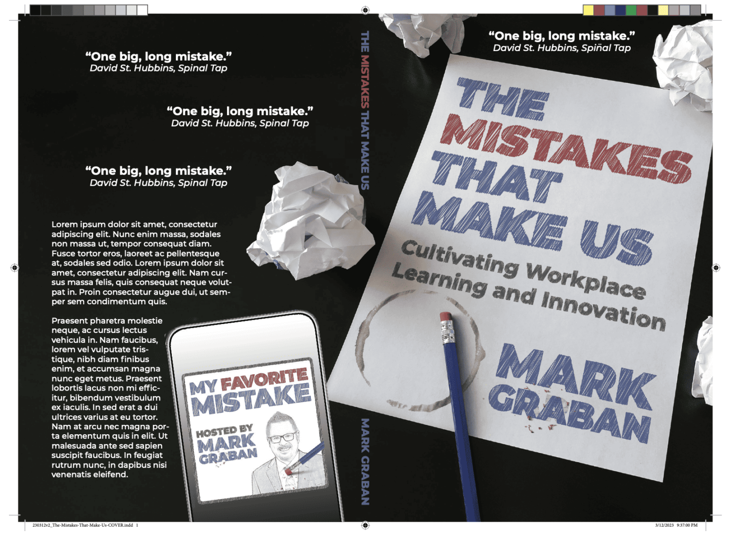
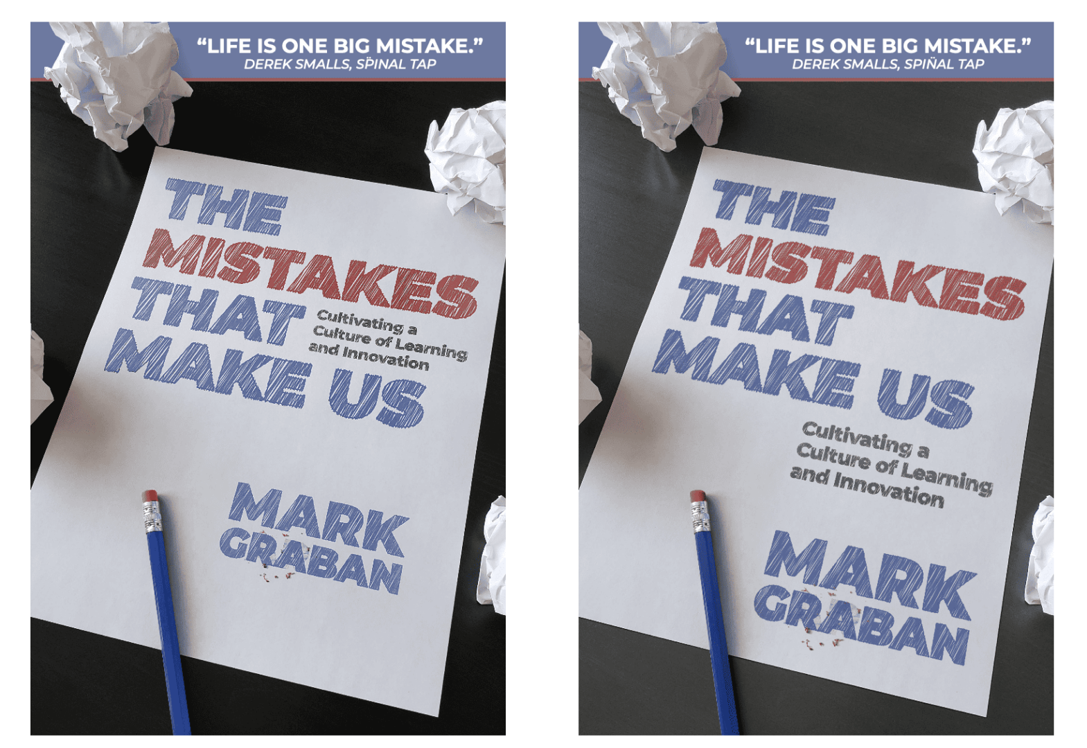
The next iteration moved the phone and podcast logo (to create space for the barcode), and the subtitle text became bigger.
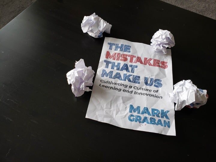
Next, I had an idea based on Don's crumpled-up balls of paper — what if the white paper was crinkled, as if it had been crumpled up and then, on second thought, uncrumpled because maybe that idea wasn't so bad after all. It's meant to represent some of the decisions we make during the creative process — is this a mistake or not?
Don was able to mock it up. It would be inexpensive to try. This did mean printing things out on paper to then crumple and de-crumple before taking a photograph. With the flat paper, Don was able to overlay digital text. But as I had finalized the subtitle, there would be less need for iteration and photo taking.
You can compare the difference here:
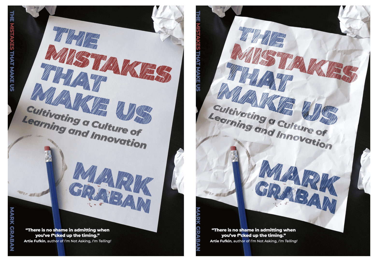
I love the crinkled effect and the shadowing… because, again, that's a photo of actual physical objects and not digital manipulation. Don did such a great job with this.
A few small iterations later on:
- What text goes on the back?
- What blurbs to use?
- What color should the various text elements be?
… and we were done!
Again the final version (or nearly so):
I've gotten a lot of really positive feedback about the cover. Then again, that's likely a biased sample since people who hate the cover might not want to say something.
I'll admit to having moments where I worried if the cover was too clever by half. But, I feel confident that it will look OK as a thumbnail on Amazon and I think it will look spectacular on the cover.
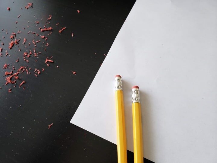
Oh, and I should have mentioned that I had many of these prototype iterations printed on a nice color photo printer to hold them in my hand at full size. I think that was more effective and helpful than just looking at them on screen would have been.
I hope you enjoyed my walkthrough of the experiments and iteration. If the cover is a huge victory… or a huge mistake… that's on me.
Behind the Scenes
I didn't share this in the LinkedIn Live event, but Don shared some “process” photos with me. I hope we will talk about this in a future video (which might be pre-recorded and made available on YouTube).
The original paper, the black table that's part of the book cover background… and yellow pencils. If I remember correctly, Don's only digital manipulation was turning the pencils blue.
Here is an angled photo of the field that Don photographed for the cover (which was done from a vertical angle).
The coffee ring on the cover is also not from digital clip art. Don used a My Favorite Mistake coffee mug I had previously sent him to create the stain ring.
“I was thinking about getting a stock coffee stain, but a custom one seemed like a better way to go, using your actual mug.”
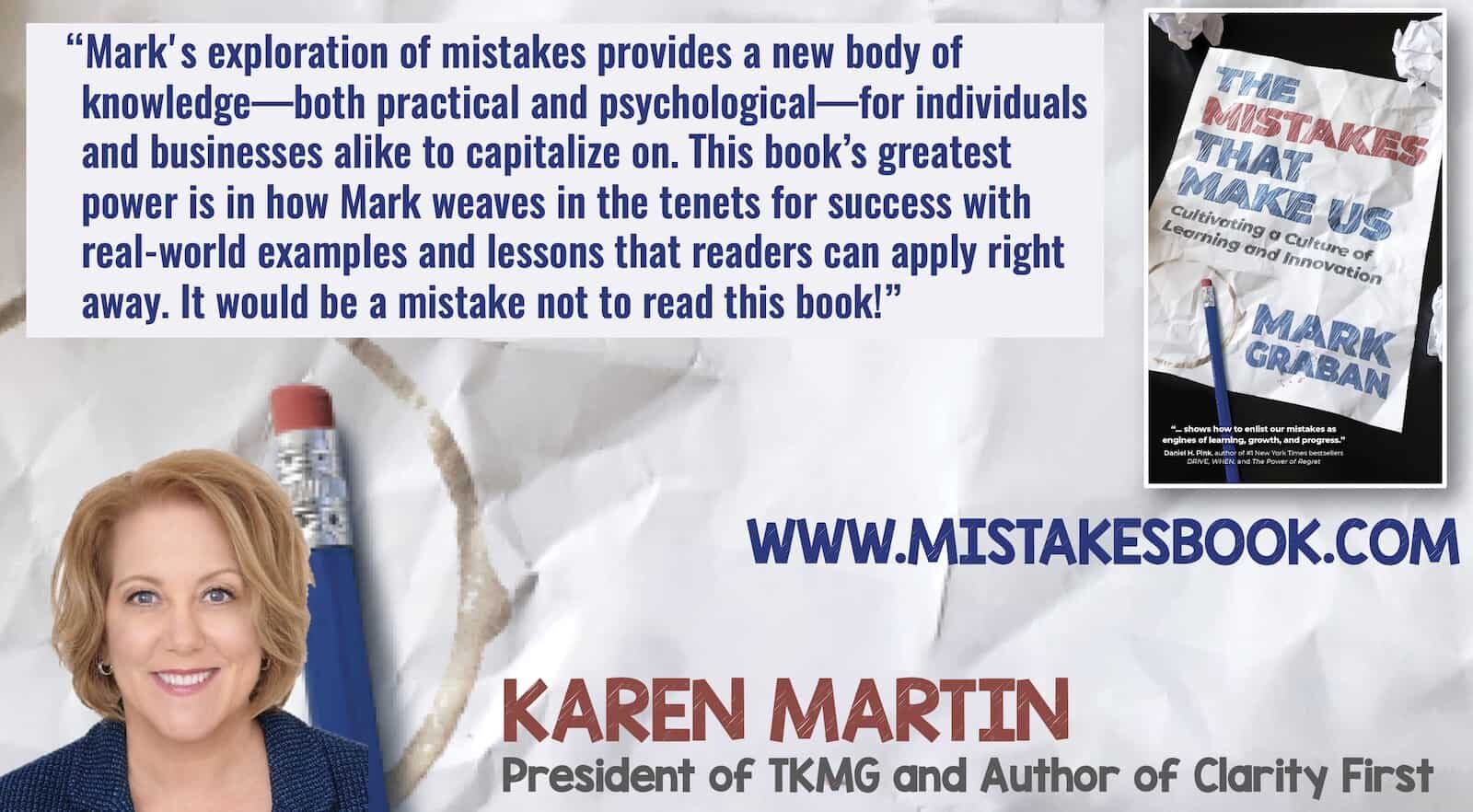
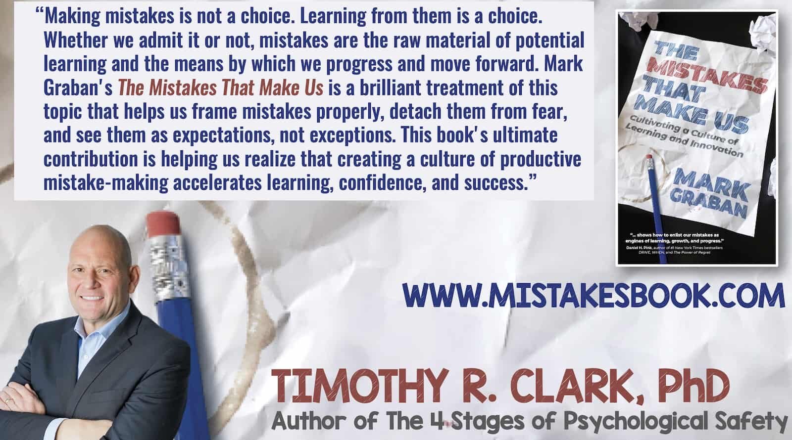
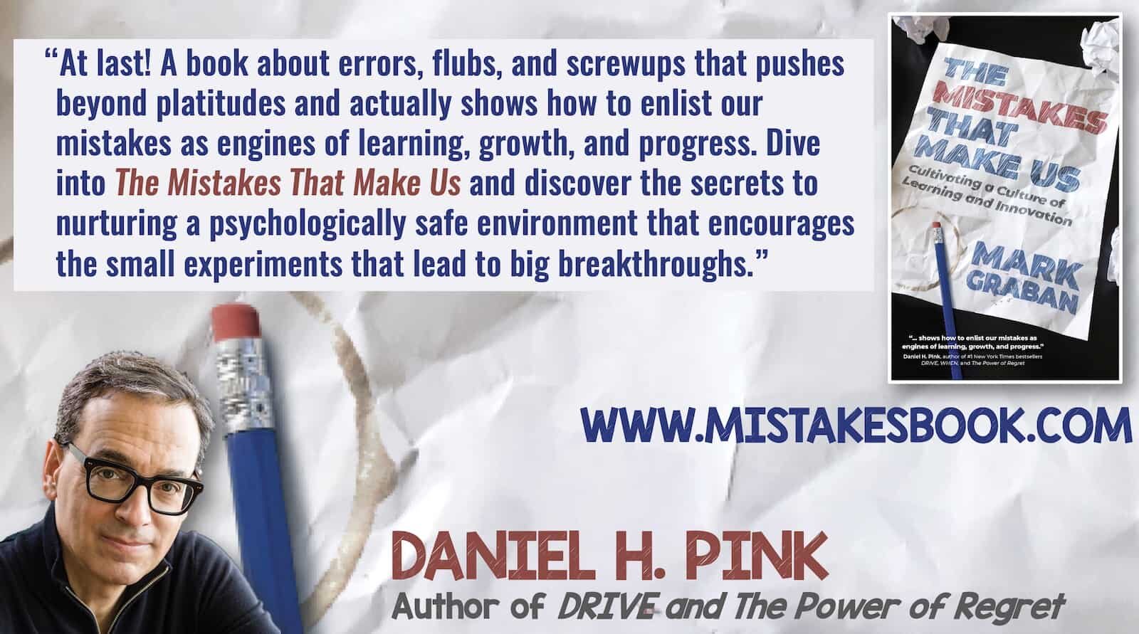
Blurbs
While I'm being self-indulgent in telling the book cover story, allow me to share a few blurbs about the book's content. Click on any of them for a larger view.
Please scroll down (or click) to post a comment. Connect with me on LinkedIn.
Let’s work together to build a culture of continuous improvement and psychological safety. If you're a leader looking to create lasting change—not just projects—I help organizations:
- Engage people at all levels in sustainable improvement
- Shift from fear of mistakes to learning from them
- Apply Lean thinking in practical, people-centered ways
Interested in coaching or a keynote talk? Let’s start a conversation.


