


I'm updating this post with data from the past two seasons, especially since Bryce Harper is considered to be a stong candidate for the National League Most Valuable Player award this year (2021).
He was widely considered to be a disappointment or a “bust” in 2019, his first season with the Phillies. I argued, and statistical analysis showed, he was merely more consistent. He didn't have the same “hot” stretches, or months with unusually high “OPS” numbers.
The Original Post From 2019
Here's a post about baseball… but it's really about statistics. Baseball has an endless supply of numbers and time-series data. This post is also about using Process Behavior Charts to evaluate performance over time.
Process Behavior Charts help us stop overreacting to every up and down in a metric, whether that's a baseball player's OPS (on-base percentage plus slugging percentage) or if it's a hospital's patient satisfaction scores.
Sports fans (and talk radio hosts) love overreacting to changes in a metric like OPS. Reacting is easy to do. Higher is better! Lower is worse! Oh, and many business leaders do this too.
But, a more important question is if those changes amount to “noise” (or routine fluctuation) in the metric or if the change is a “signal” that says the player's performance has changed in a significant way or a sustained way… or both.
One such player that people love reacting to is Bryce Harper, who signed an enormous contract with the Philadelphia Phillies this past off season.
I was reminded of him with this headline the other day:
Bryce Harper Reminding Everyone Why Phillies Were Right To Sign Him To $330 Million Contract
So far in August, Harper has his highest OPS of the season so far.
That much is obvious, even from a table of numbers:
| Month | Games | OPS |
| April/March | 29 | 0.878 |
| May | 28 | 0.811 |
| June | 27 | 0.825 |
| July | 22 | 0.847 |
| August | 17 | 1.022 |
Drawing a Process Behavior Chart with just these six data points looks like this:
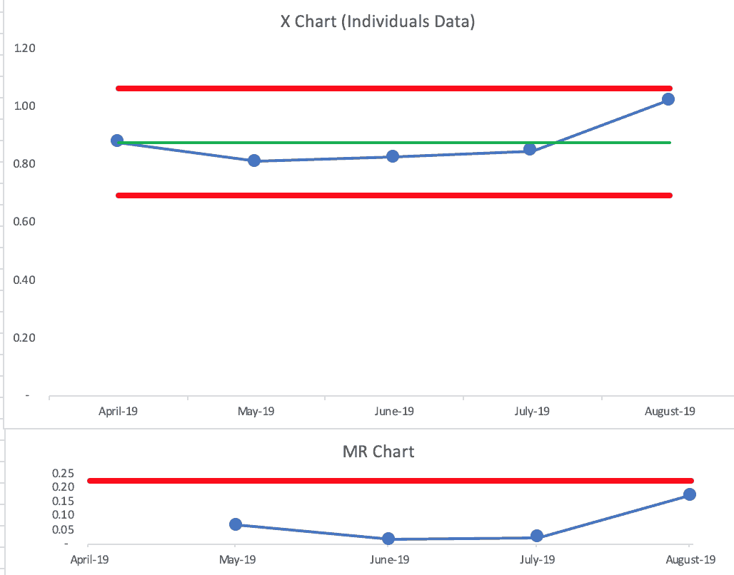
A note for those who know about Process Behavior Charts (or other forms of “control charts” or “SPC charts”), yes, you can create a chart with just six (or just four) data points. Tthe Lower and Upper Limits just aren't as valid as they would be with more data points.
There's no signal with the 2019 X Chart… no signal in the companion MR Chart. August is indeed higher, but it's not above the calculated Upper Limit. It's the highest this season, but it's not a signal.
Every metric has a “highest point ever” — that doesn't make it a statistically meaningful signal.
Embed from Getty ImagesTo put the data in
An article from just six days ago was still asking if he's a “bust”:
Is Bryce a bust? Not if you take Harper's word for it
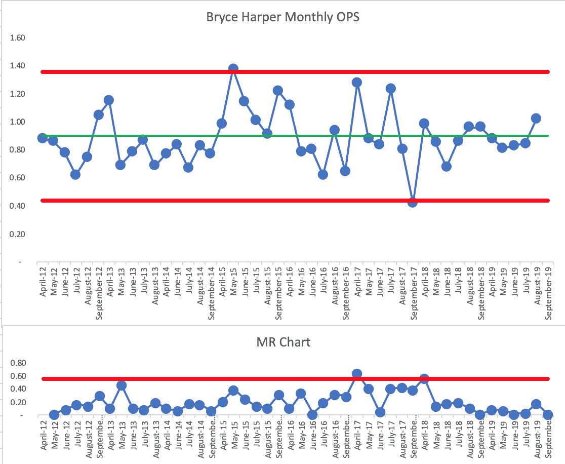
Instead of taking his word (or the local sports talk loud mouth's word) for it, let's look at the numbers. We can look at Harper's monthly OPS numbers for his entire career. That chart is seen below (using his first three seasons, or 16 data points, as the baseline for calculating the average and limits):
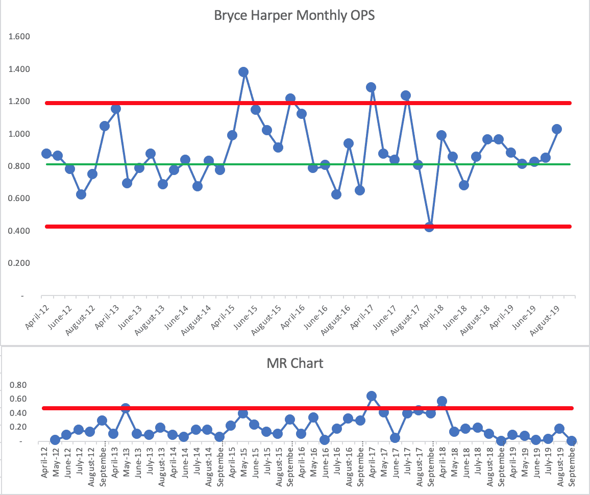
The chart tells us that Harper is an inconsistent player with high highs in some months and low lows.
His average OPS from his first three seasons was 0.812. You can see that his monthly OPS had been fluctuating around the average, but then his 2015 season (when he was the National League MVP) was clearly his best.
In 2015, Harper had two months above the calculated Upper Limit (what I call a “Rule 1” signal) and he had a cluster of three months that were closer to the Upper Limit than they were to the average (what I call a “Rule 3” signal). There were seven consecutive months that were all above average, which was one month away from being a “Rule 2” signal. 2015 was an unusually good season for Harper. The chart shows that much.
We see other signals in later seasons. I'll mark them below:
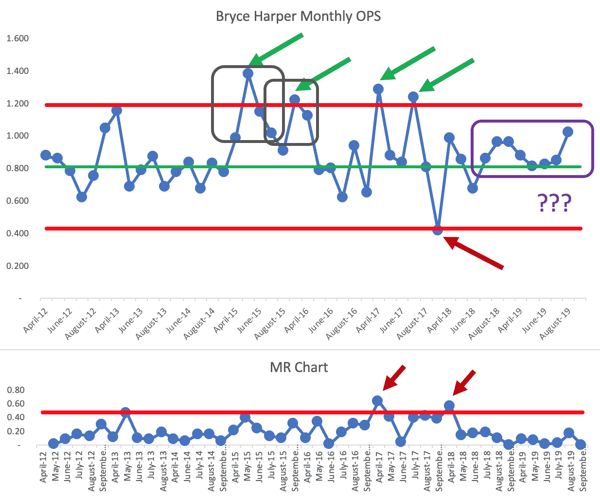
There are a total of four signals (you could call them “positive outliers”) where his monthly OPS was above the Upper Limit. In those months (and for that entire 2015 season), it would be fair to ask, “What happened? What was different for Bryce Harper?” Those data points are statistically unlikely to be random variation.
There are two grey boxes that show the Rule 3 signals. Harper had two positive outliers in the 2017 season but then September 2017 was his worst month ever and that OPS data point is just below the Lower Limit. What was different that month?? That's a month worth asking about. Was he injured?
Every data set has a “worst month ever” — and it could be a signal. The three rules tell us if we have a signal:
Looking at the MR Chart, there are two signals — the first caused by a huge INCREASE in OPS and the second caused by a huge DECREASE in OPS from month to month. Those are worth asking about — when we wouldn't ask why there were small ups and downs in the 2014 season.
Now, the last eight months for Harper, including the first five months of this year, appear to be above his baseline average. It's ALMOST a “Rule 2”
We could treat that as a signal… and I'd answer the question of “Is Bryce Harper a Bust?” like this:
- If you thought you were going to get 2015 Bryce Harper every year, you'd be mistaken… that season was an outlier for him.
- If anything, Harper is performing at an “above-average” rate this season and Phillies fans (and those who talk about the game) shouldn't panic. I would have drawn that conclusion before his high August month, even.
- His performance might even be shifting upward a bit… and getting more consistent than his earlier seasons.
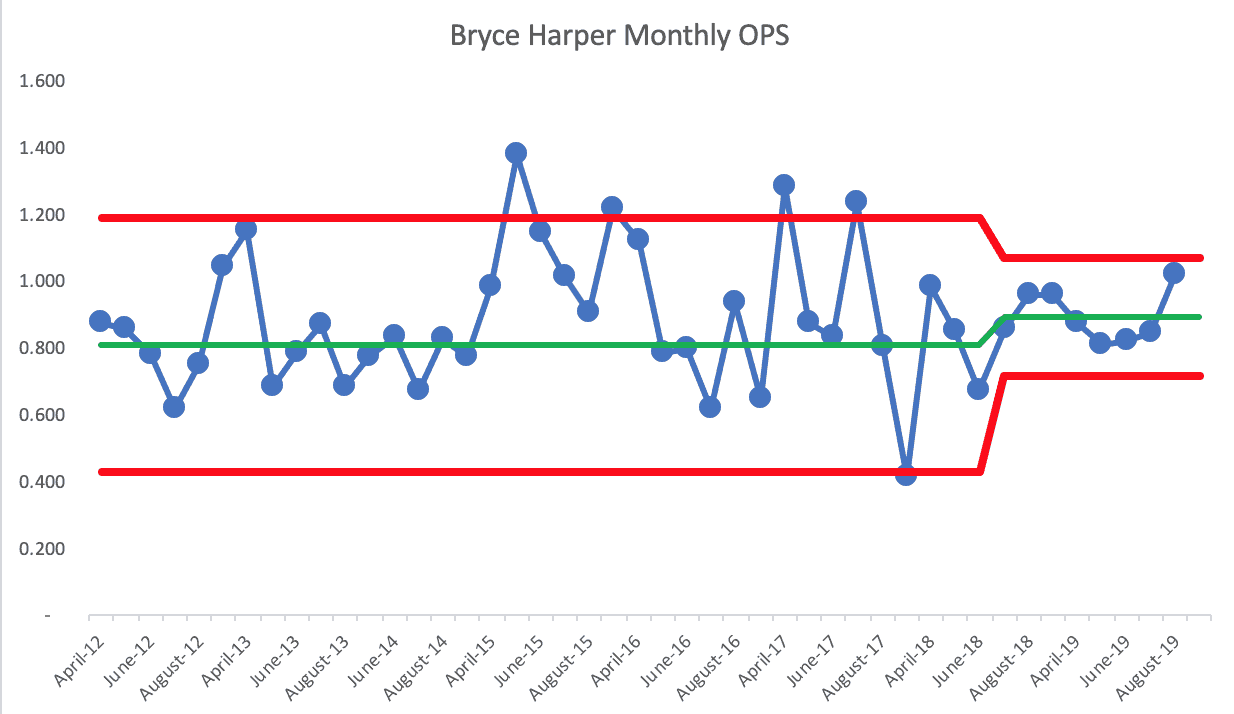
It's possible that we could shift the limits so that his future performance is predicted to be within this slightly higher, more consistent (less variable) range:
Even though the “bust” word was being thrown around, the first months of 2019 were above average for Harper.
As this headline from late April said:
Calm down, Bryce Harper will be just fine
And he is. And he was, even in April.
“Harper has gone into deep slumps any number of times over the course of his previous seven big-league seasons. He came out of them. He will come out of this one. When he does, and that is likely to happen soon, he can carry this team for two weeks.”
There's going to be variation in any metric. There's variation in any system. You wouldn't expect Bryce Harper (or any ballplayer) to have the same stats every month.
What did Harper's own words from that one article say?
“I'm not going to tell you I'm going to win MVP every single year. … There's going to be down years, there's going to be big years, there's going to be years that are just OK.”
Harper is explaining variation to us. He has such great talent, his high seasons are going to be phenomenally good. Does he have more of them ahead? Only time will tell.
If we used his ENTIRE career to calculate the average and limits, the chart looks like this:
We see the 2015 outlier data point… the point above the Upper Limit and the near-signal of seven consecutive above his career average. We now see nine consecutive below-average months early in his career. September 2017 was a negative outlier still.
But the story about this season and recent months is similar to the other PBC that used his first three seasons as the baseline:
- Four consecutive below-average months is not a signal or a trend (he wasn't a bust)
- This year, he's fluctuating around his career average and will likely continue to do so (yeah, calm down)
- The question remains — will he ever have positive outlier months or MVP seasons again? That's the $330 million gamble made by the Phillies.
Updates for 2021
I noticed headlines again proclaiming that Harper is “hyped” again, including:
Bryce Harper May Be the Most Hyped–and Underrated–Player in Baseball
I updated the Process Behavior Chart to include his monthly 2020 and 2021 OPS numbers (through the end of August).
The Process Behavior Chart looks like this:
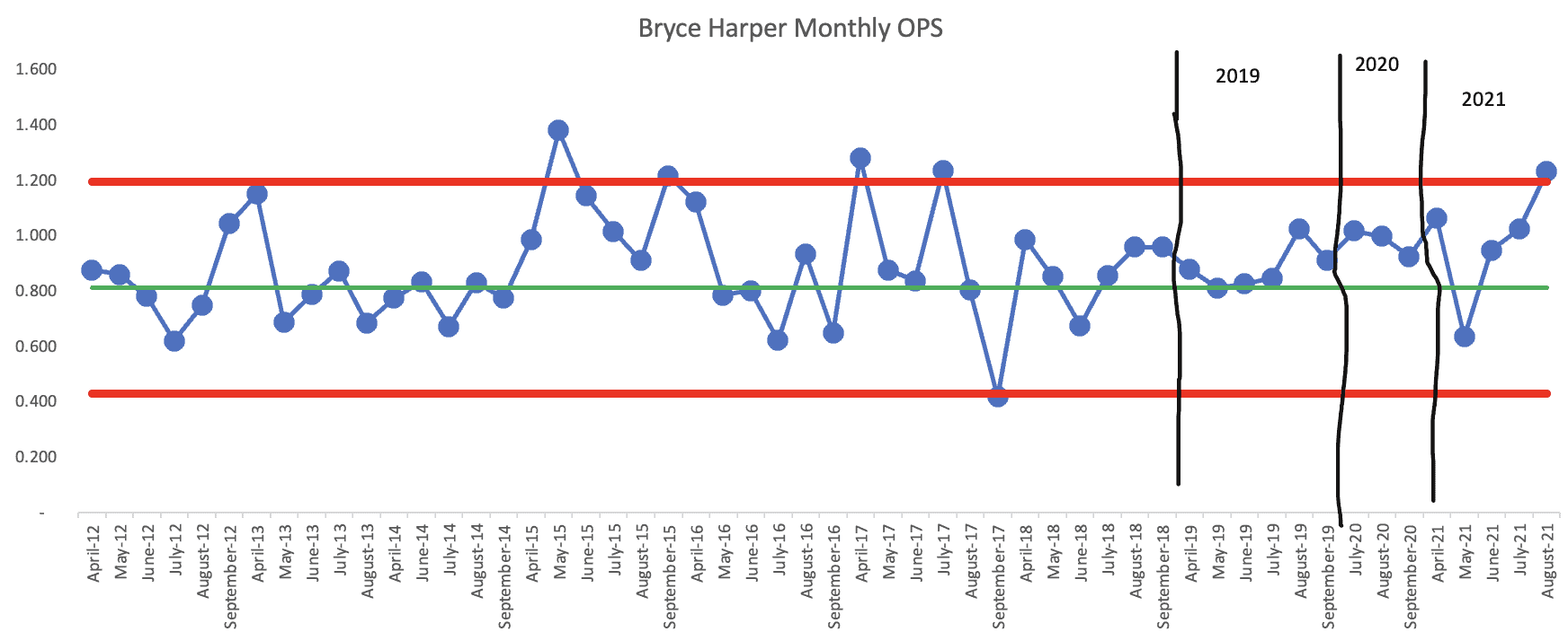
In the 2019 “bust” season, Harper's OPS was actually at or above his career average each and every month. But, fans (and the media) had been accustomed to his previous “outlier” months (data points above the upper limit).
In 2020, Harper performed even better.
In 2021, His May OPS number was below his career average. But August, where Harper started getting a lot of attention again was, once again, above the upper limit of his typical performance — for the first time since 2017.
Was there actually a shift upward in Trout's performance? From April 2019 through April 2021, it looks like Harper had more than eight consecutive above-average months, which would be one of PBC Chart rules that says “the system has changed, there's a shift in performance).
May 2019, his OPS was .811 and his career baseline average is .812, so it's technically not a “signal.”
But, for anybody who worried that Bryce Harper was no longer the same player as he had been with the Nationals, my conclusions are that he has been more consistent… and he is probably better. The Phillies shouldn't regret their investment.
From 2019, Updated for 2021: Comparisons to Mike Trout
If we look at the career of Mike Trout, a very comparable baseball superstar, we see that Trout is more consistent… but, again, there's always variation:
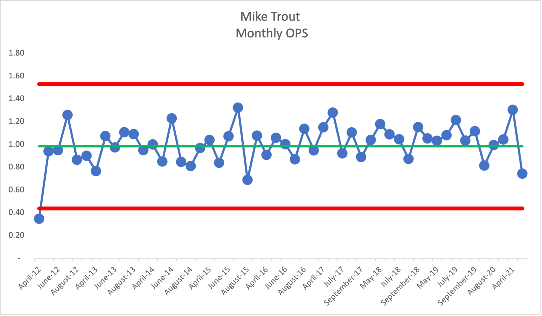
Trout has a much higher baseline average OPS at 0.984 (calculated from the first 24 months of his career).
The only signal there was the first month of his career… beyond that, he's predictable… within a range. Ten of his last eleven months are all above average, so that could mean that Trout's performance is shifting upward a bit, as is Trout's. It's not technically a Rule 2 signal, but it also doesn't look like random fluctuation. It's scary, but Mike Trout might be getting better.
Trout has higher performance… and more variation… but it's more consistent variation compared to Harper.
Embed from Getty ImagesHere's my spreadsheet with Harper and Trout analysis (via Dropbox).
Comparing to Albert Pujols
It's perhaps more difficult to predict future performance in sports because the system is changing in various ways… players get older, teams change their pitching and defensive strategies against a player (such as employing defensive shifts more often).
Embed from Getty ImagesA Process Behavior Chart showing the yearly OPS for the great Albert Pujols shows a marked shift downward starting in 2011 or so.
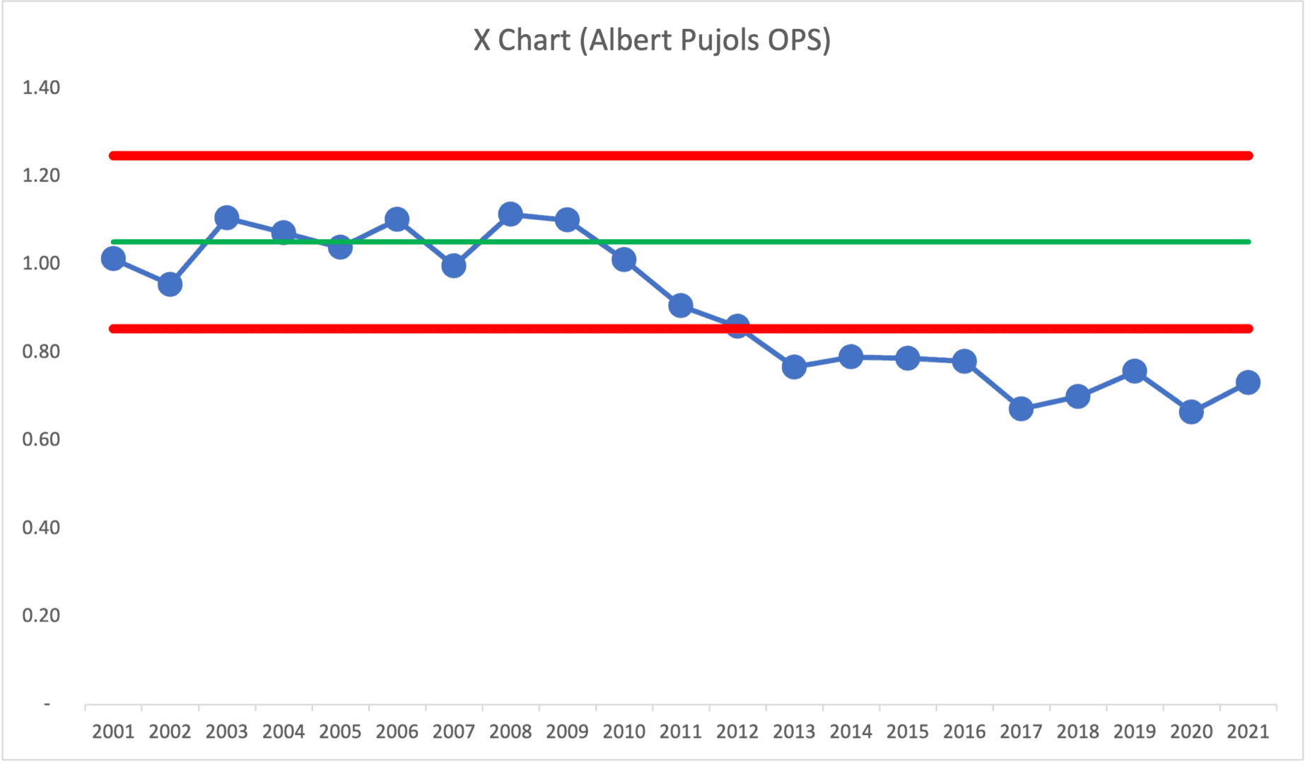
From the first ten seasons of his career, he had an average OPS of 1.050. That stat, sustained for an entire career, would have put him in the top ten of all time (along with Mike Trout). But he's now dropped to 38th of all time — still in the company of Hall of Famers (which he will be).
The PBC would have predicted that his OPS would continue fluctuating between the calculated Upper and Lower Limits. But, some blame the defensive shift for changing the system, making his performance change from the previously predictable pattern:
How the shift has ruined Albert Pujols
That change to the system (the infield shift) led to an apparent SHIFT downward in his OPS performance… that seems to be a clear (or believable) cause-and-effect relationship.
We'd no longer predict that his OPS would fluctuate around 1.000… it's been fluctuating around 0.750 in recent seasons. Again, he's probably still a Hall of Famer… but the decline is noticeable in the chart… not a steady decline, but a step function downward. The Albert Pujols of the last nine seasons is not getting the same results as the Albert Pujols of his first ten seasons.
His performance would likely remain in that lower range, unless MLB bans the defensive infield shift (as they're piloting in the Atlantic League this year). Pujols would have wished they made that change to the system a decade ago. Then again, the article quotes Pujols talking about how he refuses to change his approach to hitting… when the system around you changes, sometimes you have to change too…
Here is the Pujols data and my spreadsheet if you want to play around with it.
What are your thoughts about any of these players and how this analysis applies to some of your workplace metrics?
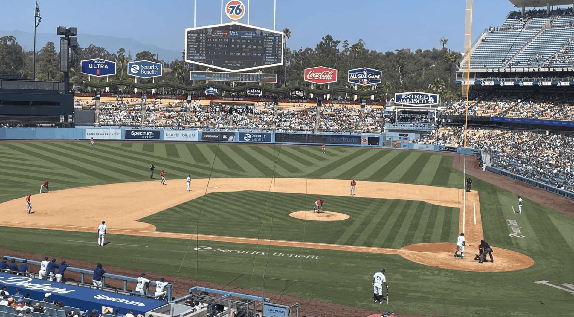
Note: I did get to see Pujols hit a home run for the Dodgers this season!
He's in the on-deck circle in this photo that I took:
Please scroll down (or click) to post a comment. Connect with me on LinkedIn.
Let’s work together to build a culture of continuous improvement and psychological safety. If you're a leader looking to create lasting change—not just projects—I help organizations:
- Engage people at all levels in sustainable improvement
- Shift from fear of mistakes to learning from them
- Apply Lean thinking in practical, people-centered ways
Interested in coaching or a keynote talk? Let’s start a conversation.


Thanks Mark for another interesting example to learn from. Pro sports examples are great for explaining and understanding lean concepts, or at least have been for me. In Harper’s case with data from 2012 to 2019, a lot of insights seem to depend on the timeframe over which you calculate the average and limits. For the big question about his recent performance being worth the big contract, I’d want to compare the most recent year or two to the period 2015-17 when he had outstanding numbers and won the MVP, which is what earned him the big contract. You could make an argument that his performance leap in 2015 came after working out the jitters from joining the majors, stabilizing his swing under new coaching. It looks to me like an increase in both average and variation from 2015 to 2017, so I’d be curious to see that with separate limits in the chart, so that I could then compare that with 2018-19. Comparing recent performance to data that includes his first few years doesn’t seem as relevant as using the strong MVP-level performance in 2015-17. This might yield different conclusions about his performance this year being contract-worthy or not. I wasn’t able to download the data from Dropbox unfortunately or I’d try it myself. Could you send it to me?
Hi Tom – Thanks for reading and commenting. I sent you the file. I’m guessing that Dropbox was blocked at your workplace?
You’re right that the time we choose for the baseline matters. As Don Wheeler said to me recently:
Generally, I’d choose the “first X” number of data points as the baseline. You could use ALL data points. Either way allows us to test the hypothesis of, “Is there a single predictable system over the timeframe or not?”
We could go back and tweak the limits… but I think there’s minimal value in doing that as a retrospective. The one question that a Process Behavior Chart answers is, “What is the range of predicted performance in the future?” The single set of limits on my last chart is valid for predicting that… performance will remain predictable until it is not… and the PBC and the rules for signals tell us when that might happen.
Thanks for sending the file. I’ll share what I found so far, based on what I was thinking and said in my comment. 1st, going on the signals in early 2015 and assuming this was a change in performance (OPS), I calc’d new limits from 2015 to 2019. Using this I see no signals from 2015-19, from which we could say he is worth the big contract since performance in 2019 is predicted by his 2015-2018 stats. Do you agree?
The only visual difference is as you suggested in the blog, that he’s gotten way more consistent vs. 2015-17, starting in 2018 (are there any PBC signal rules for change in variation?). Did he change his approach, or did coaches try to get him to be more consistent, preferring that over the big monthly swings up and down? This raises an interesting discussion about average vs. stability, doesn’t it? What would a team manager or owner rather have, the big highs and low swings, or consistency?
If you take that further, and assume he did make a change in his approach in 2018 to get more consistent, then we can look at that with new limits again starting in 2018. It shows a slight decrease in average OPS came with greater consistency. The Money Ball stat gurus could probably tell us whether the much increased consistency pays off vs. the slightly lower average OPS. Again, no signals in the X chart, maybe a signal in the MR in April 2018 but it’s probably just end of a long ‘17 season (or injury) vs. start of the 18 season when he’s fresh and healthy.
Thanks for sharing that. I’d say future performance is predicted… within that wide range. Then again, the first eight data points after the shift (save one just below the average) are above average… so it’s not the most random of fluctuations.
I think your last chart with the shift back down and narrower limits is probably the better predictor of future Bryce Harper performance. Yeah, I’m guessing he was battling some injury in Sept 2017.
Short term variation… I saw the Phillies play last night and he struck out to end the game…
He put up numbers on offense, but he’s also getting paid a lot of money. Harper is getting paid to play a lot better then he did, and that is a fact. His team also was in a playoff race, when your team is in a playoff race you need your star players to really step up to the plate and he did not.
Here is an updated chart for Bryce Harper’s season-by-season OPS… 2018 and 2019 were barely below average for him. 2020 was better than average. Each season was noise in the system…
Looking at the monthly chart (the 2020 season added only 3 data points), he’s arguably on an upward trend, with a “rule 3” signal being found (3 of 4 data points closer to the upper limit than the average):
Arguably, he is getting better… the opposite of being a “bust” in 2019.