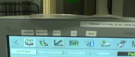
 I know this picture is a bit hard to see, but here's one for you software folks out there.
See the icons on the top of the screen? The developers got cute and put in little icons to represent common functions. The problem is, people couldn't figure out the icons, so someone took a label maker and put words on the monitor. The grouping of test tubes, of course that means “Patients”. The cute chart means “Calibrate”, of course.
I'd say this isn't very “lean” software, if I can use that term. I'd say icons and elements on a screen should follow the rule of Visual Controls in a lean setting: the visual controls should be clear and obvious to an outsider. That means using abbreviations or symbols that the average person can understand. 
Please scroll down (or click) to post a comment. Connect with me on LinkedIn.
Let’s work together to build a culture of continuous improvement and psychological safety. If you're a leader looking to create lasting change—not just projects—I help organizations:
- Engage people at all levels in sustainable improvement
- Shift from fear of mistakes to learning from them
- Apply Lean thinking in practical, people-centered ways
Interested in coaching or a keynote talk? Let’s start a conversation.


![When Was the Last Time a Leader Around You Admitted They Were Wrong? [Poll]](https://www.leanblog.org/wp-content/uploads/2025/07/Lean-Blog-Post-Cover-Image-2025-07-01T212509.843-238x178.jpg)


![When Was the Last Time a Leader Around You Admitted They Were Wrong? [Poll]](https://www.leanblog.org/wp-content/uploads/2025/07/Lean-Blog-Post-Cover-Image-2025-07-01T212509.843-100x75.jpg)

Good one! I submitted it to the ThisIsBroken (http://www.thisisbroken.com/) obviously citing you as the source.
wow, that’s scary. can’t say I haven’t experienced the same frustrations a time or two myself (e.g. function not popping up after resting the cursor over it etc). Seems that many interface designers are into the creative rather than utility aspects.
Interesting, but common. Even modern enterprise resource planning programs are slow to adapt lean concepts. It makes you wonder how much time is wasted and errors introduced into the process when programs like this are put on the plant floor.
Bad Mieruka! :/
Bad visual controls are a common element in many lean manufacturing software programs. Visual controls need to be clear and concise to help eliminate waste and costly steps in the process. The key is clear communications that eliminate waste. I found this company Premier Autoworkers to be at the forefront of visual controls for lean manufacturing. They have im plemented visual control programs for General Motors that are saving GM millions.
[…] Bad Visual Controls Example: Software via Lean Manufacturing Blog. Funny example. If I had to use it I might use a different adjective. […]