What’s Demoralizing? The Colors on a Chart or Not Improving the System?
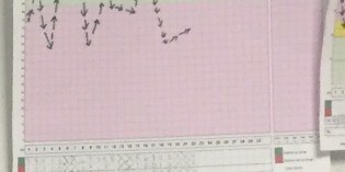
I forget what hospital these charts are even from, but it doesn’t really matter. It’s become more common, in my gemba visits, to see hospital departments charting metrics. They are often part of “huddle boards” that teams gather around on a daily basis (or, ideally, each shift). It’s good to see daily metrics, as opposed to monthly averages, since it’s better to have something closer to “real time” data — if you react and respond … Continue reading What’s Demoralizing? The Colors on a Chart or Not Improving the System?
11 Comments