Why Process Behavior Charts Show So Many Points Outside the Limits (and Why That’s Not a Problem)
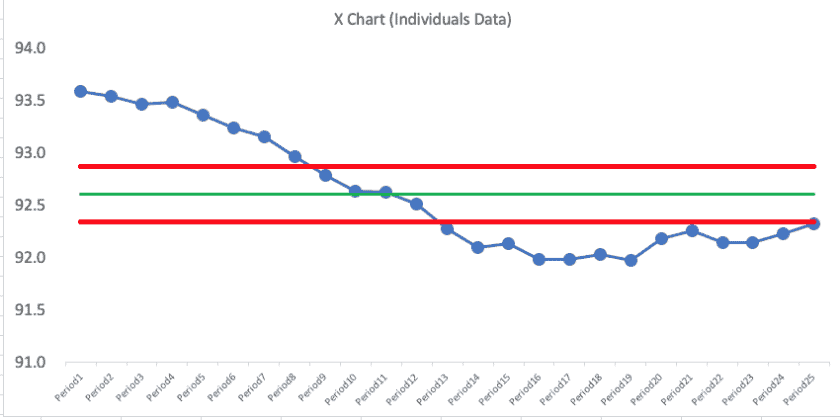
tl;dr If a Process Behavior Chart shows many points outside the limits, the issue is often the data–not the chart. Plotting moving averages instead of actual data distorts variation and creates false signals. Process Behavior Charts work best with raw, time-ordered data, where limits correctly separate noise from meaningful signals. Don’t adjust the math to “fix” the chart–fix what you’re plotting. I got a message from a reader of my book Measures of Success: React … Continue reading Why Process Behavior Charts Show So Many Points Outside the Limits (and Why That’s Not a Problem)

14 Comments