If you’re not a baseball fan, I apologize for a second baseball-themed post this week. Baseball has a lot of historical time-series data to work with and analyze. If you’re not interested in “Process Behavior Charts” or similar methods, I guess I will apologize for this post again too. Next, I’ll be apologizing for apologizing.
But, I am at Dr. Wheeler’s four-day workshop on “Understanding Statistical Process Control” as I blogged about on Monday.
It’s great to learn from Dr. Wheeler in person and I’ll be sharing reflections on the class in a later post (and I’m posting a few things on LinkedIn along the way).
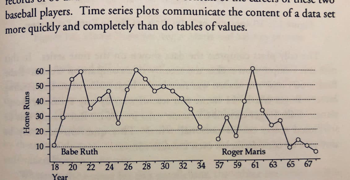
In Chapter 1 of Understanding Variation, Dr. Wheeler points out how charts or graphs are far superior to tables or lists of numbers. He uses a baseball example: