

I do my best to practice what I preach. I'm not perfect, by any means, but I'm pretty good about practicing the “Kaizen” style of continuous improvement that's any or all of the following:
- Self-initiated
- Done to make your work easier
- Small and non-bureaucratic
- Customer focused
- Low cost, putting creativity over capital
Since this blog is part of my own company, I can't blame a boss for not letting me do Kaizen. And, I'd better not claim “lack of time” as an excuse. It's my job to make time.
Here are a few recent examples of Kaizen improvements related to my websites and work.
LeanBlog.org – Forwarding From My Old Site
When I started this blog in 2005, I used the free Blogspot (later renamed Blogger) platform and used the URL http://kanban.blogspot.com. I later used Blogger with the domain leanblog.org.
For a number of reasons, I switched to “self-hosted WordPress” as a platform, with a new design, back in 2009.
I had help moving the old Blogspot content into WordPress. But, I left the old content up at kanban.blogspot.com for a couple of reasons, including:
One: Images on some of those Blogspot posts didn't get moved over to WordPress, so an old post on LeanBlog.org might load images from Blogspot. This isn't ideal, but it works — the images load and the user probably doesn't notice. I have to just hope that Google doesn't shut down the Blogger service at some point.
Two: Some blogs, including John Hunter's “Curious Cat” blog linked to posts at the old kanban.blogspot.com address (see this post for an example)
I told Google to stop indexing that old site so it wouldn't turn up in search results – only the new site would.
To steer users to my new leanblog.org URLs, the best solution I could come up to forward users wasn't ideal at all.
I give a hat tip to John Hunter for pointing out that my solution wssn't a good user experience for people trying to follow a link from his site to my older content.
With a Kaizen write up, whether we use a PPT template or software like KaiNexus, one thing we write up is the before and the after. I'll just do that simply below.
BEFORE: If somebody linked to a blog post on kanban.blogspot.com, after a brief display of a page saying “Old Lean Blog – now at LeanBlog.org,” they would be automatically forwarded to a “welcome” page on LeanBlog.org saying “please search for the post using the search bar. Many users might not do this and they wouldn't see my content. While I got them to my new site, they might be annoyed and never come back.
AFTER: I found a WordPress plugin that generated code that I could install on my old Blogspot site that would forward users to the exact post on the newer LeanBlog.org site. The old Blogspot URLs end in “.html” and WordPress doesn't use “.html,” so the plugin makes that conversion in addition to pointing to leanblog.org. Try it by clicking on this link — you'll be forwarded: http://kanban.blogspot.com/2007/03/how-about-partnership-instead.html
EFFECT: John will be happier. His readers will be happier or less annoyed with me about my old poor attempt at forwarding traffic. Other old links on the internet will work better. This might be good for my “SEO” or “Search Engine Optimization.”
This Kaizen cost me nothing other than time, about 30 minutes of research, changes, and testing.
In the Kaizen process, we follow what's sometimes an iterative Plan-Do-Study-Adjust cycle. If we “spin the PDSA (or PDCA) cycle,” as they say in Japan. We might not find an effective solution on our first try.
My cycle was:
Plan: Do some research through Google and blog posts. Find a plugin that might work. I wasn't worried about finding the “best” plugin… just find something that might work.
Do: Try the plugin…
Study: I couldn't make it work, either through my error or some other reason.
Adjust: Try a different plugin…. Plan (find a new approach), Do (install and configure), Study (it works!), and Adjust (no, it's good).
Kaizening the Japan Lean/Kaizen Tour Page
As I've blogged about, I've visited Japan twice with Kaizen Institute and we're going again February 26 to March 3 (learn more about the trip if you'd still like to join us).
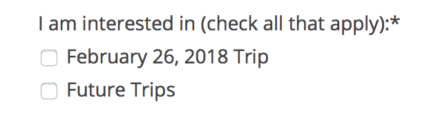
On my JapanLeanTrip.com site, there is a “Contact” page that said:
“Please fill out this form to receive more information about the Lean Healthcare Study Tour to Japan in February 2018 (or future trips), organized by Kaizen Institute.”
When people filled out the contact form, I'd have to ask them via email “are you interested in the February trip or future trips?”
After doing this a few times, I thought, “Duh.” It's OK to “duh” yourself, I think.
I should built that question into the contact form!
That part of the form now looks like this:

Some people check one or the other, some check both.
My Kaizen summary:
Before: The contact form was vague. Are they interested in future trips or the next one? I have to email them to find out.
After: The contact form is more clear. It saves me time and I don't have to ask the person via email.
Effect: Time savings all around. Less annoyance on the part of people who want information.
With Kaizen, we often do “Kaizen upon Kaizen.” One improvement leads to another.
I realized that the form could be more clear about the “check all that apply” nature of the checkboxes. It's possible that not everybody knows you can check multiple options. A “radio button” choice is “choose one,” but again, it's possible not all users know this.
So, I made another Kaizen on the form:
Before: It's possible that people think they can only check one option.
After: Added text that says “Check all that apply,”
Effect: Clearer communication.
That part of the form now looks like this:
Those changes took just a few minutes. Kaizen!
Lean Hospitals Website
Sometimes in the practice of Kaizen, we're inspired by others. Or we just copy their idea because it also seems like a good idea for us.
I saw this tweet from Catalysis last week:
Here are three of the dozens of questions from the Book Club Guide to "Management on the Mend," 1. What is the pre-work for mending management? 2. Why does he state that it is necessary? 3. Who needs to change? https://t.co/TyyNO98Fka pic.twitter.com/6XMW2tZSvF
— Catalysis (@HCValue) January 19, 2018
They are offering a free “Book Club Guide” (free PDF) with discussion questions related to Dr. John Toussaint's book Management on the Mend (listen to my podcast with him about the book).
I thought, “What a great idea!”
My book Lean Hospitals has group discussion questions at the end of each chapter. I know people also do “book clubs” and discussions around my book.
Why not put all of those questions into a single document that might be easier to work from? So, I created that and posted it on my site.
Before: Discussion questions were in the book at the end of each chapter.
After: Created a web page and a PDF.
Effect: Might help facilitate the book club discussions. Happier readers? There might be SEO benefits to me having that content out on the web.
Now, this wasn't a change that I ran past any customers. It was easy to implement, so the worst thing that happens is nobody reads the page or downloads the document. I'm willing to take that risk. Better to try the idea in practice than to agonize about it too long.
If I wanted to measure the impact (which might not be worth the effort), I could look at measures, including:
- The number of people who access that page
- The number of times that PDf is downloaded
- General web traffic on the book's website
- The number of books sold
But, it just seemed like the right thing to do… or at least to try. I don't require an “ROI” on each of these Kaizens.
Other Kaizen Opportunities?
Maybe you see continued Kaizen opportunities there or with the blog.
Feel free to post a comment if you have ideas or suggestions. Or, even if you just have “problems” that I could try to solve with my sites.
Thanks!
What do you think? Please scroll down (or click) to post a comment. Or please share the post with your thoughts on LinkedIn – and follow me or connect with me there.
Did you like this post? Make sure you don't miss a post or podcast — Subscribe to get notified about posts via email daily or weekly.
Check out my latest book, The Mistakes That Make Us: Cultivating a Culture of Learning and Innovation:


")


Mark, Glad you liked our SM post about the book club. Having healthcare leaders all thinking about improvements can be a very good thing.
Thank you for sharing, Mark. I, too, started with Blogger and soon became convinced of the merits of WordPress for my site – much more user friendly and allows for more content.
Good job actually practicing what we recommend others do (kaizen, customer focus…). More management consultants need to do so. I found another thing I think can be improved. If there is a way to put a image in a comment I don’t know how, so see:
https://evop.blogspot.com/2018/01/creating-web-sites-that-are-reliable.html
Edit:

The screenshot of what I see when viewing your site shows how a floating box (to the left of the screen) blocks the main content. That covering box moves as you scroll the page so it is always covering part of the content.
One of the big problems I see are web sites designed to look nice for the conditions that the designer has (perhaps huge screen, perhaps no latency (which can mask code issues for users that have high latency internet connections). It is one thing, for a blog from 1 person to have less than ideal usability for a wide variety of user views. I can completely understand that. Granted I do believe those of us that encourage others to continual improve also need to do that ourselves. What I can’t accept is how many web site with huge budgets have very poor coding that results in many users (given the very large user base) have to suffer from bad usability issues.
Those big budget sites should know better than to code in a way that fails to understand basic web concepts such as the extremely wide variation in how users will view the web site (screen size, operating system, browser, window size, font size preferences of the user…).
We have an epidemic of bad coding practices that result in failures which then are excused by those responsible as edge cases. Good coding practices would avoid the errors. But instead we code using needlessly complex and error prone ways and then say that we can’t deal with the edge cases that only impact a few people. The problem isn’t that those few people are requesting some special feature. The problem is the practices used are creating solutions that look nice for some subset of cases but that are not acceptable for other users. Coding with the entire user base in mind from the start would avoid any need to treat those “edge cases” that were only made into edge cases because the coding solutions are not designed for the entire spread of variation in users needs.
The most cost effective and reliable way to deal with this is often to just avoid extra complexity. Having the popup box with additional content can be cool and it can be coded in ways that don’t create the issue I see here. But to do that in a way that doesn’t create bad usability for some users is complex. Sometimes you can rely on fancy WordPress themes that have properly dealt with all those complexities. But in my experience, that is very rare. They do ok with a large set of the users but create really bad usability issues for users that don’t fit what they considered the normal use case (and created “edge cases” that have bad usability). Or if you are a big budget site you can try to code all the extra complexity yourself. That can be done successfully but I find it fails often. They create fragile systems to deliver and then are overwhelmed at how to deal with all the users that done fit in and just decide to let those users suffer.
Thanks, John. And thanks again for the prompt to improve.
You can use HTML tags in a comment. You can’t upload a photo but you can use the IMG tag to embed an online image into your comment. I added the image to your comment.
I don’t know why that box (which is part of a drop-down menu from the site) appeared and wouldn’t go away. I’m not sure what causes that (and I don’t have a big budget). Does that happen every time, John?
> Does that happen every time, John?
Hmm, it isn’t happening now. I guess it was a weird glitch (those can happen). So I would guess that is what it was some odd case where the bit of code that created that popup box and normally closes it somehow got messed up. I can see now it also somehow moved from the middle right of the screen to that left spot for some reason.
I was thinking it was one of those left aligned blocks that is suppose to scroll up and down with the content (they are often used for social network buttons and often can end up blocking part of the content). They are meant to be over the white space but the code isn’t good enough to figure out when it is over the content. I was thinking what I captured above was something like that – instead of just some weird glitch that doesn’t usually happen even with the setup that resulted in it happening to me once.
FYI, I just checked and that “more stories” box on the right that does appear over the white space (and disappears when the page is scrolled to where that column has content – at least for me it does). If you shrink the browser window (from my current settings) it does then overlap the main content area. It does a pretty good job of adjusting the main content to fit in a smaller space until if finally gives up. It does so at a pretty narrow width so I doubt many users would ever experience the problem – assuming it is smart enough not to show it on smartphones… which I would imagine the code is smart enough to do.
That “more stories” box does cover up the footer (instead of disappearing as it does at the top of the screen when other content is there. This reminds me of one lame usability bug with many “continuous scroll” sites – you go to the bottom to use the footer to find what you want and before you can it replaces the footer more stuff so you can’t see it :-( This isn’t how your site works, I just mean it is a common failure I see.
The “More Stories” box can be removed by clicking “X” but maybe that’s not a necessary and helpful feature.
That box and some other elements of the UI are NOT shown on the phone version of the site, at least.