

This Post in <50 Words: Patients waiting too long for the E.D. is a problem around the world. Many U.S. hospitals put up billboards that claim to shed light on how long you'll have to wait. But are the signs and numbers more confusing than helpful? Does it matter?
My favorite book is Understanding Variation by Donald J. Wheeler, PhD, as I've blogged about before.
One of his key points is:
“No data have meaning apart from their context.”
In the book, Wheeler, explains:
1. “Trust no one who cannot, or will not, provide the context for their figures.
2. Stop reporting comparisons between pairs of values except as part of a broader comparison.
3. Start using graphs to present current values in context.”
This means, for example, the idea that two data points do not usually make a trend.
As I blogged about in 2011, this is an example of data without any context:

We see a lot of this in healthcare… two data point comparisons that “prove” things got better (when it really doesn't). We see a lot of data without context… including the proliferation of billboards across the country that pretend to give us useful information about emergency department waiting times.
These Silly Emergency Department Billboards
Emergency department waiting times are a big problem in many parts of the U.S. (and around the world).
In the U.S., we often have a choice about which hospital to go to. There are also a growing number of free-standing emergency department buildings popping up, whether they are owned by health systems or standalone businesses.
If we had a life-threatening emergency or trauma, I'd hope we'd go to the nearest E.D. and they would probably prioritize us properly.
But, many people use emergency departments for less-than-life-threatening situations. When there's more time available, it would be ideal to choose a facility based on proximity, as well as their quality of care, waiting times, and customer service.
That data often isn't readily available.
So, to fill that information void, many hospitals and health systems have started putting up billboards that seem, on the surface to have helpful information.
But, when you take a closer look (and when you know more about how hospitals operate), the signs often beg more questions instead of answering questions with helpful and timely information.
Most of these billboards lack context. Let's take a look at some I found online.
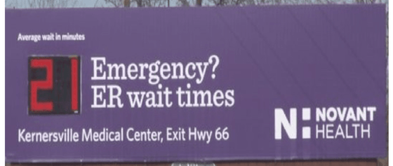
Basic Billboards That Are Just Vague
Here's a sign that promises an “average” wait time of 4 minutes.

It's an average over what time period? Today's average? The average over the past year?
Does that mean a patient arriving should only expect to wait four minutes? Roughly half of patients are going to wait longer than average (or more than half, given the likely statistical distribution).
Signs like this don't answer the question, “Waiting for what?”
Is this 4 minutes waiting to be registered? Waiting to be triaged? Waiting to be seen by a doctor?
Perhaps the time spent waiting to be seen by a doctor is the most meaningful. Or maybe the total outpatient length of stay, from door to door, is of the most interest?
That sign isn't any more helpful. Is that hospital far worse than the first that had the 4 minute time? Are they measuring the same wait? We don't know.
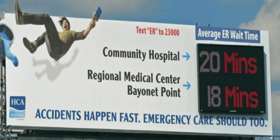
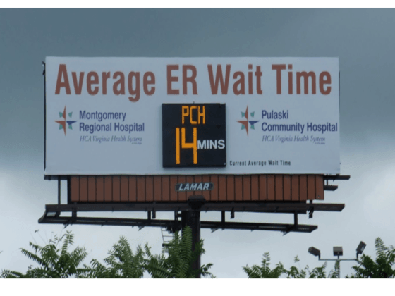
This health system compares two of their hospitals. I guess if you know the area, you might know if Bayonet Point is a longer drive from the billboard. But what if you're visiting? If Bayonet is 45 minutes further down the road, should you really go there?
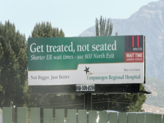
Billboards With a “Current” Average
Some signs try to answer the “what timeframe?” question with a vague answer.
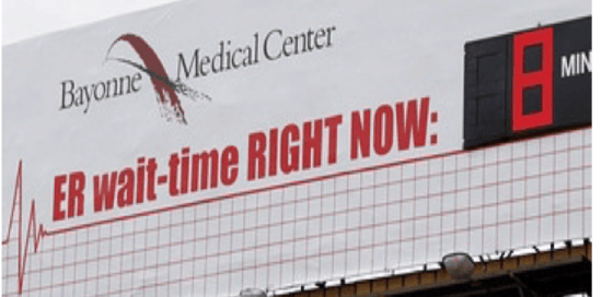
It still doesn't answer the “waiting for what?” question. It also doesn't explain what “right now” means. I guess it means at this very instant, but experience shows that “real time” data is usually delayed by some period. I wonder if you stood and watched this billboard, how often would it change?
Here are some other signs that say “current” – but, again, there could be different operational definitions of “current.” The last hour? Today? Right now?
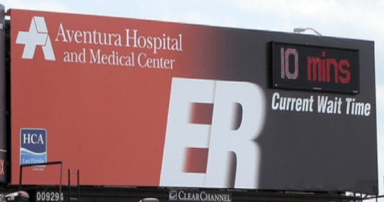
It's interesting to me that the above billboard, from an HCA hospital, is a different format and different information from the HCA billboard that's further up in this post.
None of these signs provide context about how these waits compare to competitors. I guess that's not the point. These billboards are for marketing… they want you to think they are better than their competitors? Or that they're more transparent?
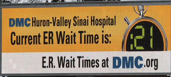
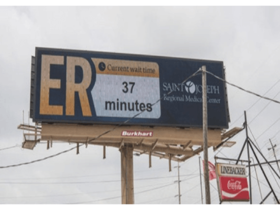
Current or Average or “Current Average?”
I'm confused also by the term “current average.” Does that imply a shorter timeframe like “today's average” or “this hour's average” compared to the longer-term average? We don't know.
Sometimes, the billboard labels the time as “average” and “current average.” It still doesn't say what you're waiting for in context of the overall length of stay.
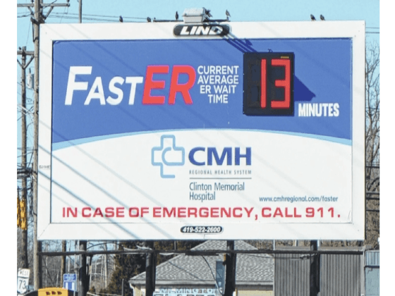
So What Are We Waiting For?
Some of these billboards DO explain:
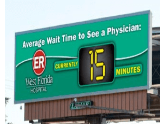
That's helpful information that you'll be waiting about that long to see a physician. We're still not sure what context there is about “average” or “current.”
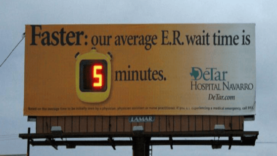
The fine print on that billboard read:
“Based on the average time to be initially seen by a physician, physician assistant, or nurse practitioner.”
Ah, “initially” seen. That seems like a metric that's just begging to be “gamed” or fudged. If an MD, PA, or NP waves a thermometer past you, is that being “initially seen?” What if you're triaged and then forced to wait for four hours?
You were “initially seen” really fast, but you're probably not the happiest patient.
You also wouldn't want to get into an accident as you struggle to read that fine print while driving.
So Some Aren't Trustworthy?
I'm not sure if this billboard intends to take a shot at other health systems for lying or not being as transparent:
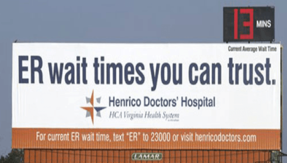
You can't trust other hospital wait time billboards? We still don't know what a “current average” means.
It's strange that these billboards seem to encourage people to text and drive. They'd want the passenger to do that, of course… unless they're in too much pain.
More Definitive Vagueness
These billboards don't confuse anybody with the use of the words current, average, or current average.
They say “the wait time is ______” which seems far too definitive and absolute.
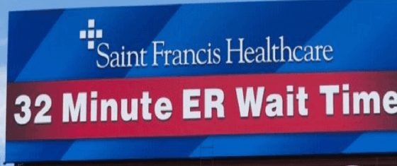
Is that a digital billboard that's updated to show different times? Does it always say 32 minutes?
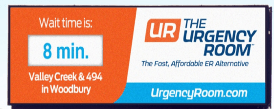
Same questions about this next billboard:
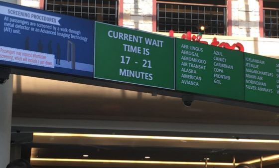
Yesterday, the Orlando airport showed a “current” TSA waiting time that was a range… which seems more realistic than a single number:
A More Meaningful Promise?
I find it interesting when hospitals make a promise or a guarantee about waiting times, as does DMC:
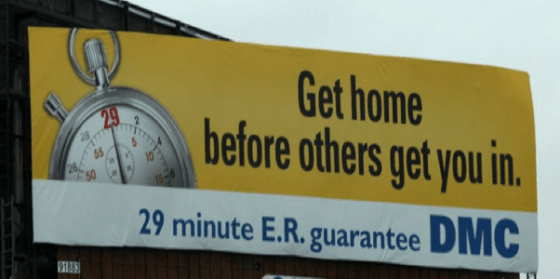
But this billboard is confusing too. It seems unreasonable that you'd get home within 29 minutes. What are they promising exactly? Less than a 29 minute wait for a doctor?
Here is a 2010 video about this 29 minute guarantee:
The video says “you'll be seen by a physician within 29 minutes.” Is that different than being “initially seen?”
DMC does post “real time” wait times on their website:
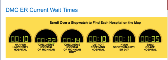
They also have a smartphone app.
Do these show how they're doing against the 29-minute guarantee? What does “current” mean? Waiting for what? For the physician? That's what I'd guess from their other information.
The website DOES make it easy to map the locations of the hospitals though, so you can decide if Troy or downtown Detroit makes more sense for you and your needs.
Of course, if you need surgery, you'd need to question if DMC is still having problems sterilizing instruments properly (something that has continued to be a problem in more recent weeks).
Exposé About Detroit Medical Center, Dirty Surgical Instruments, Dysfunction, and… Lean?
How Would You Communicate This?
I've tried to lay out the case that the current state of these billboards is bad.
The bigger problem is when waiting times are too long…
But what would you recommend for a better, more helpful billboard design?
Does this matter to the general public? These signs are just advertising, so maybe we shouldn't worry about it?
I'm curious of international readers outside of the U.S. have billboards or websites or apps with waiting times where you live?
What do you think? Please scroll down (or click) to post a comment. Or please share the post with your thoughts on LinkedIn – and follow me or connect with me there.
Did you like this post? Make sure you don't miss a post or podcast — Subscribe to get notified about posts via email daily or weekly.
Check out my latest book, The Mistakes That Make Us: Cultivating a Culture of Learning and Innovation:


Great article. This same subject drove me to design an app for our registration team that measures the exact wait time for each patient in our various waiting rooms. From there, we can run a report that gives us averages by time period, day week or month. Or, how long a particular patient waited. We can actually SHOW what our wait time is. From that, we can staff accordingly. Solid metrics deliver solid results. No fuzzy math here!
Thanks…
Have you seen a reduction in E.D. length of stay thanks to those efforts?
Does your organization share that wait time data with the public in a way that’s more clear to them and less fuzzy?
This applies more to our outpatient areas such as imaging, OP surgery, labs etc. It also allows these area to “see” who is waiting (similar to a grease board), how long they have been waiting…or if they were “missed” accidentally. I talked to the administrator that uses it and she said that it has drastically improved the workflow and they could not fathom being without it.
When I first started seeing these on the highway several years ago, I thought the same thing. Fast ED wait times (however we measure those) don’t necessarily represent the most efficient door-to-door process and certainly not the best way to ensure good clinical outcomes. But it’s not just bad process management, it’s also bad marketing. People don’t choose their hospitals by ED wait times. They choose hospitals for coverage by their insurance, proximity to their house, and their docs (pretty much in that order). Moreover, it also drives poor consumer behavior as many patients view the ED as an quicker and more accessible alternative to a primary care visit.
But if I had to guess, I say that the billboards weren’t actually intended to get people to choose their ED over another hospital’s. Instead I would guess that they’re hoping that the person chooses their ED over some unaffiliated urgent care/minute clinic/doc in a box/etc. They’re becoming a bigger and bigger challenge for hospital systems and cause leakage and, probably more significantly, lost Rx revenue.
A comment from LinkedIn:
Mark,
In the UK we have a fixation on wait times in A&E (our ED). Fixation on wait times for consultations, time for operations, time to see a doctor, times for ambulances to arrive etc,etc..
In fact it’s so much entered our psyche that if you go to hospital, doctors etc the first questions anyone asks is “what was the wait time when you arrived? Or how long did you wait? ”
Not sure any of our waiting times are relevant. For instance as I understand strokes need to be treated in the Golden Hour so is a 25 min wait worse than a 10 minute one? And is 3 hour wait with an open wound a problem?
Ironically my first “lean” project was in a hospital outpatient clinic, to reduce the wait issues back in 1992. The cause appeared to be appointments made for patients that they couldn’t arrive on time for. They relied on patient transport which arrived after the clinic opened.
Regards
Mark