

 If you have to add a warning or instruction label to something that should be obvious in its use, then the item is probably badly designed. I think that's a pretty good design principle for products or software. Slapping on a label after the fact is a workaround, at best.
I've found a few recent examples of that principle in my travels.
First is from the North American International Auto Show (which I also blogged about here).
The BMW display, beyond the cool cars and the apparent 5S markings, had a step that many people kept tripping over, even with a warning sign.
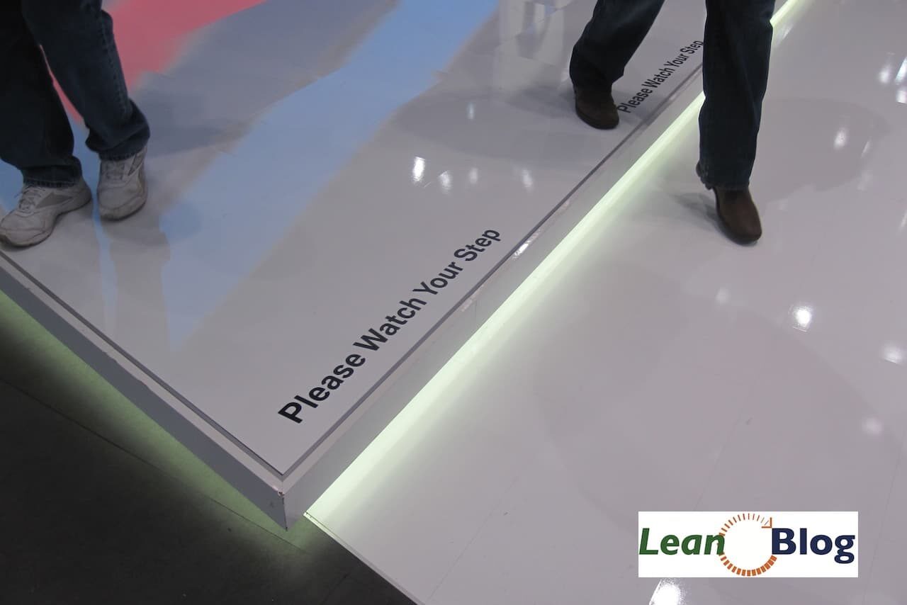
The white step down onto a white surface… from the top of the step, people couldn't really see that light. So about half of the people tripped, even with the warning sign. It goes to show a warning sign can't make up for bad (yet beautiful) design.
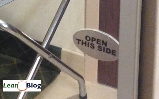
The second example was from a Hampton Inn that I stayed at. The mirrored closet door looks completely symmetrical and you wouldn't know what side to pull on.
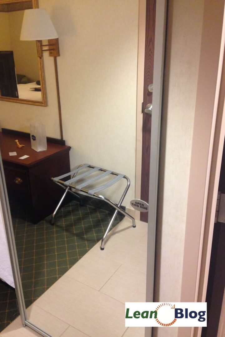
Tacking on the “OPEN THIS SIDE” decal is a sign that the door wasn't designed well. They could have had some sort of handle that indicated which side to open.
Why does this stuff matter? Am I just being a nit-picky grouch? I think it matters when we think about the workplace and poor human factors. Have we designed a workplace that's visual and obvious to employees, making it easy for them to do the right things the right way… or are we slapping up a bunch of warnings and labels as a workaround?
Last example was from a hospital cafeteria. It sure looks like a trash can…
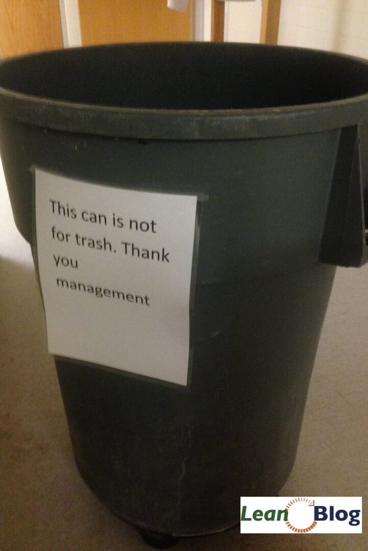
It was really unclear what this was if it was not a trash can. It was near the area where you return cafeteria trays. There was no alternative to the trash can, I mean no alternative to the “non-trash can.” The sign seems to be a indicator of a design problem, the problem being that it's reasonable for people to assume it's a trash can because, well, it looks like one. It is one.
I have a collection of silly workplace warnings at my sister site www.BeMoreCareful.com… as the site description says, these “be carefuls!” rarely get to the root cause of any issue. The sign is a symptom of a problem. The sign is generally not an effective countermeasure.
The sign says don't trip… people trip and fall. A sign says “pull here” and the hotel guest pulls first on the wrong side (yes, that happened). A sign says “don't throw trash here” and there's probably always trash there anyway… don't blame the people, blame the system.
What do you think? Please scroll down (or click) to post a comment. Or please share the post with your thoughts on LinkedIn – and follow me or connect with me there.
Did you like this post? Make sure you don't miss a post or podcast — Subscribe to get notified about posts via email daily or weekly.
Check out my latest book, The Mistakes That Make Us: Cultivating a Culture of Learning and Innovation:


I should have cited the influence that Don Norman and his book “The Design of Everyday Things” has had on my thinking here.
See a blog post via Martin Burns about the book.
For the most part I agree, but I’m contemplating warning signs that are mandated by regulation, not necessarily need. The one that immediately pops into my mind are the Prop 65 “Warning – may cause cancer” signs and decals you see all over California, from gas pumps to bathroom fixtures. So many that they are completely ignored (another issue). Gas pumps are pretty well designed, especially in California where every last drop is captured by elaborate design. Are such warning labels really necessary – or an indicator of a bad design? I guess we could say it indicates bad regulatory design!
Great question. Some warning signs are necessary if they are the best and only option that you have. When we see a warning/caution/careful, I think we should ask “Can we error proof this?”
For the gas pump sign, we probably can’t remove the carcinogen from the gasoline? We can’t prevent pregnant women from pumping gas. A warning/awareness sign is probably reasonable.
There’s a warning that says you must turn off your vehicle before fueling up. That *could* be error proofed (fuel cap won’t come off unless the car is off), but I guess society and the automakers have decided that’s not important or worth the cost.
There’s NOT a warning that says “don’t forget to put the fuel nozzle back in the pump” because that’s been error proofed in a way. The problem is not prevented, but the impact of the driver/customer error is lessened by a quick release valve.
There *is* a warning about “don’t smoke while fueling” because I’m not sure how you could error proof that.
There’s NOT a sign saying “don’t forget to take your credit card” because that’s pretty well error proofed by the way you swipe your card (the swiping occurs when you remove the card quickly, right?). Some ATM machines are not designed as well and they DO have to warn you to make sure you take your card (because, say, the cash comes out before the card comes out… the “swipe out” method where the card never stays inside the machine seems to be best).
But, in the three cases in this post, I think there could have been a simple, elegant, and not ugly solution that could have eliminated the need for these three warnings.
There are many things in daily life that are inherently dangerous, wherein the risk cannot be designed out without loss of functionality. For example, knives and hammers.
There is a standard design principle in engineering called the “Hazard Control Hierarchy”: First, remove the hazard; if not possible, then guard against the hazard; otherwise, warn about the hazard. For example, the best solution for a big hole in a sidewalk is to fix the hole; if not possible, put a fence around the hole; if that’s not possible (or practical), then you should put a warning.
Although it is true that warnings should not be used to fix poor design, warnings are not the enemy either.
Great example. I think we are in agreement that warning signs should be a “last resort” if we can’t find a better way.