

To borrow a theme from Kevin Meyer, here's some “fun with statistics,” or at least this kind of thing is fun to me, being a big proponent of Statistical Process Control (SPC) and the methods taught by Deming and Wheeler (an incredible reference is Wheeler's book Understanding Variation).
I forget the exact context, but a I heard a news story that talked about some data (I forget if it was employment related, housing starts, etc) and the key point made was “it was the 24th consecutive month where the number was lower than the previous year.”
OK, kind of convoluted, but the clear implication was that there was an indicator of a downward trend, or that was the conclusion we were supposed to draw.
A different comparison, 24 consecutive declining months, compared month to month instead of to a year prior, certainly would be an indicator of a system that is not in statistical control, as pictured below. The line in the middle is the “mean” and the red lines are calculated “control limits” — clearly not a process that is “in control.” This is a trend we can draw a clear conclusion from. We can probably predict the next month will be lower (in fact, you can draw a control chart with a “slope” that takes into account a consistent increase or decrease). 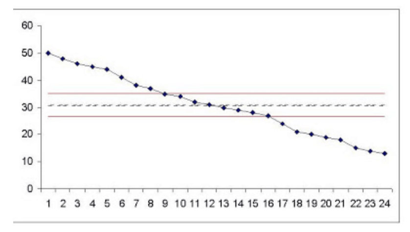
But, the case mentioned on the radio might very well be a stable system. Again, in this case, I made up data, but trust me, each point 13-24 is lower (even if just slightly) than the data point 12 before.
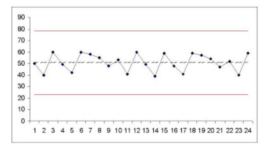
In this case, we do have a process that is in statistical control, as shown below. It is quite possible that the “24 consecutive months where the number was lower than the previous year” is what you might call “statistical trivia” — interesting, maybe, but meaningless. What this SPC chart tells us is that the next month is most likely to be in that range from 23 to 78, unless something changes (a “special cause”).
There are far too many cases when the media (or business leaders) use (or abuse) year-on-year comparisons. Wheeler makes a compelling case in his book about why trend charts and SPC are much better than comparing two data points. We are less likely to make bad decisions based on trends that aren't there.
Has anyone else out there used SPC for evaluating business metrics? The great thing about using SPC is that you can avoid overreacting to every up and down in your hourly, daily, or weekly numbers. That overreaction creates a lot of “muda” (waste) and really wears everybody down.
What do you think? Please scroll down (or click) to post a comment. Or please share the post with your thoughts on LinkedIn – and follow me or connect with me there.
Did you like this post? Make sure you don't miss a post or podcast — Subscribe to get notified about posts via email daily or weekly.
Check out my latest book, The Mistakes That Make Us: Cultivating a Culture of Learning and Innovation:


I’m right in the middle of a project to begin using SPC on weekly numbers. I’m hopeful that it will help calm nerves around here.
We have used spc to calm our corporate office on our OSHA incident rate. We’d have a couple of months of decreasing rate and then have a “negative” point and HQ would go nuts. We started to SPC chart to show that we had a stable process and not overreact to a single point. Of course, we were shooting for the unstable decreasing process.
The man who introduced me to Wheeler asked that I keep control charts for all of my KPI’s each year. If my numbers were within the Natural Process Limits no further report was necessary. Trends in either direction, or unexpected variance required words. It was one of the best jobs I have ever had.
I realize this post is about SPC, but I must digress, for more fun with statistics.
Year on year (YOY) comparisons drive me nuts. You see it all the time in real estate, where the change in housing prices is expressed as a percentage with reference to the same month of the previous year. Of course, its done to reinforce the ‘assumption’ that the number should always be positive. Lies and statistics.
The worst part is when people do statistical analysis on YOY data. YOY employs a moving reference, such that subsequent numbers (one month to the next) can’t really be compared because of the different reference in the prior year. Then when doing further analysis (all of which assumes normal data, but of course no one checks that) the results are completely meaningless.
Oh well. Real estate never depreciates though. right? doesn’t it?…..